
8.8 Scatter Plots, Correlation, and Regression Lines
Learning Objectives
After completing this section, you should be able to:
- Construct a scatter plot for a dataset.
- Interpret a scatter plot.
- Distinguish among positive, negative and no correlation.
- Compute the correlation coefficient.
- Estimate and interpret regression lines.
One of the most powerful tools statistics gives us is the ability to explore relationships between two datasets containing quantitative values, and then use that relationship to make predictions. For example, a student who wants to know how well they can expect to score on an upcoming final exam may consider reviewing the data on midterm and final exam scores for students who have previously taken the class. It seems reasonable to expect that there is a relationship between those two datasets: If a student did well on the midterm, they were probably more likely to do well on the final than the average student. Similarly, if a student did poorly on the midterm, they probably also did poorly on the final exam.
Of course, that relationship isn’t set in stone; a student’s performance on a midterm exam doesn’t cement their performance on the final! A student might use a poor result on the midterm as motivation to study more for the final. A student with a really good grade on the midterm might be overconfident going into the final, and as a result doesn’t prepare adequately.
The statistical method of regression can find a formula that does the best job of predicting a score on the final exam based on the student’s score on the midterm, as well as give a measure of the confidence of that prediction! In this section, we’ll discover how to use regression to make these predictions. First, though, we need to lay some graphical groundwork.
Relationships Between Quantitative Datasets
Before we can evaluate a relationship between two datasets, we must first decide if we feel that one might depend on the other. In our exam example, it is appropriate to say that the score on the final depends on the score on the midterm, rather than the other way around: if the midterm depended on the final, then we’d need to know the final score first, which doesn’t make sense.
Here’s another example: if we collected data on home purchases in a certain area, and noted both the sale price of the house and the annual household income of the purchaser, we might expect a relationship between those two. Which depends on the other? In this case, sale price depends on income: people who have a higher income can afford a more expensive house. If it were the other way around, people could buy a new, more expensive house and then expect a raise! (This is very bad advice.)
It's worth noting that not every pair of related datasets has clear dependence. For example, consider the percent of a country’s budget devoted to the military and the percent earmarked for public health. These datasets are generally related: as one goes up, the other goes down. However, in this case, there’s not a preferred choice for dependence, as each could be seen as depending on the other. When exploring the relationship between two datasets, if one set seems to depend on the other, we’ll say that dataset contains values of the response variable (or dependent variable). The dataset that the response variable depends on contains values of what we call the explanatory variable (or independent variable). If no dependence relationship can be identified, then we can assign either dataset to either role.
Once we’ve assigned roles to our two datasets, we can take the first step in visualizing the relationship between them: creating a scatter plot.
Creating Scatter Plots
A scatter plot is a visualization of the relationship between two quantitative sets of data. The scatter plot is created by turning the datasets into ordered pairs: the first coordinate contains data values from the explanatory dataset, and the second coordinate contains the corresponding data values from the response dataset. These ordered pairs are then plotted in the -plane. Let's return to our exam example to put this into practice.
For large datasets, it’s impractical to create scatter plots manually. Luckily, Google Sheets automates this process for us.
Reading and Interpreting Scatter Plots
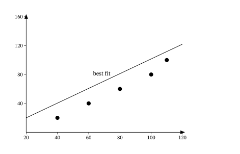
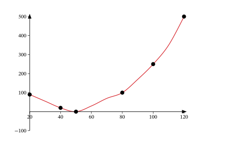
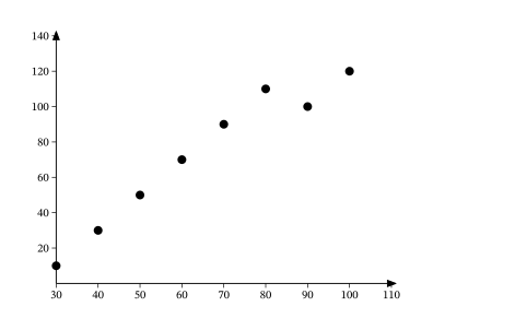
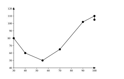
Scatter plots give us information about the existence and strength of a relationship between two datasets. To break that information down, there are a series of questions we might ask to help us. First: Is there a curved pattern in the data? If the answer is “yes,” then we can stop; none of the linear regression techniques from here to the end of this section are appropriate. Figure 8.72 and Figure 8.75 show several examples of scatter plots that can help us identify these curved patterns.
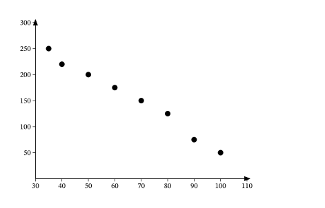
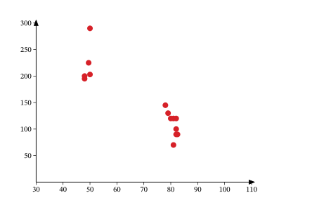
Once we have confirmed that there is no curved pattern in our data, we can move to the next question: Is there a linear relationship? To answer this, we must look at different values of the explanatory variable and determine whether the corresponding response values are different, on average. It's important to look at the values “on average” because, in general, our scatter plots won’t include just one corresponding response point for each value of the explanatory variable (i.e., there may be multiple response values for each explanatory value). So, we try to look for the center of those points. Let’s look again at Figure 8.75, but consider some different values for the explanatory variable. Let’s highlight the points whose -values are around 50 and those that are around 80:
Now, we can estimate the middle of each group of points. Let's add our estimated averages to the plot as starred points:
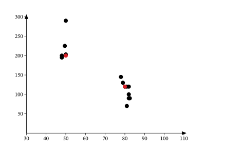
Since those two starred points occur at different heights, we can conclude that there’s likely a relationship worth exploring.
Here’s another example using a different set of data:
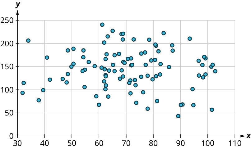
Let’s look again at the points near 50 and near 80, and estimate the middles of those clusters:
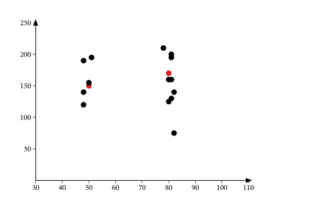
Notice that there’s not much vertical distance between our two starred points. This tells us that there’s not a strong relationship between these two datasets.
Positive and Negative Linear Relationships
Another way to assess whether there is a relationship between two datasets in a scatter plot is to see if the points seem to be clustered around a line (specifically, a line that’s not horizontal). The stronger the clustering around that line is, the stronger the relationship.
Once we’ve established that there’s a relationship worth exploring, it’s time to start quantifying that relationship. Two datasets have a positive linear relationship if the values of the response tend to increase, on average, as the values of the explanatory variable increase. If the values of the response decrease with increasing values of the explanatory variable, then there is a negative linear relationship between the two datasets. The strength of the relationship is determined by how closely the scatter plot follows a single straight line: the closer the points are to that line, the stronger the relationship. The scatter plots in Figure 8.75 to Figure 8.81 depict varying strengths and directions of linear relationships.
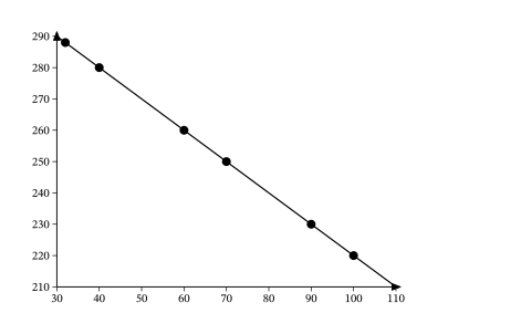
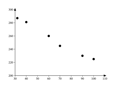
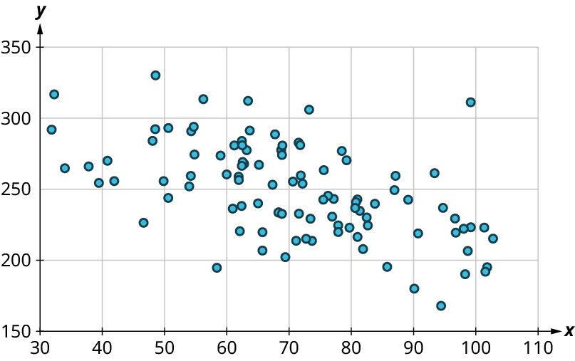
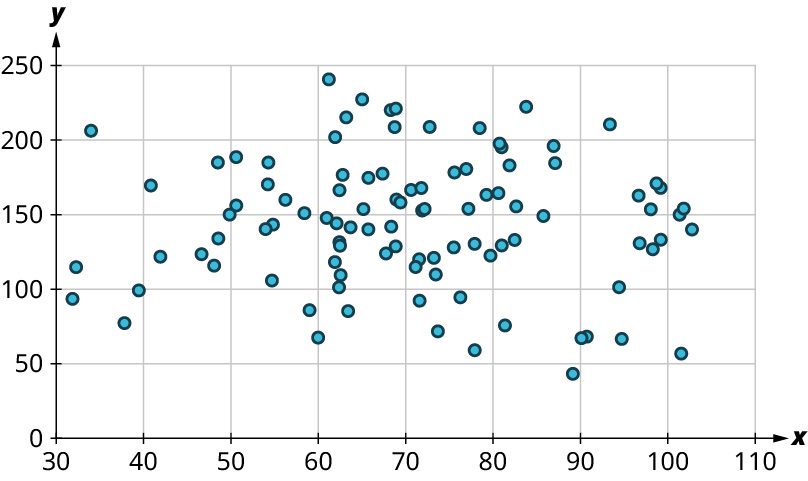
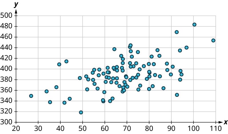
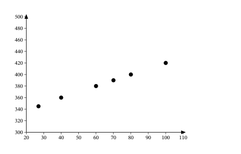
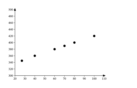
The strength and direction (positive or negative) of a linear relationship can also be measured with a statistic called the correlation coefficient (denoted ). Positive values of indicate a positive relationship, while negative values of indicate a negative relationship. Values of close to 0 indicate a weak relationship, while values close to correspond to a very strong relationship. Looking again at Figure 8.75 to Figure 8.81, the correlation coefficients for each, in sequential order, are: ‒1, ‒0.97, ‒0.55, ‒0.03, 0.61, 0.97, and 1.
There’s no firm rule that establishes a cutoff value of to divide strong relationships from weak ones, but is often given as the dividing line (i.e., if or the relationship is strong, and if the relationship is weak).
The formula for computing is very complicated; it’s almost never done without technology. Google Sheets will do the computation for you using the CORREL function. The syntax works like this: if your explanatory values are in cells A2 to A50 and the corresponding response values are in B2 to B50, then you can find the correlation coefficient by entering “=CORREL(A2:A50, B2:B50)”. (Note that the order doesn’t matter for correlation coefficients; “=CORREL(B2:B50, A2:A50)” will give the same result.)
Let’s put all of this together in an example.
Linear Regression
The final step in our analysis of the relationship between two datasets is to find and use the equation of the regression line. For a given set of explanatory and response data, the regression line (also called the least-squares line or line of best fit) is the line that does the best job of approximating the data.
What does it mean to say that a particular line does the “best job” of approximating the data? The way that statisticians characterize this “best line” is rather technical, but we’ll include it for the sake of satisfying your curiosity (and backing up the claim of "best"). Imagine drawing a line that looks like it does a pretty good job of approximating the data. Most of the points in the scatter plot will probably not fall exactly on the line; the distance above or below the line a given point falls is called that point’s residual. We could compute the residuals for every point in the scatter plot. If you take all those residuals and square them, then add the results together, you get a statistic called the sum of squared errors for the line (the name tells you what it is: “sum” because we’re adding, “squared” because we’re squaring, and “errors” is another word for “residuals”). The line that we choose to be the “best” is the one that has the smallest possible sum of squared errors. The implied minimization (“smallest”) is where the “least” in “least squares” comes from; the “squares” comes from the fact that we’re minimizing the sum of squared errors. This is very similar to the process we outlined in the "game" that we used to introduce the mean. Both the regression line and the mean are designed to minimize a sum of squared errors. Here ends the super technical part.
Finding the Equation of the Regression Line
So, how do we find the equation of the regression line? Recall the point-slope form of the equation of a line:
The regression line has two properties that we can use to find its equation. First, it always passes through the point of means. If and are the means of the explanatory and response datasets, respectively, then the point of means is . We’ll use that as the point in the point-slope form of the equation. Second, if and are the standard deviations of the explanatory and response datasets, respectively, and if is the correlation coefficient, then the slope is . Putting all that together with the point-slope formula gives us this:
Let's walk through an example.
As you can see, finding the equation of the regression line involves a lot of steps if you have to find all of the values of the needed quantities yourself. But, as usual, technology comes to our rescue. This video (which you actually watched earlier when learning how to create scatter plots) covers the regression line at around the 3:30 mark. Note that Google Sheets calls it the "trendline."
Let's put this into practice.
Using the Equation of the Regression Line
Once we’ve found the equation of the regression line, what do we do with it? We’ll look at two possible applications: making predictions and interpreting the slope.
We can use the equation of the regression line to predict the response value for a given explanatory value . All we have to do is plug that explanatory value into the formula and see what response value results. This is useful in two ways: first, it can be used to make a guess about an unknown data value (like one that hasn’t been observed yet). Second, it can be used to evaluate performance (meaning, we can predict an outcome given a particular event). In Example 2, we created a scatter plot of final exam scores vs. midterm exam scores using this data:
| Name | Midterm Grade | Final Grade |
|---|---|---|
| Allison | 88 | 84 |
| Benjamin | 71 | 80 |
| Carly | 75 | 77 |
| Daniel | 94 | 95 |
| Elmo | 68 | 73 |
The equation of the regression line is , where is the final exam score and is the midterm exam score. If Frank scored 85 on the midterm, then our prediction for his final exam score is . To use the regression line to evaluate performance, we use a data value we’ve already observed. For example, Allison scored 88 on the midterm. The regression line predicts that someone who scores an 88 on the midterm will get on the final. Allison actually scored 84 on the final, meaning she underperformed expectations by almost 4 points .
The second application of the equation of the regression line is interpreting the slope of the line to describe the relationship between the explanatory and response datasets. For the exam data in the previous paragraph, the slope of the regression line is 0.687. Recall that the slope of a line can be computed by finding two points on the line and dividing the difference in the -values of those points by the difference in the -values. Keeping that in mind, we can interpret our slope as . Multiplying both sides of that equation by the denominator of the fraction, we get . Thus, a one-point increase in the midterm score would result in a predicted increase in the final score of 0.687 points. A ten-point drop in the midterm score would give us a decrease in the predicted final score of 6.87 points. In general, the slope gives us the predicted change in the response that corresponds to a one unit increase in the explanatory variable.
Extrapolation
A very common misuse of regression techniques involves extrapolation, which involves making a prediction about something that doesn't belong in the dataset.
Correlation Does Not Imply Causation
One of the most common fallacies about statistics has to do with the relationship between two datasets. In the dataset “Public”, we find that the correlation coefficient between the 75th percentile math SAT score and the 75th percentile verbal SAT score is 0.92, which is really strong. The slope of the regression line that predicts the verbal score from the math score is 0.729, which we might interpret as follows: “If the 75th percentile math SAT score goes up by 10 points, we’d expect the corresponding verbal SAT score to go up by just over 7 points.”
Does the increasing math score cause the increase in the verbal score? Probably not. What’s really going on is that there’s a third variable that’s affecting them both: To raise the SAT math score by 10 points, a school will recruit students who do better on the SAT in general; these students will also naturally have higher SAT verbal scores. This third variable is sometimes called a lurking variable or a confounding variable. Unless all possible lurking variables are ruled out, we cannot conclude that one thing causes another.
Key Terms
- response variable (dependent variable)
- explanatory variable (independent variable)
- scatter plot
- positive linear relationship
- negative linear relationship
- correlation coefficient
- regression line (least-squares line, line of best fit)
Key Concepts
- If one variable affects the value of another variable, we say the first is an explanatory variable and the second is a response variable.
- Scatter plots place a point in the -plane for each unit in the dataset. The -value is the value of the explanatory variable, and the -value is the value of the response variable.
- The correlation coefficient gives us information about the strength and direction of the relationship between two variables. If is positive, the relationship is positive: an increase in the value of the explanatory variable tends to correspond to an increase in the value of the response variable. If is negative, the relationship is negative: an increase in the value of the explanatory variable tends to correspond to a decrease in the value of the response variable. Values of that are close to 0 indicate weak relationships, while values close to –1 or indicate strong relationships.
- The regression line for a relationship between two variables is the line that best represents the data. It can be used to predict values of the response variable for a given value of the explanatory variable.
Formulas
If a line has slope and passes through a point , then the point-slope form of the equation of the line is:
Suppose and are explanatory and response datasets that have a linear relationship. If their means are and respectively, their standard deviations are and respectively, and their correlation coefficient is , then the equation of the regression line is:
Videos
Projects
- Browse through some news websites to find five stories that report on data and include data visualizations. Can you tell from the report how the data were collected? Was randomization used? Are the visualizations appropriate for the data? Are the visualizations presented in a way that might bias the reader?
- We discussed three measures of centrality in this chapter: the mode, the median, and the mean. In a broader context, the mean as we discussed it is more properly called the arithmetic mean, to distinguish it from other types of means. Examples of these include the geometric mean, harmonic mean, truncated mean, and weighted mean. How are these computed? How do they compare to the arithmetic mean? In what situations would each of these be preferred to the arithmetic mean?
- Simpson’s Paradox is a statistical phenomenon that can sometimes appear when we observe a relationship within several subgroups of a population, but when the data for all thegroups are analyzed all together, the opposite relationship appears. Find some examples of Simpson’s Paradox in real-world situations, and write a paragraph or two that would explain the concept to someone who had never studied statistics before.
Adapted from Contemporary Mathematics by OpenStax (openstax.org), licensed under CC BY-NC-SA 4.0. Changes were made. License: CC-BY-NC-SA-4.0.