
10.4 Graphs and Equations
Graphs are useful tools for studying mathematical relationships. A graph provides an overview of a quantity of data, and it helps us identify trends or unexpected occurrences. Interpreting the graph can help us answer questions about the data.
For example, here are some data showing the atmospheric pressure at different altitudes. Altitude is given in feet, and atmospheric pressure is given in inches of mercury.
| Altitude (ft) | |||||||
|---|---|---|---|---|---|---|---|
| Pressure (in. Hg) |
We observe a generally decreasing trend in pressure as the altitude increases, but it is difficult to say anything more precise about this relationship. A clearer picture emerges if we plot the data. To do this, we use two perpendicular number lines called axes. We use the horizontal axis for the values of the first variable, altitude, and the vertical axis for the values of the second variable, pressure.
The entries in the table are called ordered pairs, in which the first component is the altitude and the second component is the atmospheric pressure measured at that altitude. For example, the first two entries can be represented by and . We plot the points whose coordinates are given by the ordered pairs, as shown in the figure on the left.
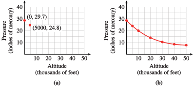
We can connect the data points with a smooth curve as shown in the figure on the right. In doing this, we are assuming that one variable changes smoothly with respect to the other, and in fact this is true for many physical situations. Thus, a smooth curve will thus serve as a good model.
Reading a Graph
Once we have constructed a graph, we can use it to estimate values of the variables between the known data points.
We can also use the graph to obtain information about the relationship between altitude and pressure that would be difficult to see from the data alone.
Graphs of Equations
In Example, we used a graph to illustrate data given in a table. Graphs can also help us analyze models given by equations. Let's first review some facts about solutions of equations in two variables.
An equation in two variables, such as y = 2x + 3, is said to be satisfied if the variables are replaced by a pair of numbers that make the statement true. The pair of numbers is called a solution of the equation and is usually written as an ordered pair . (The first number in the pair is the value of and the second number is the value of .)
To find a solution of a given equation, we can assign a number to one of the variables and then solve for the second variable.
An equation in two variables may have infinitely many solutions, so we cannot list them all. However, we can display the solutions on a graph. For this we use a Cartesian (or rectangular) coordinate system, as shown below left.
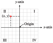

The graph of an equation is a picture of its solutions. A point is included in the graph if its coordinates satisfy the equation, and if the coordinates do not satisfy the equation, the point is not part of the graph. A graph of is shown above right.
This graph does not display all the solutions of the equation, but it shows important features such as the intercepts on the - and -axes. Because there is a solution corresponding to every real number , the graph extends infinitely in either direction, as indicated by the arrows.
Section Summary
Vocabulary
Look up the definitions of new terms in the Glossary.
- Ordered pair
- Component
- Cartesian coordinate system
- Solution
- Equation in two variables
- Satisfy an equation
- Coordinate
- Axis
- Graph
SKILLS
Practice each skill in the exercises listed.
- Read values from a graph: #1–4
- Find solutions to an equation in two variables: #5–8
- Make a table of values from an equation: #9–12
- Make a table of values from a graph: #13–16
- Estimate values from a graph: #17–20
- Use the Trace feature on a calculator: #21–24
- Find solutions to an equation in two variables from a graph: #25–32
Exercises A.4
For Problems 1-4, answer the questions about the graph.
The graph shows the temperatures recorded during a winter day in Billings, Montana.
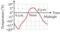
- What were the high and low temperatures recorded during the day?
- During what time intervals is the temperature above F? Below F?
- Estimate the temperatures at 7 a.m. and 2 p.m. At what time(s) is the temperature approximately F? Approximately F?
- How much did the temperature increase between 3 a.m. and 6 a.m.? Between 9 a.m. and noon? How much did the temperature decrease between 6 p.m. and 9 p.m.?
- During which 3-hour interval did the temperature increase most rapidly? Decrease most rapidly?
- High: F; Low: F
- Above F from noon to 3 p.m.; Below F from midnight to 9 a.m. and from 7 p.m. to midnight
- 7 a.m.: F; 2 p.m.: F; 10 a.m. and 5 p.m.: F; 6 a.m. and 10 p.m.: F
- Between 3 a.m. and 6 a.m.: F; Between 9 a.m. and noon: F; Between 6 p.m. and 9 p.m.: F
- Increased most rapidly: 9 a.m. to noon; Decreased most rapidly: 6 p.m. to 9 p.m.
The graph shows the altitude of a commercial jetliner during its flight from Denver to Los Angeles.
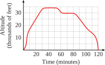
- What was the highest altitude the jet achieved? At what time(s) was this altitude recorded?
- During what time intervals was the altitude greater than 10,000 feet? Below 20,000 feet?
- Estimate the altitudes 15 minutes into the flight and 35 minutes into the flight. At what time(s) was the altitude approximately 16,000 feet? 32,000 feet?
- How many feet did the jet climb during the first 10 minutes of flight? Between 20 minutes and 30 minutes? How many feet did the jet descend between 100 minutes and 120 minutes?
- During which 10-minute interval did the jet ascend most rapidly? Descend most rapidly?
The graph shows the gas mileage achieved by an experimental model automobile at different speeds.
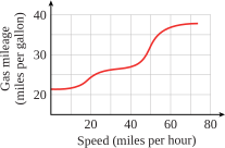
- Estimate the gas mileage achieved at 43 miles per hour.
- Estimate the speed at which a gas mileage of 34 miles per gallon is achieved.
- At what speed is the best gas mileage achieved? Do you think that the gas mileage will continue to improve as the speed increases? Why or why not?
- The data illustrated by the graph were collected under ideal test conditions. What factors might affect the gas mileage if the car were driven under more realistic conditions?
- 28 mpg
- 50 mph
- Best gas mileage at 70 mph. The graph seems to be leveling off for higher speeds; any improvement in mileage probably would not be significant, and the mileage might in fact deteriorate.
- Road condition, weather conditions, traffic, weight in the car
The graph shows the fish population of a popular fishing pond.
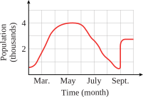
- During what months do the young fish hatch?
- During what months is fishing allowed?
- When does the park service restock the pond?
For Problems 5-8, find five solutions (ordered pairs) for the equation.
For Problems 9-12, fill in the table of values for the given equation.
For Problems 13-16, fill in the table of values for the graph.
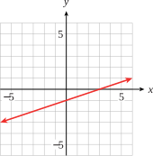
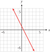
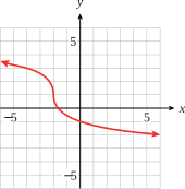
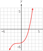
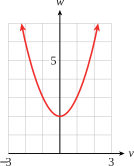
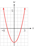
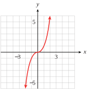
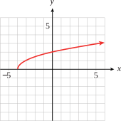
For Problems 17-20, estimate from the graph, any values of with the given value of .
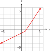
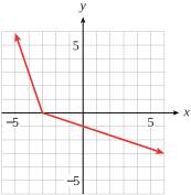
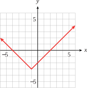
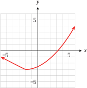
For Problems 21-24, graph the equation in the given friendly window. Use the calculator's Trace feature to make a table of values. (See Using a Graphing Calculator for help with entering expressions.) Round -values to three decimal places.
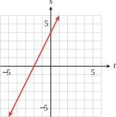
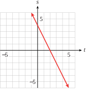
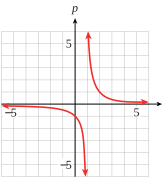
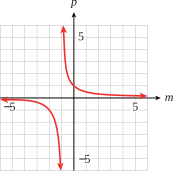
For Problems 25–32,
- Use the graph to find the missing component in each solution of the equation.
- Verify your answers algebraically.
Modeling, Functions, and Graphs by Katherine Yoshiwara (yoshiwarabooks.org), GNU Free Documentation License 1.2 or later. Adapted for the XYZ HTML edition with the authors' permission (recorded 2026-07-04). License: GFDL-1.2-or-later.