
12.2 Scatterplots
A scatterplot shows the relationship between two quantitative variables measured on the same individuals.
- The predictor variable is labeled on the horizontal or -axis.
- The response variable is labeled on the vertical or -axis.
How to Interpret a Scatterplot:
- Look for the overall pattern and for deviations from that pattern.
- Look for outliers, individual values that fall outside the overall pattern of the relationship.
- A positive linear relation results when larger values of one variable are associated with larger values of the other.
- A negative linear relation results when larger values of one variable are associated with smaller values of the other.
- A scatterplot has no association if no obvious linear pattern is present.
Correlation Coefficient
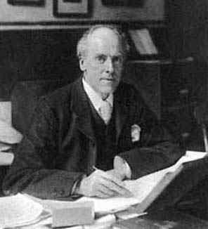
The sample correlation coefficient measures the direction and strength of the linear relationship between two quantitative variables. There are several different types of correlations. We will be using the Pearson Product Moment Correlation Coefficient (PPMCC). The PPMCC is named after biostatistician Karl Pearson. We will just use the lower-case for short when we want to find the correlation coefficient, and the Greek letter , pronounced “rho,” (rhymes with sew) when referring to the population correlation coefficient.
Interpreting the Correlation:
- A positive indicates a positive association (positive linear slope).
- A negative indicates a negative association (negative linear slope).
- is always between and , inclusive.
- If is close to or , there is a strong linear relationship between and .
- If is close to , there is a weak linear relationship between and . There may be a non-linear relation or there may be no relation at all.
- Like the mean, is strongly affected by outliers. Figure 12-1 gives examples of correlations with their corresponding scatterplots.
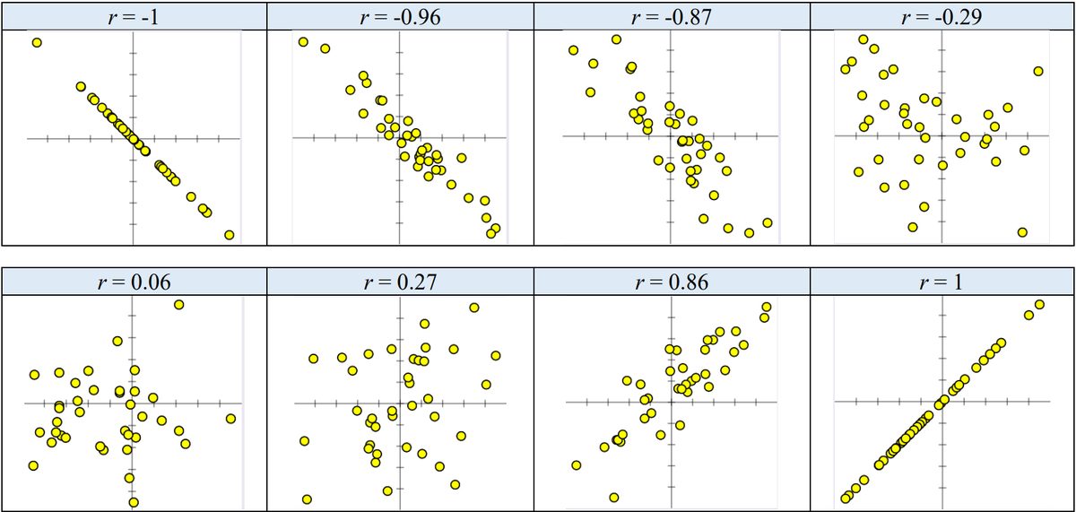
When you have a correlation that is very close to or , then the points on the scatter plot will line up in an almost perfect line. The closer gets to , the more scattered your points become.
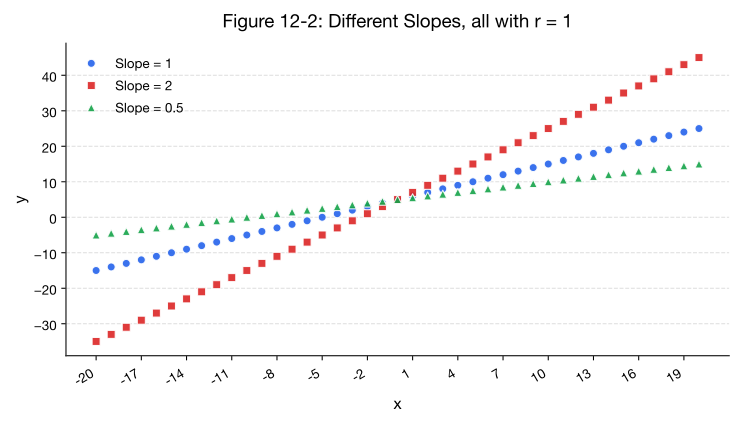
When is equal to or all the dots in the scatterplot line up in a straight line. As the points disperse, gets closer to zero. The correlation tells the direction of a linear relationship only. It does not tell you what the slope of the line is, nor does it recognize nonlinear relationships. For instance, in Figure 12-2, there are three scatterplots overlaid on the same set of axes. All three data sets would have even though they all have different slopes.
For the next example in Figure 12-3, would indicate no linear relationship; however, there is clearly a non-linear pattern with the data.
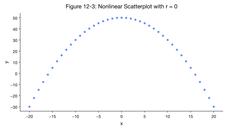
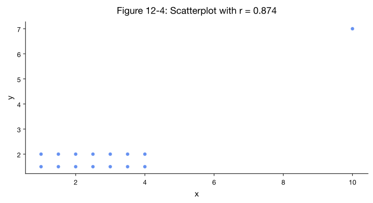
Figure 12-4 shows a correlation , which is pretty close to one, indicating a strong linear relationship. However, there is an outlier, called a leverage point, which is inflating the value of the slope. If you remove the outlier then , and there is no up or down trend to the data.
Calculating Correlation
To calculate the correlation coefficient by hand we would use the following formula.
Instead of doing all of these sums by hand we can use the output from summary statistics. Recall that the formula for a variance of a sample is . If we were to multiply both sides by the degrees of freedom, we would get .
We use these sums of squares frequently, so for shorthand we will use the notation . The same would hold true for the variable; just changing the letter, the variance of would be , therefore .
The numerator of the correlation formula is taking in the horizontal distance of each data point from the mean of the values, times the vertical distance of each point from the mean of the values. This is time-consuming to find so we will use an algebraically equivalent formula , and for short we will use the notation .
To start each problem, use descriptive statistics to find the sum of squares.
When is a correlation statistically significant? The next subsection shows how to run a hypothesis test for correlations.
Adapted from Mostly Harmless Statistics by Rachel Webb (Portland State University, https://mostlyharmlessstat.wixsite.com/webpage), © Rachel Webb, licensed under CC BY-SA 4.0. Changes were made. License: CC-BY-SA-4.0.