
2.9 Line Graphs
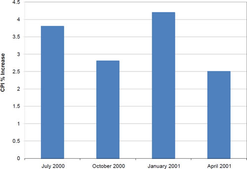
A line graph is a bar graph with the tops of the bars represented by points joined by lines (the rest of the bar is suppressed). For example, Figure 1 was presented in the section on bar charts and shows changes in the Consumer Price Index (CPI) over time.
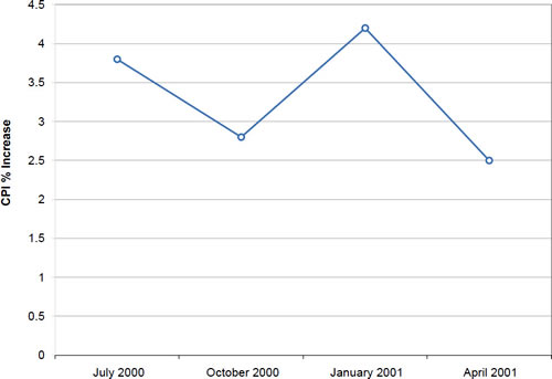
A line graph of these same data is shown in Figure 2. Although the figures are similar, the line graph emphasizes the change from period to period.
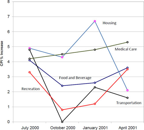
Line graphs are appropriate only when both the X- and Y-axes display ordered (rather than qualitative) variables. Although bar graphs can also be used in this situation, line graphs are generally better at comparing changes over time. Figure 3, for example, shows percent increases and decreases in five components of the Consumer Price Index (CPI). The figure makes it easy to see that medical costs had a steadier progression than the other components. Although you could create an analogous bar chart, its interpretation would not be as easy.
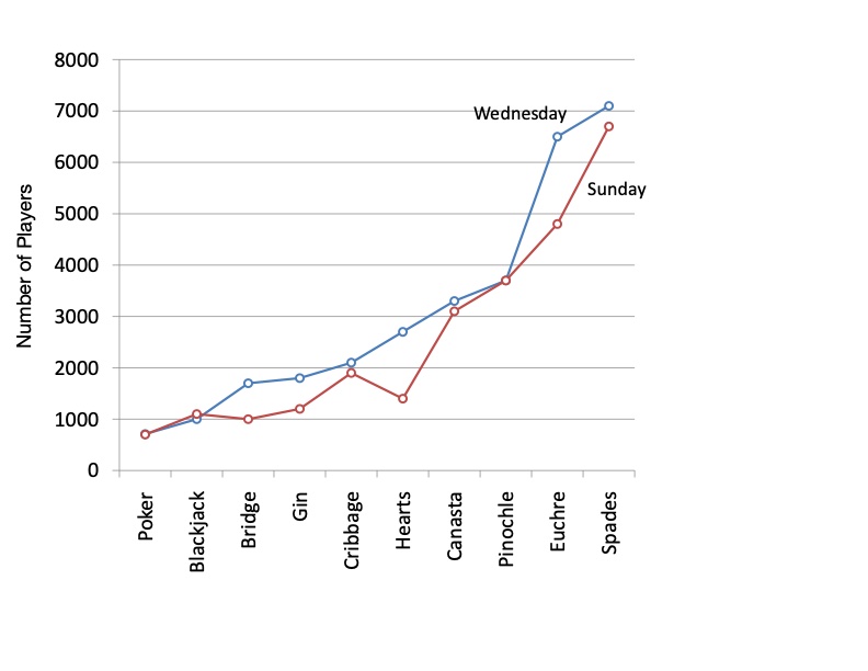
Let us stress that it is misleading to use a line graph when the X-axis contains merely qualitative variables. Figure 4 inappropriately shows a line graph of the card game data from Yahoo, discussed in the section on qualitative variables. The defect in Figure 4 is that it gives the false impression that the games are naturally ordered in a numerical way.
Note that the graphs on this page were not created in R. However, the R code shown here produces a very similar graph.
# Figure 3
food=c(4.1,2.4,2.6,3.6)
housing=c(4.9,4.3,6.7,2.1)
medical = c(4.2,4.5,4.8,5.3)
rec = c(3.3,0.8,1.2,3.5)
tran = c(4.8,0,2.3,1.6)

plot(housing, type="o", xaxt="none",col="purple", xlab="Date", ylab="CPI % Increase",ylim=c(0,7))
lines(food,type="o",col="blue")
lines(medical,type="o",col="green")
lines(rec,type="o",col="red")
lines(tran,type="o",col="black")

legend("topleft",
legend=c("housing","food","medical","recreation","transportation"),
col=c("blue","violet","green","red","black"),
lty=1,lwd=2)
axis(1, at=1:4, lab=c("July 2000", "October 2000", "January 2001","April 2001"))
Adapted from Online Statistics Education: A Multimedia Course of Study (onlinestatbook.com), Project Leader: David M. Lane, Rice University. Developed with NSF support. The original work is in the public domain; it is cited here at the authors' request. Changes were made: reformatted as an accessible XYZ web edition with native MathML. License: Public-Domain.