
2.11 Statistical Literacy
A news report on the safety of commercial vehicles in Texas stated that one out of five commercial vehicles have been pulled off the road in 2012 because they were unsafe. In addition, 12,301 commercial drivers have been banned from the road for safety violations.
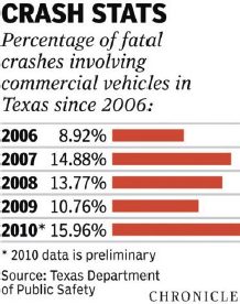
The author presents the bar chart below to provide information about the percentage of fatal crashes involving commercial vehicles in Texas since 2006. The author also quotes DPS director Steven McCraw:
Commercial vehicles are responsible for approximately 15 percent of the fatalities in Texas crashes. Those who choose to drive unsafe commercial vehicles or drive a commercial vehicle unsafely pose a serious threat to the motoring public.
What do you think?
Based on what you have learned in this chapter, does this bar chart provide enough information to conclude that unsafe or unsafely driven commercial vehicles pose a serious threat to the motoring public? What might you conclude if 30 percent of all the vehicles on the roads of Texas in 2010 were commercial and accounted for 16 percent of fatal crashes?
This bar chart does not provide enough information to draw such a conclusion because we don’t know, on the average, in a given year what percentage of all vehicles on the road are commercial vehicles. For example, if 30 percent of all the vehicles on the roads of Texas in 2010 are commercial ones and only 16 percent of fatal crashes involved commercial vehicles, then commercial vehicles are safer than non-commercial ones. Note that in this case 70 percent of vehicles are non-commercial and they are responsible for 84 percent of the fatal crashes.
Linear By Design
Graphing Distributions
What do you think?
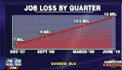
Does Fox News' line graph provide misleading information? Why or Why not?
There are major flaws with the Fox News graph. First, the title of the graph is misleading. Although the data show the number unemployed, Fox News’ graph is titled "Job Loss by Quarter." Second, the intervals on the X-axis are misleading. Although there are 6 months between September 2008 and March 2009 and 15 months between March 2009 and June 2010, the intervals are represented in the graph by very similar lengths. This gives the false impression that unemployment increased steadily.
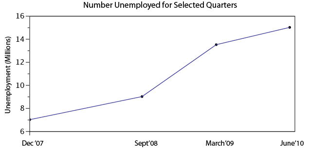
The graph presented below is corrected so that distances on the X-axis are proportional to the number of days between the dates. This graph shows clearly that the rate of increase in the number unemployed is greater between September 2008 and March 2009 than it is between March 2009 and June 2010.
Adapted from Online Statistics Education: A Multimedia Course of Study (onlinestatbook.com), Project Leader: David M. Lane, Rice University. Developed with NSF support. The original work is in the public domain; it is cited here at the authors' request. Changes were made: reformatted as an accessible XYZ web edition with native MathML. License: Public-Domain.