
2.6 Box Plots
We have already discussed techniques for visually representing data (see histograms and frequency polygons). In this section, we present another important graph called a box plot. Box plots are useful for identifying outliers and for comparing distributions. We will explain box plots with the help of data from an in-class experiment. As part of the "Stroop Interference Case Study," students in introductory statistics were presented with a page containing 30 colored rectangles. Their task was to name the colors as quickly as possible. Their times (in seconds) were recorded. We'll compare the scores for the 16 men and 31 women who participated in the experiment by making separate box plots for each gender. Such a display is said to involve parallel box plots.
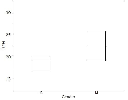
There are several steps in constructing a box plot. The first relies on the 25th, 50th, and 75th percentiles in the distribution of scores. Figure 1 shows how these three statistics are used. For each gender, we draw a box extending from the 25th percentile to the 75th percentile. The 50th percentile is drawn inside the box. Therefore,
the bottom of each box is the 25th percentile,
the top is the 75th percentile,
and the line in the middle is the 50th percentile.
The data for the women in our sample are shown in Table 1.
Table 1. Women's times.
| 14 15 16 16 17 | 17 17 17 17 18 | 18 18 18 18 18 | 19 19 19 20 20 | 20 20 20 20 21 | 21 22 23 24 24 | 29 |
For these data, the 25th percentile is 17, the 50th percentile is 19, and the 75th percentile is 20. For the men (whose data are not shown), the 25th percentile is 19, the 50th percentile is 22.5, and the 75th percentile is 25.5.
Before proceeding, the terminology in Table 2 is helpful.
Table 2. Box plot terms and values for women's times.
| Name | Formula | Value |
|---|---|---|
| Upper Hinge | 75th Percentile | 20 |
| Lower Hinge | 25th Percentile | 17 |
| H-Spread | Upper Hinge - Lower Hinge | 3 |
| Step | 1.5 x H-Spread | 4.5 |
| Upper Inner Fence | Upper Hinge + 1 Step | 24.5 |
| Lower Inner Fence | Lower Hinge - 1 Step | 12.5 |
| Upper Outer Fence | Upper Hinge + 2 Steps | 29 |
| Lower Outer Fence | Lower Hinge - 2 Steps | 8 |
| Upper Adjacent | Largest value below Upper Inner Fence | 24 |
| Lower Adjacent | Smallest value above Lower Inner Fence | 14 |
| Outside Value | A value beyond an Inner Fence but not beyond an Outer Fence | 29 |
| Far Out Value | A value beyond an Outer Fence | None |
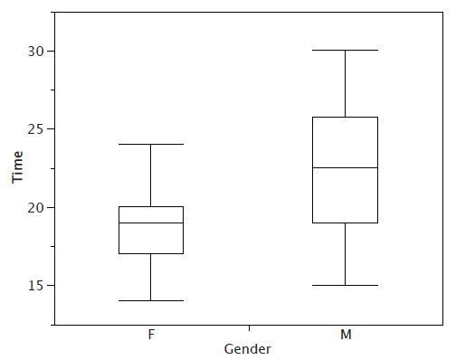
Continuing with the box plots, we put "whiskers" above and below each box to give additional information about the spread of the data. Whiskers are vertical lines that end in a horizontal stroke. Whiskers are drawn from the upper and lower hinges to the upper and lower adjacent values (24 and 14 for the women's data).
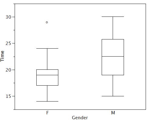
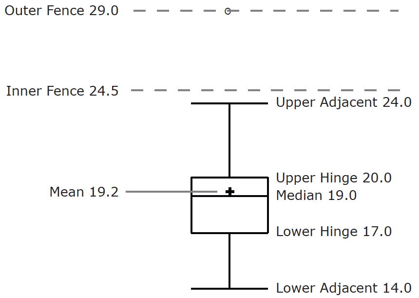
Although we don't draw whiskers all the way to outside or far out values, we still wish to represent them in our box plots. This is achieved by adding additional marks beyond the whiskers. Specifically, outside values are indicated by small "o's" and far out values are indicated by asterisks (*). In our data, there are no far out values and just one outside value. This outside value of 29 is for the women and is shown in Figure 3.
There is one more mark to include in box plots (although sometimes it is omitted). We indicate the mean score for a group by inserting a plus sign. Figure 4 shows the result of adding means to our box plots.
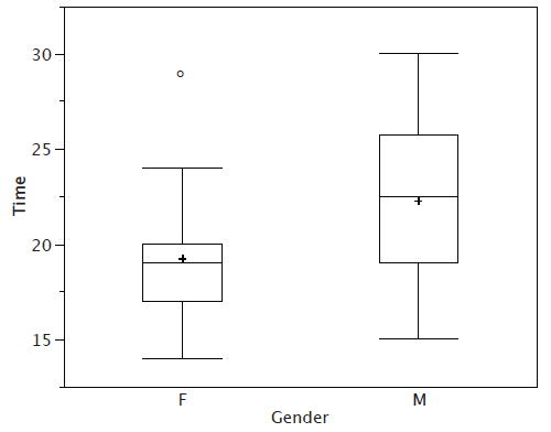
Figure 4 provides a revealing summary of the data. Since half the scores in a distribution are between the hinges (recall that the hinges are the 25th and 75th percentiles), we see that half the women's times are between 17 and 20 seconds, whereas half the men's times are between 19 and 25.5. We also see that women generally named the colors faster than the men did, although one woman was slower than almost all of the men. Figure 5 shows the box plot for the women's data with detailed labels.
Box plots provide basic information about a distribution. For example, a distribution with a positive skew would have a longer whisker in the positive direction than in the negative direction. A larger mean than median would also indicate a positive skew. Box plots are good at portraying extreme values and are especially good at showing differences between distributions. However, many of the details of a distribution are not revealed in a box plot, and to examine these details one should create a histogram and/or a stem and leaf display.
Here are some other examples of box plots:
Time
to move the mouse over a target
Draft
lottery
Variations on box plots
Statistical analysis programs may offer options on how box plots are created. For example, the box plots in Figure 6 are constructed from our data but differ from the previous box plots in several ways.
- It does not mark outliers.
- The means are indicated by green lines rather than plus signs.
- The mean of all scores is indicated by a gray line.
- Individual scores are represented by dots. Since the scores have been rounded to the nearest second, any given dot might represent more than one score.
- The box for the women is wider than the box for the men because the widths of the boxes are proportional to the number of subjects of each gender (31 women and 16 men).
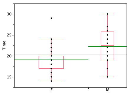
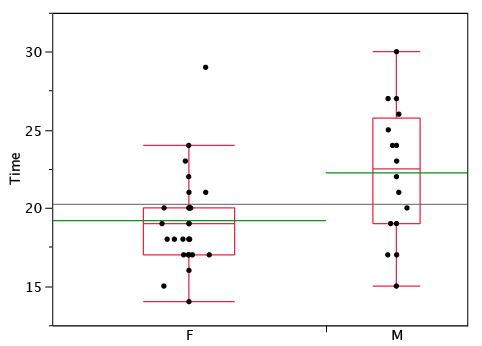
Each dot in Figure 6 represents a group of subjects with the same score (rounded to the nearest second). An alternative graphing technique is to jitter the points. This means spreading out different dots at the same horizontal position, one dot for each subject. The exact horizontal position of a dot is determined randomly (under the constraint that different dots don’t overlap exactly). Spreading out the dots helps you to see multiple occurrences of a given score. However, depending on the dot size and the screen resolution, some points may be obscured even if the points are jittererd. Figure 7 shows what jittering looks like.
Different styles of box plots are best for different situations, and there are no firm rules for which to use. When exploring your data, you should try several ways of visualizing them. Which graphs you include in your report should depend on how well different graphs reveal the aspects of the data you consider most important.
Adapted from Online Statistics Education: A Multimedia Course of Study (onlinestatbook.com), Project Leader: David M. Lane, Rice University. Developed with NSF support. The original work is in the public domain; it is cited here at the authors' request. Changes were made: reformatted as an accessible XYZ web edition with native MathML. License: Public-Domain.