
2.8 Bar Charts
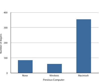
In the section on qualitative variables, we saw how bar charts could be used to illustrate the frequencies of different categories. For example, the bar chart shown in Figure 1 shows how many purchasers of iMac computers were previous Macintosh users, previous Windows users, and new computer purchasers.
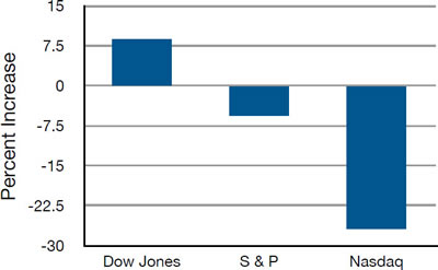
In this section, we show how bar charts can be used to present other kinds of quantitative information, not just frequency counts. The bar chart in Figure 2 shows the percent increases in the Dow Jones, Standard and Poor 500 (S & P), and Nasdaq stock indexes from May 24th 2000 to May 24th 2001. Notice that both the S & P and the Nasdaq had “negative increases” which means that they decreased in value. In this bar chart, the Y-axis is not frequency but rather the signed quantity percentage increase.
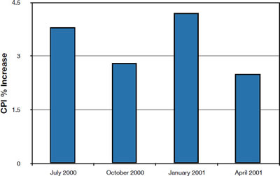
Bar charts are particularly effective for showing change over time. Figure 3, for example, shows the percent increase in the Consumer Price Index (CPI) over four three-month periods. The fluctuation in inflation is apparent in the graph.
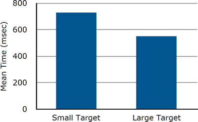
Bar charts are often used to compare the means of different experimental conditions. Figure 4 shows the mean time it took one of us (DL) to move the mouse to either a small target or a large target. On average, more time was required for small targets than for large ones.
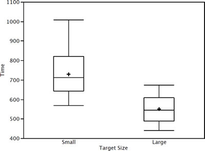
Although bar charts can display means, we do not recommend them for this purpose. Box plots should be used instead since they provide more information than bar charts without taking up more space. For example, a box plot of the mouse-movement data is shown in Figure 5. You can see that Figure 5 reveals more about the distribution of movement times than does Figure 4.
The section on qualitative variables presented earlier in this chapter discussed the use of bar charts for comparing distributions. Some common graphical mistakes were also noted. The earlier discussion applies equally well to the use of bar charts to display quantitative variables.
Adapted from Online Statistics Education: A Multimedia Course of Study (onlinestatbook.com), Project Leader: David M. Lane, Rice University. Developed with NSF support. The original work is in the public domain; it is cited here at the authors' request. Changes were made: reformatted as an accessible XYZ web edition with native MathML. License: Public-Domain.