
2.12 Exercises
Selected answers
- Name some ways to graph quantitative variables and some ways
to graph qualitative variables. (relevant
section & relevant
section)
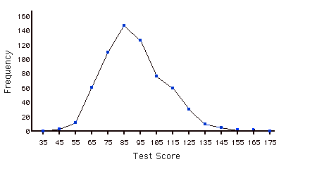
- Based on the frequency polygon displayed
below, the most common test grade was around what score? Explain.
(relevant section)
- An experiment compared the ability of three
groups of participants to remember briefly-presented chess
positions. The data are shown below. The numbers represent
the total number of pieces correctly remembered from three chess
positions. Create side-by-side box plots for these three groups.
What can you say about the differences between these groups
from the box plots?
(relevant section)
Non-players Beginners Tournament players 22.1 32.5 40.1 22.3 37.1 45.6 26.2 39.1 51.2 29.6 40.5 56.4 31.7 45.5 58.1 33.5 51.3 71.1 38.9 52.6 74.9 39.7 55.7 75.9 43.2 55.9 80.3 43.2 57.7 85.3 - You have to decide between displaying your data with a histogram
or with a stem and leaf display. What factor(s) would affect
your choice? (relevant
section & relevant
section)
- In a box plot, what percent of the scores are between the lower and upper hinges? (relevant
section)
- A student has decided to display the results of his project on the number of hours people in various countries slept per night. He compared the sleeping patterns of people from the US, Brazil, France, Turkey, China, Egypt, Canada, Norway, and Spain. He was planning on using a line graph to display this data. Is a line graph appropriate? What might be a better choice for a graph? (relevant section & relevant
section)
- For the data from the 1977 Stat. and Biom. 200 class for eye color, construct: (relevant section)
- pie graph
- horizontal bar graph
- vertical bar graph
- a frequency table with the relative frequency of each
eye color
(Question submitted by J. Warren, UNH)
Eye Color Number of students Brown 11 Blue 10 Green 4 Gray 1
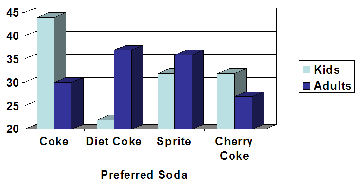
- A graph appears below showing the number of adults and children
who prefer each type of soda. There were 130 adults and kids
surveyed. Discuss some ways in which the graph below could
be improved. (relevant
section)
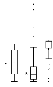
- Which of the box plots below has a large
positive skew? Which has a large negative skew? (relevant
section & relevant
section)
Questions from Case Studies:
The following questions are from the Angry Moods (AM) case study.
- (AM#6) Is there a difference in how much
males and females use aggressive behavior to improve an angry
mood? For the "Anger-Out" scores:
- Create parallel box plots. (relevant
section)
- Create a back to back stem and leaf displays
(You may have trouble finding a computer to do this so you
may have to do it by hand.) (relevant
section)
- Create parallel box plots. (relevant
section)
- (AM#9) Create parallel box plots for the
Anger-In scores by sports participation.
(relevant
section)
- (AM#11) Plot a histogram of the distribution of the Control-Out
scores. (relevant
section)
- (AM#14) Create a bar graph comparing the mean Control-In
score for the athletes and the non-athletes. What would be a better
way to display this data? (relevant
section)
- (AM#18) Plot parallel box plots of the Anger Expression
Index by sports participation. Does it look like there are any
outliers? Which group reported expressing more anger? (relevant section)
The following questions are from the Flatulence (F) case study.
- (F#1) Plot a histogram of the variable "per day." (relevant section)
- (F#7)
Create parallel box plots of "how long" as a function
gender. Why is the 25th percentile not showing? What can you
say about the results? (relevant
section)
- (F#9) Create a stem and leaf plot of the
variable "how long" What can you say about the shape of the
distribution? (relevant section.1)
The following questions are from the Physicians' Reactions (PR) case study.
- (PR#1) Create box plots comparing the time
expected to be spent with the average-weight and overweight
patients. (relevant section)
- (PR#4) Plot histograms of the time spent with the average-weight
and overweight patients. (relevant section)
- (PR#5)
To which group does the patient with the highest expected time
belong?
The following questions are from the Smiles and Leniency (SL) case study
- (SL#1) Create parallel box plots for the four conditions.
(relevant section)
- (SL#3)
Create back to back stem and leaf displays for the false smile
and neutral conditions. (It may be hard to find a computer program
to do this for you, so be prepared to do it by hand). (relevant section)
The following questions are from the ADHD Treatment (AT) case study.
- (AT#3) Create a line graph of the data.
Do certain dosages appear to be more effective than others?
(relevant section)
- (AT#5) Create a stem and leaf plot of the
number of correct responses of the participants after taking
the placebo (d0 variable). What can you say about the shape
of the distribution? (relevant section)
- Create box plots for the four conditions. You may have to
rearrange the data to get a computer program to create the
box plots.
The following question is from the SAT and College GPA case study.
- Create histograms and stem and leaf displays
of both high-school grade point average and university grade
point average. In what way(s) do the distributions differ?
- The April 10th issue of the Journal of the American Medical
Association reports a study on the effects of anti-depressants.
The study involved 340 subjects who were being treated for
major depression. The subjects were randomly assigned to receive
one of three treatments: St. John's wort (an herb), Zoloft
(Pfizer's cousin of Lilly's Prozac) or placebo for an 8-week
period. The
following are the mean scores (approximately) for the three
groups of subjects over the eight-week experiment. The first
column is the baseline. Lower scores mean less depression.
Create a graph to display these means.
The following questions are from
Visit the site
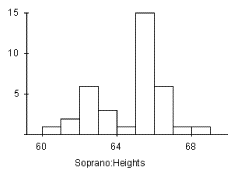
Placebo 22.5 19.1 17.9 17.1 16.2 15.1 12.1 12.3 Wort 23.0 20.2 18.2 18.0 16.5 16.1 14.2 13.0 Zoloft 22.4 19.2 16.6 15.5 14.2 13.1 11.8 10.5 - For the graph below, of heights of singers in a large chorus,
please write a complete description of the histogram. Be sure
to comment on all the important features.
- Pretend you are constructing a histogram for describing the distribution of salaries
for individuals who are 40 years or older, but are not yet retired. (a) What
is on the Y-axis? Explain. (b) What is on the X-axis? (c) What would
be the probable shape of the salary distribution? Explain why.
Answers:
2) 85
Adapted from Online Statistics Education: A Multimedia Course of Study (onlinestatbook.com), Project Leader: David M. Lane, Rice University. Developed with NSF support. The original work is in the public domain; it is cited here at the authors' request. Changes were made: reformatted as an accessible XYZ web edition with native MathML. License: Public-Domain.