
16.2 Tukey Ladder of Powers
Introduction
We assume we have a collection of bivariate data
(x1,y1),(x2,y2),...,(xn,yn)
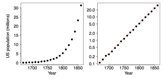
and that we are interested in the relationship between variables x and y. Plotting the data on a scatter diagram is the first step. As an example, consider the population of the United States for the 200 years before the Civil War. Of course, the decennial census began in 1790. These data are plotted two ways in Figure 1. Malthus predicted that geometric growth of populations coupled with arithmetic growth of grain production would have catastrophic results. Indeed the US population followed an exponential curve during this period.
Tukey's Transformation Ladder
Tukey (1977) describes an orderly way of re-expressing variables using a power transformation. You may be familiar with polynomial regression (a form of multiple regression) in which the simple linear model y = b0 + b1X is extended with terms such as b2X2 + b3X3 + b4X4. Alternatively, Tukey suggests exploring simple relationships such as
y = b0 + b1Xλ or yλ = b0 + b1X (Equation 1)
where λ is a parameter chosen to make the relationship as close to a straight line as possible. Linear relationships are special, and if a transformation of the type xλ or yλ works as in Equation (1), then we should consider changing our measurement scale for the rest of the statistical analysis.
There is no constraint on values of λ that we may consider. Obviously choosing λ = 1 leaves the data unchanged. Negative values of λ are also reasonable. For example, the relationship
y = b0 + b1/x
would be represented by λ = −1. The value λ = 0 has no special value, since X0 = 1, which is just a constant. Tukey (1977) suggests that it is convenient to simply define the transformation when λ = 0 to be the logarithm function rather than the constant 1. We shall revisit this convention shortly. The following table gives examples of the Tukey ladder of transformations.
Table 1. Tukey's Ladder of Transformations
| λ | -2 | -1 | -1/2 | 0 | 1/2 | 1 | 2 |
|---|---|---|---|---|---|---|---|
| y |
If x takes on negative values, then special care must be taken so that the transformations make sense, if possible. We generally limit ourselves to variables where x > 0 to avoid these considerations. For some dependent variables such as the number of errors, it is convenient to add 1 to x before applying the transformation.
Also, if the transformation parameter λ is negative, then the transformed variable xλ is reversed. For example, if x is increasing, then 1/x is decreasing. We choose to redefine the Tukey transformation to be -xλ if λ < 0 in order to preserve the order of the variable after transformation. Formally, the Tukey transformation is defined as
Equation 2In Table 2 we reproduce Table 1 using the modified definition when λ < 0.
Table 2. Modified Tukey's Ladder of Transformations
| λ | -2 | -1 | -1/2 | 0 | 1/2 | 1 | 2 |
|---|---|---|---|---|---|---|---|
| y |
The Best Transformation for Linearity
The goal is to find a value of λ that makes the scatter diagram as linear as possible. For the US population, the logarithmic transformation applied to y makes the relationship almost perfectly linear. The red dashed line in the right frame of Figure 1 has a slope of about 1.35; that is, the US population grew at a rate of about 35% per decade.
The logarithmic transformation corresponds to the choice λ = 0 by Tukey's convention. In Figure 2, we display the scatter diagram of the US population data for λ = 0 as well as for other choices of λ.
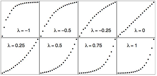
The raw data are plotted in the bottom right frame of Figure 2 when λ = 1. The logarithmic fit is in the upper right frame when λ = 0. Notice how the scatter diagram smoothly morphs from convex to concave as λ increases. Thus intuitively there is a unique best choice of λ corresponding to the "most linear" graph.
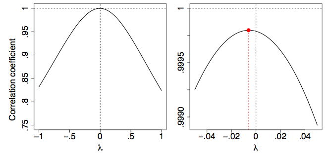
One way to make this choice objective is to use an objective function for this purpose. One approach might be to fit a straight line to the transformed points and try to minimize the residuals. However, an easier approach is based on the fact that the correlation coefficient, r, is a measure of the linearity of a scatter diagram. In particular, if the points fall on a straight line then their correlation will be r = 1. (We need not worry about the case when r = −1 since we have defined the Tukey transformed variable xλ to be positively correlated with x itself.)
In Figure 3, we plot the correlation coefficient of the scatter diagram (x,yλ) as a function of λ. It is clear that the logarithmic transformation (λ = 0) is nearly optimal by this criterion.
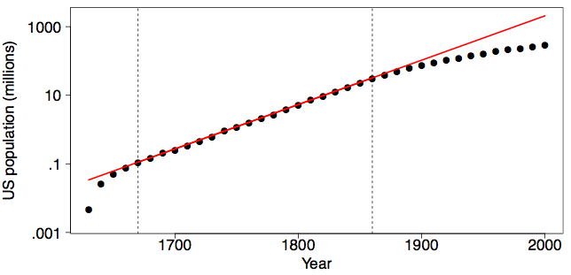
Is the US population still on the same exponential growth pattern? In Figure 4, we display the US population from 1630 to 2000 using the transformation and fit used in the right frame of Figure 1. Fortunately, the exponential growth (or at least its rate) was not sustained into the Twentieth Century. If it had, the US population in the year 2000 would have been over 2 billion (2.07 to be exact), larger than the population of China.
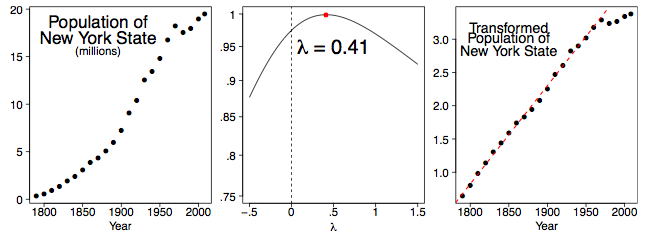
We can examine the decennial census population figures of individual states as well. In Figure 5, we display the population data for the state of New York from 1790 to 2000, together with an estimate of the population in 2008. Clearly something unusual happened starting in 1970. (This began the period of mass migration to the West and South as the rust belt industries began to shut down.) Thus, we compute the best λ value using the data from 1790-1960 in the middle frame of Figure 5. The right frame displays the transformed data, together with the linear fit for the 1790-1960 period. The value of λ = 0.41 is not obvious and one might reasonably choose to use λ = 0.50 for practical reasons.
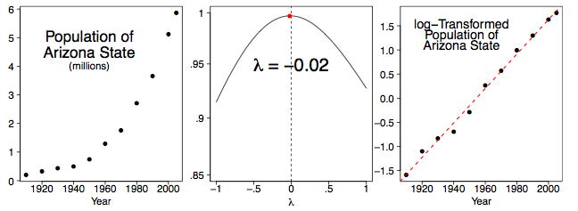
If we look at one of the younger states in the West, the picture is different. Arizona has attracted many retirees and immigrants. Figure 6 summarizes our findings. Indeed, the growth of population in Arizona is logarithmic, and appears to still be logarithmic through 2005.
Reducing Skew
Many statistical methods such as t tests and the analysis of variance assume normal distributions. Although these methods are relatively robust to violations of normality, transforming the distributions to reduce skew can markedly increase their power.
As an example, the data in the "Stereograms" case study are very skewed. A t test of the difference between the two conditions using the raw data results in a p value of 0.056, a value not conventionally considered significant. However, after a log transformation (λ = 0) that reduces the skew greatly, the p value is 0.023 which is conventionally considered significant.
The demonstration in Figure 7 shows distributions of the data from the Stereograms case study as transformed with various values of λ. Decreasing λ makes the distribution less positively skewed. Keep in mind that λ = 1 is the raw data. Notice that there is a slight positive skew for λ = 0 but much less skew than found in the raw data (λ = 1). Values of below 0 result in negative skew.
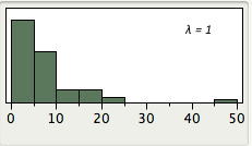
Figure 7. Distribution of data from the Stereograms case study for various values of λ (push buttons to change λ). The starting point is the raw data (λ = 1).
References
Tukey, J. W. (1977). Exploratory Data Analysis. Addison-Wesley, Reading, MA.
Adapted from Online Statistics Education: A Multimedia Course of Study (onlinestatbook.com), Project Leader: David M. Lane, Rice University. Developed with NSF support. The original work is in the public domain; it is cited here at the authors' request. Changes were made: reformatted as an accessible XYZ web edition with native MathML. License: Public-Domain.