
16.4 Statistical Literacy
Many financial web pages give you the option of using a linear or a logarithmic Y-axis. An example from Google Finance is shown below.
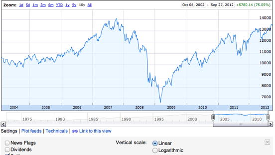
What do you think?
To get a straight line with the linear option chosen, the price would have to go up the same amount every time period. What would result in a straight line with the logarithmic option chosen?
The price would have to go up the same proportion every time period. For example, go up 0.1% every day.
Housing Appreciation
The graph at the top of this page states that the prices are shown in a logarithmic scale.
What do you think?
The Y-axis values do not appear to be a log scale. Interpret the scale for the Y-axis.
Note that the distance between 10 and 100 is the same as the distance between 100 and 1,000. That makes it a log scale since equal proportional increases are represented by the same difference on the graph. For ease of interpretation, the log values are translated back to raw scores for the labels.
Adapted from Online Statistics Education: A Multimedia Course of Study (onlinestatbook.com), Project Leader: David M. Lane, Rice University. Developed with NSF support. The original work is in the public domain; it is cited here at the authors' request. Changes were made: reformatted as an accessible XYZ web edition with native MathML. License: Public-Domain.