Login
📚 Online Statistics Education
Chapters ▾
⇩ Download ▾

4.2 Values of the Pearson Correlation

The Pearson product-moment correlation coefficient is a measure of the strength of the linear relationship between two variables. It is referred to as Pearson's correlation or simply as the correlation coefficient. If the relationship between the variables is not linear, then the correlation coefficient does not adequately represent the strength of the relationship between the variables.

The symbol for Pearson's correlation is "ρ" when it is measured in the population and "r" when it is measured in a sample. Because we will be dealing almost exclusively with samples, we will use r to represent Pearson's correlation unless otherwise noted.

Pearson's r can range from -1 to 1. An r of -1 indicates a perfect negative linear relationship between variables, an r of 0 indicates no linear relationship between variables, and an r of 1 indicates a perfect positive linear relationship between variables. Figure 1 shows a scatter plot for which r = 1.
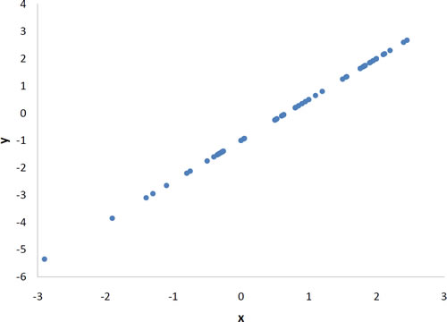
Scatterplot of y against x, both running from about -3 to 3 on x, in which every point lies exactly on one upward-sloping straight line — a perfect positive linear relationship, r = 1.
Figure 1. A perfect positive linear relationship, r = 1.
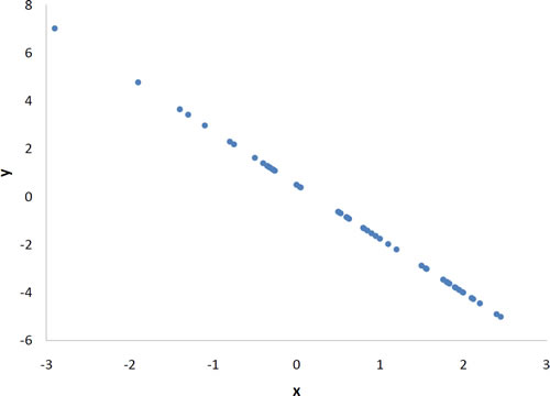
Scatterplot of y against x with every point lying exactly on one downward-sloping straight line, running from about (-2.9, 7) to (2.4, -5) — a perfect negative linear relationship, r = -1.
Figure 2. A perfect negative linear relationship, r = -1.
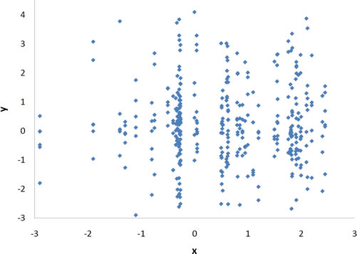
Scatterplot of y against x showing a formless cloud: for every x from -3 to 3 the y values scatter over roughly the same range of -3 to 4, with no upward or downward drift. Knowing x tells you nothing about y — r = 0.
Figure 3. A scatter plot for which r = 0. Notice that there is no relationship between X and Y.


With real data, you would not expect to get values of r of exactly -1, 0, or 1. The data for spousal ages shown in Figure 4 and described in the introductory section has an r of 0.97.
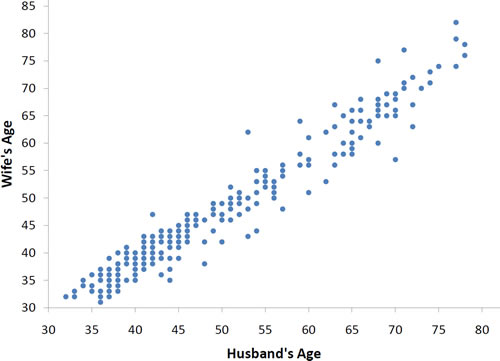
Scatterplot of Wife's Age (y, 30 to 85) against Husband's Age (x, 30 to 80) for about 280 couples. The points form a tight upward band running from about (32, 32) to about (78, 78): the older the husband, the older the wife. The relationship is strong, positive, and close to linear, with a handful of couples well off the band (for example about (53, 62) and (68, 75)).
Figure 4. Scatter plot of spousal ages, r = 0.97.
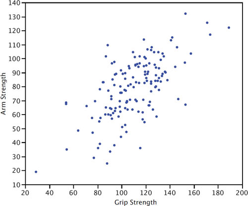
Scatterplot of Arm Strength (y, 10 to 140) against Grip Strength (x, 20 to 200) for 147 subjects. The cloud rises to the right — stronger grip goes with stronger arm — but the points are scattered much more loosely about the trend than in the spousal-age plot, and one subject sits alone at the bottom left near (29, 19).
Figure 5. Scatter plot of Grip Strength and Arm Strength, r = 0.63.

The relationship between grip strength and arm strength depicted in Figure 5 (also described in the introductory section) is 0.63.

Adapted from Online Statistics Education: A Multimedia Course of Study (onlinestatbook.com), Project Leader: David M. Lane, Rice University. Developed with NSF support. The original work is in the public domain; it is cited here at the authors' request. Changes were made: reformatted as an accessible XYZ web edition with native MathML. License: Public-Domain.