
4.1 Introduction to Bivariate Data
Measures of central tendency, variability, and spread summarize a single variable by providing important information about its distribution. Often, more than one variable is collected on each individual. For example, in large health studies of populations it is common to obtain variables such as age, sex, height, weight, blood pressure, and total cholesterol on each individual. Economic studies may be interested in, among other things, personal income and years of education. As a third example, most university admissions committees ask for an applicant's high school grade point average and standardized admission test scores (e.g., SAT). In this chapter we consider bivariate data, which for now consists of two quantitative variables for each individual. Our first interest is in summarizing such data in a way that is analogous to summarizing univariate (single variable) data.
By way of illustration, let's consider something with which we are all familiar: age. Let’s begin by asking if people tend to marry other people of about the same age. Our experience tells us "yes," but how good is the correspondence? One way to address the question is to look at pairs of ages for a sample of married couples. Table 1 below shows the ages of 10 married couples. Going across the columns we see that, yes, husbands and wives tend to be of about the same age, with men having a tendency to be slightly older than their wives. This is no big surprise, but at least the data bear out our experiences, which is not always the case.
Table 1. Sample of spousal ages of 10 White American Couples.
| Husband | 36 | 72 | 37 | 36 | 51 | 50 | 47 | 50 | 37 | 41 |
|---|---|---|---|---|---|---|---|---|---|---|
| Wife | 35 | 67 | 33 | 35 | 50 | 46 | 47 | 42 | 36 | 41 |
The pairs of ages in Table 1 are from a dataset consisting of 282 pairs of spousal ages, too many to make sense of from a table. What we need is a way to summarize the 282 pairs of ages. We know that each variable can be summarized by a histogram (see Figure 1) and by a mean and standard deviation (See Table 2).
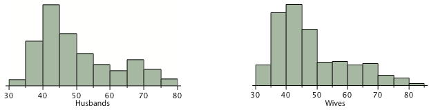
Table 2. Means and standard deviations of spousal ages.
| Mean | Standard Deviation | |
|---|---|---|
| Husbands | 49 | 11 |
| Wives | 47 | 11 |
Each distribution is fairly skewed with a long right tail. From Table 1 we see that not all husbands are older than their wives and it is important to see that this fact is lost when we separate the variables. That is, even though we provide summary statistics on each variable, the pairing within couple is lost by separating the variables. We cannot say, for example, based on the means alone what percentage of couples has younger husbands than wives. We have to count across pairs to find this out. Only by maintaining the pairing can meaningful answers be found about couples per se. Another example of information not available from the separate descriptions of husbands and wives' ages is the mean age of husbands with wives of a certain age. For instance, what is the average age of husbands with 45-year-old wives? Finally, we do not know the relationship between the husband's age and the wife's age.
We can learn much more by displaying the bivariate data in a graphical form that maintains the pairing. Figure 2 shows a scatter plot of the paired ages. The x-axis represents the age of the husband and the y-axis the age of the wife.
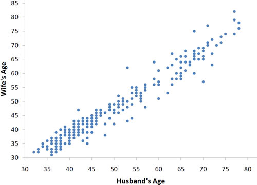
There are two important characteristics of the data revealed by Figure 2. First, it is clear that there is a strong relationship between the husband's age and the wife's age: the older the husband, the older the wife. When one variable (Y) increases with the second variable (X), we say that X and Y have a positive association. Conversely, when Y decreases as X increases, we say that they have a negative association.
Second, the points cluster along a straight line. When this occurs, the relationship is called a linear relationship.
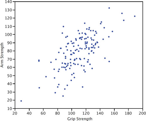
Figure 3 shows a scatter plot of Arm Strength and
Grip Strength from 149 individuals working in physically demanding
jobs including electricians, construction and maintenance workers,
and auto mechanics. Not surprisingly, the stronger someone's
grip, the stronger their arm tends to be. There is therefore
a positive association between these variables. Although the
points cluster along a line, they are not clustered quite as
closely as they are for the scatter plot of spousal age.
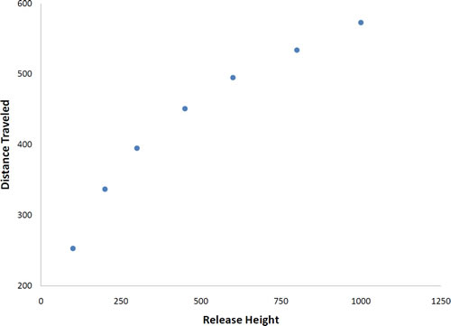
Not all scatter plots show linear relationships. Figure 4 shows the results of an experiment conducted by Galileo on projectile motion. In the experiment, Galileo rolled balls down an incline and measured how far they traveled as a function of the release height. It is clear from Figure 4 that the relationship between "Release Height" and "Distance Traveled" is not described well by a straight line: If you drew a line connecting the lowest point and the highest point, all of the remaining points would be above the line. The data are better fit by a parabola.
D. Dickey and T. Arnold's description of the study including a movie
Scatter plots that show linear relationships between variables can differ in several ways including the slope of the line about which they cluster and how tightly the points cluster about the line. A statistical measure of the strength of the relationship between two quantitative variables that takes these factors into account is the subject of the section "Values of Pearson's Correlation."
Adapted from Online Statistics Education: A Multimedia Course of Study (onlinestatbook.com), Project Leader: David M. Lane, Rice University. Developed with NSF support. The original work is in the public domain; it is cited here at the authors' request. Changes were made: reformatted as an accessible XYZ web edition with native MathML. License: Public-Domain.