
4.6 Restriction of Range Demo
This section is an interactive demonstration. The live simulation runs on the original site: open the demonstration at onlinestatbook.com.
Learning Objectives
- State how range restriction affects the correlation between two variables
- State the effect of choosing the upper and lower extremes on the correlation
Instructions
This demonstration illustrates the effect of restricting the range of scores on the the correlaton between variables. When the demonstration begins, the dataset "Strength" is displayed. The X-axis contains scores on a measure of grip strength; the Y-axis contains scores on a measure of arm strength. Notice that there is a strong relationship. Also note that the two scatterplots are identical and both show that for the entire dataset of 147 subjects, the correlaton is 0.63.
The two vertical bars on the upper graph can be used to select a subset of scores to be plotted on the lower graph. If you click on the left-hand bar and drag it to the right, scores to the left of the bar will not be included on the lower graph. The correlaton shown for the lower graph shows only the correlation for the data in the subset.
Similarly, if you drag the right-hand bar to the left, scores to the right of the bar will be excluded.
If you click the "Data outside bars" button, the lower graph will, as you might expect, only include scores to the left of the left-hand bar and to the right of the right-hand bar.
Illustrated Instructions
Video Demo
The restriction of range simulation displays data from 1 of 4 datasets. You can change datasets by selecting one from the drop down menu at the top of the simulation. The top scatterplot displays all the data from the selected dataset.
Notice the two vertical bars on either side of this graph. You can "drag" these bars and restrict the range of data from the dataset that is displayed in the bottom scatterplot. You can include data on the inside or outside of the bars by selecting one of the options right above the graph.
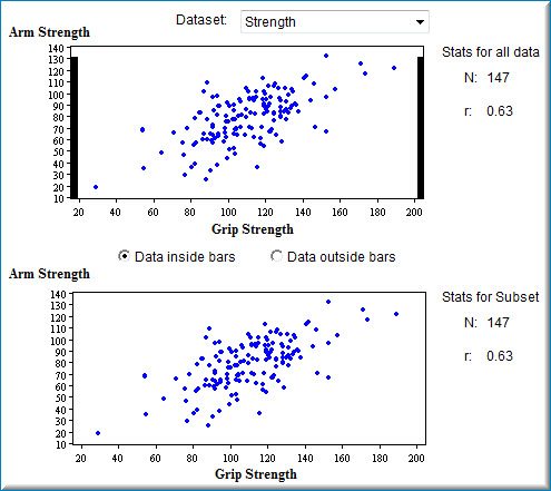
The video below shows how to restrict the range by dragging both vertical bars inward and then changes which data should be included in the bottom scatterplot. Notice how the statistics change for the second scatterplot based on which data is included.
Video Demo
Drag the black vertical bars on either side of the graph at the top to change the portion of data shown in the bottom graph.
Watch the video demonstration (onlinestatbook.com)
Adapted from Online Statistics Education: A Multimedia Course of Study (onlinestatbook.com), Project Leader: David M. Lane, Rice University. Developed with NSF support. The original work is in the public domain; it is cited here at the authors' request. Changes were made: reformatted as an accessible XYZ web edition with native MathML. License: Public-Domain.