
3.3 Measures of Placement
3.3.1 Z-Scores
A z-score is the number of standard deviations an observation x is above or below the mean. Z-scores are used to compare placement of a value compared to the mean.
If the z-score is negative, x is less than the mean. If the z-score is positive, x is greater than the mean.
There are no shortcuts on the calculator in Excel for z-score, but you can find s and then simply subtract and divide.
The number of standard deviations that a data value is from the mean is frequently used when comparing position of values. If a z-score is zero, then the data value is the same as the mean. If the z-score is one, then the data value x is one standard deviation above the mean. If the z-score is –3.5, then the data value is three and a half standard deviations below the mean. The shaded area in Figure 3-20 represents one standard deviation from the mean.
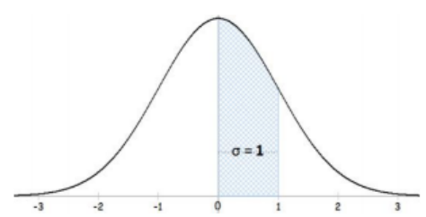
Figure 3-20
3.3.2 Percentiles
Along with the center and variability, another useful numerical measure is the ranking of a number. A percentile is a measure of ranking. It represents a location measurement of a data value to the rest of the values. Many standardized tests give the results as a percentile. Doctors use percentiles graphs to show height and weight standards.
Interpreting Percentiles
The p th percentile is the value that separates the bottom p% from the upper (100 – p)% of the ordered (smallest to largest) data. For example, the 75th percentile is the value that separates the bottom 75% from the upper 25% of the data. There are several methods used to find percentiles. You may get different percentile values depending on which software or calculator you use. For example, Excel has two methods, both of which are not the same method as the TI calculators.
Percentile versus Score
If the test was out of 100 points and you scored at the 80th percentile, what was your score on the test? You do not know! All you know is that you scored the same as or better than 80% of the people who took the test. If all the scores were low, you could have still failed the test. On the other hand, if many of the scores were high you could have gotten a 95% or so.
Note there is more than one method to find percentiles. This rounding rule in Excel is not the same as used on your TI calculators.
Finding a Percentile:
Step 1: Arrange the data in order from lowest to highest.
Step 2: Substitute into the formula i= where n = sample size and p = percentile.
Step 3A: If i is a whole number, count out i places from the lowest number to find the percentile. For example, if you get i = 3, then the 3rd value is the percentile.
Step 3B: If i is not a whole number, then take the weighted average between the ith and ith +1 data value as the percentile. For example, if i = 3.25, this would be 25% of the distance between the 3rd and the 4th data values as the percentile. Percentile = ith data value + (ith + 1 data value – ith data value)*(0.##) where ## is the remainder percent.
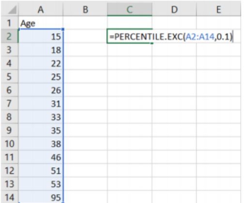
In Excel use =PERCENTILE.EXC(array, k) where array is the cell reference to where the data is located and k is the percentile as a decimal between 0 and 1. Note you do not have to sort the data prior to typing it in to Excel.
For this example, if you type in the data into column A, then use the formula =PERCENTILE.EXC(A1:A13, 0.1) = 16.2.
3.3.3 Quartiles
There are special percentiles called quartiles. Quartiles are numbers that divide the data into fourths. One fourth (or a quarter) of the data falls between consecutive quartiles. There are three quartiles Q1, Q2, and Q3 that subsequently divide the ordered data into the 4 pieces of approximately equal size, or 25% each. Thus, 25% of the values are less than Q1, 25% of the data values are between Q1 and Q2, 25% of the data values are between Q2 and Q3, and 25% are of the data values are greater than Q3.
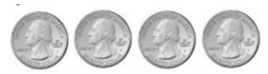
Use the dollar as an example. If we make change for a dollar, we would get four quarters to make one dollar. Hence, quarter for quartiles.
To find the quartiles use the same rules as percentiles where we:
1. Arrange the observations from smallest to largest and use the previous percentile rule.
2. Then find all three quartiles.
- Q1 = first quartile = 25th percentile
- Q2 = second quartile = median = 50th percentile
- Q3 = third quartile = 75th percentile
Other Types of Percentiles
Quintiles break a data set up into five equal pieces. We will not be using these, but be aware that percentiles come in different forms.
Deciles break a data set up into ten equal pieces and are found using the percentile rule. For example, the 6th decile = D6 = 60th percentile.
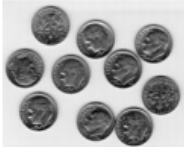
Use the dollar as an example. If we make change for a dollar, we would get ten dimes to make one dollar. Hence, a dime might help you remember deciles.
3.3.4 Five Number Summary & Outliers
If you record the quartiles together with the minimum and maximum values from a data set, you have five numbers. These five numbers are known as the five-number summary consisting of the minimum, the first quartile (Q1), the median (Q2), the third quartile (Q3), and the maximum (in that order).
The interquartile range, IQR, is the difference between the first and third quartiles, Q1 and Q3. Half of the data (50%) falls in the interquartile range. If the IQR is “large,” the data is spread out and if the IQR is “small,” the data is closer together.
Not only does the IQR give a range of the middle 50% of the data, but is also used to determine outliers in a sample.
To find these outliers we first find what are called a lower and upper limit sometimes called fences.
If all the numbers in the sample fall between the lower and upper limit, including the endpoints, then there are no outliers in the sample. Any values outside these limits would be considered outliers.
3.3.5 Modified Box-and-Whisker Plot
A boxplot (or box-and-whisker plot) is a graphical display of the five-number summary. A boxplot can be drawn vertically or horizontally. The modified boxplot shows outliers, whereas a regular boxplot does not show outliers. The basic format of the plot is a box drawn from Q1 to Q3, a vertical line drawn inside the box for the median, and horizontal lines (called whiskers) extending out of the middle of each end of the box to the minimum and maximum. The box should not touch the number line. The modified boxplot extends the left line to the smallest value greater than the lower fence, and extends the right line to the largest value less than the upper fence. Dots, circles or asterisks represent any outlier. We will make modified boxplots for this course. Like always, label the tick marks on the number line and give the graph a title.
A boxplot is a graph of the 5-number summary, see Figure 3-23.
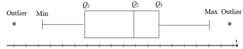
Figure 3-23
It is important to note that when you are making the boxplot the limits for finding outliers are not graphed in the plot, they were only used to find the outliers. The whiskers would go to the next largest (or smallest) value in the data set after you removed the outlier(s).
If the sample has a symmetrical distribution, then the boxplot will be visibly symmetrical. If the data distribution has a left skew or a right skew, the line on that side of the boxplot will be visibly long in the direction of skewness. If the four quartiles are all about the same distance apart, then the data are likely a near uniform distribution. If a boxplot is symmetrical, and both outside lines are noticeably longer than the Q1 to median and median to Q3 distance, the distribution is then probably bell-shaped.
The TI-calculator and newer versions of Excel will make a modified boxplot. Note that the quartile rules used in the TI calculators are slightly different then in Excel and what is presented in this content. They do not use a weighted mean between values, just half way between values.
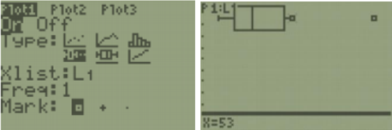
TI-84: First, enter your data in to list 1. Next, press 2nd > STAT PLOT, then choose the first plot. Note that your calculator may say Plot1…Off or show a different type of graph then the screenshot. Using your arrow keys, turn the plot on. Choose the modified boxplot which is the first of the two boxplot options with the small dots to the right of the whiskers representing outliers. Make sure your Xlist: is on L1, keep frequency as a one, and any mark will work, but the square shows up best.
Here is screen shot from the calculator for the last example. You can use Trace on the boxplot from the TI-84 calculator below to see where each quartile, whisker and outlier are.
TI-89: Enter the data into the Stat/List editor under list 1. Press [APP] then scroll down to Stat/List Editor; on the older style TI-89 calculators, go into the Flash/App menu, and then scroll down the list. Make sure the cursor is in the list, not on the list name, and type the desired values pressing [ENTER] after each one. To clear a previously stored list of data values, arrow up to the list name you want to clear, press [CLEAR], and then press enter. After you enter the data, select Press [F2] Plots, scroll down to [1: Plot Setup] and press [Enter]. Then select [F1] Define.

Use your arrow keys to select Mod Box Plot for Type, and then scroll down to the x-variable box. Press [2nd] [Var-Link] this key is above the + sign. Then arrow down until you find your List1 name under the Main file folder.
Then press [Enter] and this will bring the name List1 back to the menu. You will now see that Plot1 has a small picture of a boxplot. To view the boxplot, press [F5] Zoom Data.

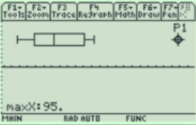
Select [F3:Trace] to see the five-number summary and any outliers. Use the left and right arrow keys to move to the other values.
Excel: Note this example is on a PC running Excel 2019. Older versions of Excel may not have a boxplot option. First, type your sample data into column A in any order. Highlight the data, and then select the Insert tab. Under the graphing options, the picture shaped liked a histogram called statistical charts, select Box and Whisker.
You can change the formatting options and add the chart title as needed.
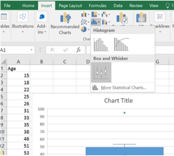
Below is the finished Excel boxplot. Note that Excel does a vertical boxplot rather than the traditional horizontal number line.
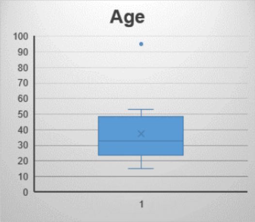
Excel marks an × just above the median where the mean would fall. Usually one would not include the mean on a boxplot. Remember that when the mean is greater than the median the distribution is usually skewed to the right.
When a boxplot has outliers only on one side, then we can also say the distribution is skewed in the direction of the outlier, which also indicates that these ages are skewed to the right.
Side by side boxplots are great at comparing quartiles and distribution shapes for several samples using the same units and scale.
3.3.6 Empirical Rule
Before looking at the process for computing probabilities, it is somewhat useful to look at the Empirical Rule which gives the approximate proportion of data points under a bell-shaped curve between two points. The Empirical Rule is just an approximation, more precise methods for finding these proportions will be demonstrated in later sections.
The Empirical Rule should only be used with bell-shaped data.

Note that we are using notation for the population mean μ and the population standard deviation σ, but the rule would also work using the sample mean and sample standard deviation.
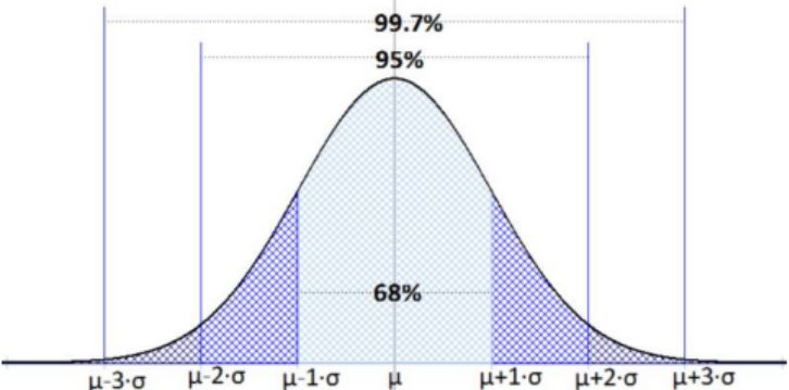
Figure 3-26
If you were to get a z-score that is not –3, –2, –1, 1, 2 or 3 then you would not be able to apply the Empirical Rule. We also need to ensure that our population has a bell-shaped curve before using the Empirical Rule.
3.3.7 Chebyshev’s Theorem
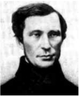
One way of estimating the proportion of values from any data set within a certain number of standard deviations is Chebyshev’s Theorem. Pafnuty Chebyshev (Чебышёва) was a Russian mathematician who proved several important theorems. One that we will use for this chapter is called Chebyshev’s Inequality. The Empirical Rule only works for bell-shaped distributions. However, we can use Chebyshev’s Inequality for any distribution shape.
If the distribution of quiz scores were bell shaped we would have a larger percent (95%) between 8.9 and 21.5. Chebyshev’s Inequality assumes the distribution is skewed and says “at least” which would then also be correct if more students fell within the range.
Since Chebyshev’s Inequality works for any shape of a distribution we should only use if between two values, not strictly below or above a point. If we were interested in below a certain point, we would not know if we had the fat or skinny tail of a skewed distribution. The following picture shows a positively skewed distribution with 1.5 standard deviations from the mean shaded in red. Chebyshev’s Inequality would guarantee at least
= 56% of the data in the shaded area would fall within 1.5 standard deviations from the mean.
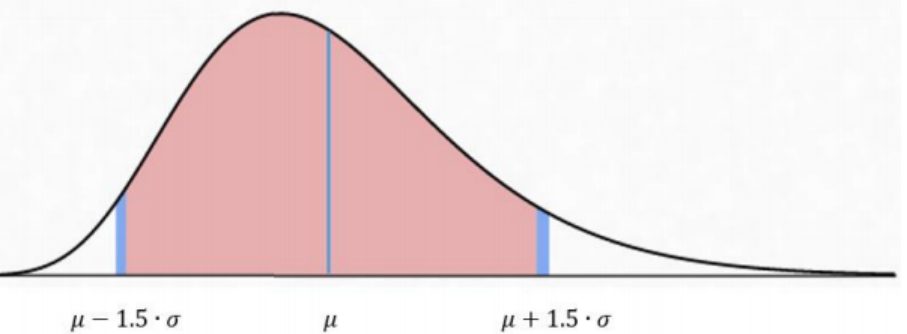
Figure 3-30
Summary:
Use the mode for nominal, ordinal, interval, and ratio data, since the mode is just the data value that occurs most often. You are just counting the data values. The median can be found on ordinal, interval, and ratio data, since you need to put the data in order. As long as there is order to the data you can find the median. The mean can be found on interval and ratio data, since you must have numbers to add together. The mean is pulled in the direction of outliers. By comparing the mean to the median, you can decide if a distribution is symmetric or skewed. The range, variance, standard deviation and coefficient of variation are used to measure how spread out a data set is from the middle. When comparing two data sets with different units or scale use the coefficient of variation. Z-scores tell you how many standard deviations a data point is away from the mean. Quartiles are special percentiles that are used to find the interquartile range, identify outliers, and make a box-and-whisker plot. Use the Empirical Rule when finding the proportion of a sample or population that fall within 1, 2 or 3 standard deviations on a bell-shaped curve. If the distribution is bell shaped then the Empirical Rule states that approximately 68% of the data will fall within one standard deviation, 95% within two standard deviations and 99.7% within three standard deviations. If you do not know the distribution shape, then use Chebyshev’s Inequality to find the minimum proportion within |z| > 1 standard deviations from the mean.
Adapted from Mostly Harmless Statistics by Rachel Webb (Portland State University, https://mostlyharmlessstat.wixsite.com/webpage), © Rachel Webb, licensed under CC BY-SA 4.0. Changes were made. License: CC-BY-SA-4.0.