
5.7 Scatter Plots
A data set with a pair of quantitative variables can be displayed with a scatter plot.
Example: Age in years and the corresponding height in centimeters is given below. Draw a scatter plot.
| age(yrs) | Height(cm) |
|---|---|
| 5 | 95 |
| 6 | 100 |
| 7 | 105 |
| 8 | 107 |
| 9 | 110 |
| 10 | 115 |
- Click
+ Code - Type
import matplotlib.pyplot as plt - Type
x = [5,6,7,8,9,10] - Type
y = [95,100,105,107,110,115] - Type
plt.scatter(x,y) - Type
plt.suptitle('Scatter Plot Age vs Height') - Type
plt.xlabel('Age(yrs)') - Type
plt.ylabel('Height(cm)') - Click
playbutton
import matplotlib.pyplot as plt

x = [5,6,7,8,9,10]
y = [95,100,105,107,110,115]

plt.scatter(x,y)

plt.suptitle('Scatter Plot Age vs Height')
plt.xlabel('Age(yrs)')
plt.ylabel('Height(cm)')
Show expected output
Text(0, 0.5, 'Height(cm)')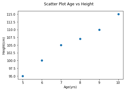
Adapted from Python for Introductory Statistics, by Simon Aman (Truman College, City Colleges of Chicago), licensed under CC BY 4.0. Changes were made: reformatted as an accessible XYZ web edition with live in-browser code cells. License: CC-BY-4.0.