
5.4 Histogram, Polygon and Ogive
A histogram uses connected bars to represent the frequency distribution of a continuous dataset.
Syntax for n bins(classes)
import matplotlib.pyplot as plt
plt.hist(x,bins=n,ec='k')
Example: The dataset below is scores of 20 students in a Math class. Write a program to construct a histogram with 5 classes(bins).
33, 42, 49, 49, 53, 55, 55, 61, 63, 67, 68, 68, 69, 69, 72, 73, 74,78, 80, 83, 88, 88, 88, 90, 92, 94, 94, 94, 94, 96, 100
- Click
+ Code - Type
import matplotlib.pyplot as plt - Type
x = [33, 42, 49, 49, 53, 55, 55, 61, 63, 67, 68, 68, 69, 69, 72, 73, 74,78, 80, 83, 88, 88, 88, 90, 92, 94, 94, 94, 94, 96, 100] - Type
plt.hist(x,bins=5,ec='k') - Click
playbutton
Note: ec='k' adds solid black lines to the bars.
import matplotlib.pyplot as plt
x = [33, 42, 49, 49, 53, 55, 55, 61, 63, 67, 68, 68, 69, 69, 72, 73, 74,78, 80,
     83, 88, 88, 88, 90, 92, 94, 94, 94, 94, 96, 100]
plt.hist(x,bins=5,ec='k')
Show expected output
(array([ 2.,  5.,  9.,  4., 11.]),
 array([ 33. ,  46.4,  59.8,  73.2,  86.6, 100. ]),
 <a list of 5 Patch objects>)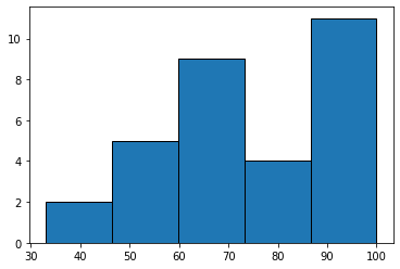
Example: The dataset below is scores of 20 students in a Math class. Write a program to construct a histogram with 5 classes(bins). Use class limits for the x-axis.
33, 42, 49, 49, 53, 55, 55, 61, 63, 67, 68, 68, 69, 69, 72, 73, 74,78, 80, 83, 88, 88, 88, 90, 92, 94, 94, 94, 94, 96, 100
- Click
+ Code - Type
import matplotlib.pyplot as plt - Type
x = [33, 42, 49, 49, 53, 55, 55, 61, 63, 67, 68, 68, 69, 69, 72, 73, 74,78, 80, 83, 88, 88, 88, 90, 92, 94, 94, 94, 94, 96, 100] - Type
(freq, class_limit, patches) = plt.hist(x,bins=5) - Type
plt.xticks(class_limit) - Click
playbutton
import matplotlib.pyplot as plt
x = [33, 42, 49, 49, 53, 55, 55, 61, 63, 67, 68, 68, 69, 69, 72, 73, 74,
           78, 80, 83, 88, 88, 88, 90, 92, 94, 94, 94, 94, 96, 100]

(freq,class_limit,patches) = plt.hist(x,bins=5,ec='k')
plt.xticks(class_limit)
Show expected output
([<matplotlib.axis.XTick at 0x7fcbbda5b910>,
  <matplotlib.axis.XTick at 0x7fcbbda5b490>,
  <matplotlib.axis.XTick at 0x7fcbbda5b950>,
  <matplotlib.axis.XTick at 0x7fcbbda3bad0>,
  <matplotlib.axis.XTick at 0x7fcbbda3bc50>,
  <matplotlib.axis.XTick at 0x7fcbbda45590>],
 <a list of 6 Text major ticklabel objects>)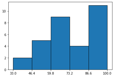
Example: Histograms from raw data
Use the US Senators age data given below and write a program to:
- Make a histogram with 5 bins (classes) and age range of 40 to 90
- Display the frequencies and bins(classes)
- Add titles and labels
81,81,80,80,80,80,78,78,78,77,77,75,75,74,74,74,73,72,72,71,71,71,71,70,70,70,70,68,68,68,68,68,67,67,67,66,66,65,65,65,65,64,64,64,64,64,64,63,63,63,63,62,62,62,62,62,61,61,61,60,60,59,59,59,59,59,59,59,59,58,58,57,57,56,56,55,54,54,54,54,54,53,53,52,52,52,52,52,51,50,49,48,46,45,44,43,43,43,42,41
import matplotlib.pyplot as plt

age = [81,81,80,80,80,80,78,78,78,77,77,75,75,74,74,74,73,72,72,71,71,71,71,70,70,
        70,70,68,68,68,68,68,67,67,67,66,66,65,65,65,65,64,64,64,64,64,64,63,63,
        63,63,62,62,62,62,62,61,61,61,60,60,59,59,59,59,59,59,59,59,58,58,57,57,
        56,56,55,54,54,54,54,54,53,53,52,52,52,52,52,51,50,49,48,46,45,44,43,43,
        43,42,41]

(freq, bins, patches) = plt.hist(age,bins=5,edgecolor='white', range=[40,90])

plt.suptitle("Histogram")
plt.xlabel("Age")
plt.ylabel("Freq")

print("bins", bins)
print("freq",freq)
Show expected output
bins [40. 50. 60. 70. 80. 90.]
freq [10. 29. 34. 21.  6.]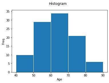
Interpretation from the above output for bins and frequencies:
| bins | frequency |
|---|---|
| 40-50 | 10 |
| 50-60 | 29 |
| 60-70 | 34 |
| 70-80 | 21 |
| 80-90 | 6 |
key: 40-50 is [40,50)
Frequency Polygon
A frequency polygon is a line graph connecting midpoints of each class/bin.
Example: Use the above example (Senators age) to construct a frequency polygon.
We will use the function below to construct a polygon. The arguments (input) to the function are the data values, x, and number of classes(bins), n.
Python Functions
A function is a block of code which only runs when it is called. You can pass data, known as arguments, into a function. A function can return data as a result. In Python a function is defined using the def keyword.
Syntax
def func_name(data):
    statement(s)
    return result  # optional
When the function func_name(x) is called it will return result.
To graph a frequency polygon, use the function polygon(x,n) given below. x is the dataset list and n is the number of classes/bins.
def polygon(x,n):
  import matplotlib.pyplot as plt
  import numpy as np

  freq, bins, edges = plt.hist(x,bins=n,ec="k",range=[min(x),max(x)+1])
  plt.title("Frequency Polygon")
  plt.xlabel('Midpoint data values')
  plt.ylabel('Frequency')

  a1=bins[0]-(bins[1]-bins[0])
  a2=bins[-1]+(bins[1]-bins[0])
  bin1=np.insert(bins,[0],a1)
  bin1=np.append(bin1,a2)

  freq,edges,_=plt.hist(x,bins=bin1,ec='k', facecolor='blue', range=[min(x),max(x)+1])
  midpoints=0.5*(edges[1:]+edges[:-1])
  plt.plot(midpoints,freq)
#  plt.xticks(bin1)
  plt.xticks(midpoints)
  plt.show()
Example: Use the the polygon(x,n) function above to plot a frequency polygon of the US Senators age data given below with 5 bins(classes).
81,81,80,80,80,80,78,78,78,77,77,75,75,74,74,74,73,72,72,71,71,71,71,70,70,70,70,68,68,68,68,68,67,67,67,66,66,65,65,65,65,64,64,64,64,64,64,63,63,63,63,62,62,62,62,62,61,61,61,60,60,59,59,59,59,59,59,59,59,58,58,57,57,56,56,55,54,54,54,54,54,53,53,52,52,52,52,52,51,50,49,48,46,45,44,43,43,43,42,41
- Click
playbutton on the above codedef polygon(x,n) - Type
x = [81,81,80,80,80,80,78,78,78,77,77,75,75,74,74,74,73,72,72,71,71,71,71,70,70,70,70,68,68,68,68,68,67,67,67,66,66,65,65,65,65,64,64,64,64,64,64,63,63,63,63,62,62,62,62,62,61,61,61,60,60,59,59,59,59,59,59,59,59,58,58,57,57,56,56,55,54,54,54,54,54,53,53,52,52,52,52,52,51,50,49,48,46,45,44,43,43,43,42,41] - Type
polygon(x,5) - Click on
playbutton
x = [81,81,80,80,80,80,78,78,78,77,77,75,75,74,74,74,73,72,72,71,71,71,71,70,70,
        70,70,68,68,68,68,68,67,67,67,66,66,65,65,65,65,64,64,64,64,64,64,63,63,
        63,63,62,62,62,62,62,61,61,61,60,60,59,59,59,59,59,59,59,59,58,58,57,57,
        56,56,55,54,54,54,54,54,53,53,52,52,52,52,52,51,50,49,48,46,45,44,43,43,
        43,42,41]
polygon(x,5)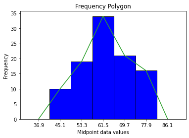
Ogive
Ogive is a line graph that displays cumulative frequency of each (upper) class. To graph an ogive, use the function ogive(x,n) given below. x is the dataset list and n is the number of classes/bins.
def ogive(x,n):
  import matplotlib.pyplot as plt
  import numpy as np

  freq, bins, edges = plt.hist(x,bins=n,ec="k",range=[min(x),max(x)+1])
  plt.title("Ogive")
  plt.xlabel('data values')
  plt.ylabel('Cumulative frequency')

  a1=bins[0]-(bins[1]-bins[0])
  a2=bins[-1]+(bins[1]-bins[0])
  bin1=np.insert(bins,[0],a1)
  bin1=np.append(bin1,a2)

  freq,edges,_=plt.hist(x,bins=bin1,ec='k', facecolor='blue', range=[min(x),max(x)+1])

  ogive1 = edges[:-1]
  cumfreq = np.cumsum(freq)
  plt.plot(ogive1,cumfreq)
  plt.xticks(bin1)
  plt.show()
Example: Use the ogive(x,n) function above to plot an ogive of the US Senators age data given below with 5 bins(classes).
81,81,80,80,80,80,78,78,78,77,77,75,75,74,74,74,73,72,72,71,71,71,71,70,70,70,70,68,68,68,68,68,67,67,67,66,66,65,65,65,65,64,64,64,64,64,64,63,63,63,63,62,62,62,62,62,61,61,61,60,60,59,59,59,59,59,59,59,59,58,58,57,57,56,56,55,54,54,54,54,54,53,53,52,52,52,52,52,51,50,49,48,46,45,44,43,43,43,42,41
- Click
playbutton on the above codedef ogive(x,n) - Type
x = [81,81,80,80,80,80,78,78,78,77,77,75,75,74,74,74,73,72,72,71,71,71,71,70,70,70,70,68,68,68,68,68,67,67,67,66,66,65,65,65,65,64,64,64,64,64,64,63,63,63,63,62,62,62,62,62,61,61,61,60,60,59,59,59,59,59,59,59,59,58,58,57,57,56,56,55,54,54,54,54,54,53,53,52,52,52,52,52,51,50,49,48,46,45,44,43,43,43,42,41] - Type
ogive(x,5) - Click on
playbutton
x = [81,81,80,80,80,80,78,78,78,77,77,75,75,74,74,74,73,72,72,71,71,71,71,70,70,
        70,70,68,68,68,68,68,67,67,67,66,66,65,65,65,65,64,64,64,64,64,64,63,63,
        63,63,62,62,62,62,62,61,61,61,60,60,59,59,59,59,59,59,59,59,58,58,57,57,
        56,56,55,54,54,54,54,54,53,53,52,52,52,52,52,51,50,49,48,46,45,44,43,43,
        43,42,41]
ogive(x,5)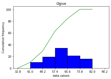
Adapted from Python for Introductory Statistics, by Simon Aman (Truman College, City Colleges of Chicago), licensed under CC BY 4.0. Changes were made: reformatted as an accessible XYZ web edition with live in-browser code cells. License: CC-BY-4.0.