
5.3 Bar Graphs and Pie Charts
Given frequency tables with two columns: categories/values and frequencies:
Syntax for bar graph
import matplotlib.pyplot as plt
value = [x1,x2,...]
freq = [y1,y2,...]
plt.bar(value,freq)
Syntax for pie chart
import matplotlib.pyplot as plt
value = [x1,x2,...]
freq = [y1,y2,...]
plt.pie(freq, labels=value,autopct='%1.1f%%' )
Example: 20 students were asked if they were registered to vote. Their responses are given below. Plot a bar graph.
| vote | freq |
|---|---|
| Yes | 11 |
| No | 9 |
- Click
+ Code - Type
import matplotlib.pyplot as plt - Type
v = ['Yes','No'] - Type
f = [11,9] - Type
plt.bar(v,f) - Click
playbutton - Right click image to save it to your device
import matplotlib.pyplot as plt
v = ['yes','no']
f = [11,9]
plt.bar(v,f)
Show expected output
<BarContainer object of 2 artists>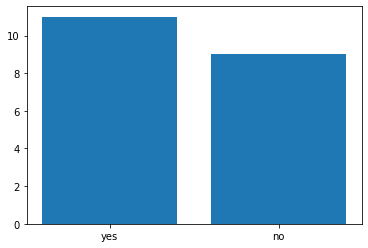
Example: 20 students were asked if they were registered to vote. Their responses are given below. Plot a pie chart (percent).
| vote | freq |
|---|---|
| Yes | 11 |
| No | 9 |
- Click
+ Code - Type
import matplotlib.pyplot as plt - Type
v = ['Yes','No'] - Type
f = [11,9] - Type
plt.bar(f,labels=f,autopct='%1.1f%%') - Click
playbutton - Right click on the image to save it to your device
Note: autopct='%1.1f%%' changes the frequency to percent rounded to one decimal place, and adds the percent sign %.
import matplotlib.pyplot as plt
v = ['yes','no']
f = [11,9]
plt.pie(f,labels=v,autopct='%1.1f%%')
Show expected output
([<matplotlib.patches.Wedge at 0x7fcbc206d1d0>,
  <matplotlib.patches.Wedge at 0x7fcbc202f3d0>],
 [Text(-0.17207795223283848, 1.086457168210212, 'yes'),
  Text(0.17207795223283862, -1.086457168210212, 'no')],
 [Text(-0.09386070121791189, 0.5926130008419338, '55.0%'),
  Text(0.09386070121791196, -0.5926130008419338, '45.0%')])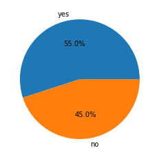
Example: 20 students were asked if they were registered to vote. Their responses are given below. Plot a bar graph.
| vote | freq |
|---|---|
| Yes | 11 |
| No | 9 |
Add title, vertical and horizontal labels.
- Click
+ Code - Type
import matplotlib.pyplot as plt - Type
v = ['Yes','No'] - Type
f = [11,9] - Type
plt.bar(v,f) - Type
plt.suptitle("Voter Registation") - Type
plt.xlabel("Registration") - Type
plt.ylabel("Frequency") - Click
playbutton
import matplotlib.pyplot as plt
v = ['yes','no']
f = [11,9]
plt.bar(v,f)
plt.suptitle("Voter Registration")
plt.xlabel("Registration")
plt.ylabel("Frequency")
Show expected output
Text(0, 0.5, 'Frequency')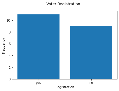
Example: The frequency distribution below is the waiting time, in minutes, of 20 customers at a fast food restaurant.
| Waiting_time | Frequency |
|---|---|
| 1 | 2 |
| 2 | 3 |
| 3 | 4 |
| 4 | 5 |
| 5 | 5 |
| 6 | 1 |
Plot a bar graph and a pie chart.
Note: First the data values in the two columns are entered separately using Python lists: waiting_time and frequency.
- Click
+ Code - Type
import matplotlib.pyplot as plt - Type
waiting_time = [1,2,3,4,5,6] - Type
frequency = [2,3,4,5,5,1] - Type
plt.bar(waiting_time,frequency) - Type
plt.xlabel("Waiting Time") - Type
plt.ylabel("Frequency") - Click
playbutton
import matplotlib.pyplot as plt

waiting_time = [1,2,3,4,5,6]
frequency = [2,3,4,5,5,1]

plt.bar(waiting_time,frequency)

plt.xlabel("Waiting Time")
plt.ylabel("Frequency")
Show expected output
Text(0, 0.5, 'Frequency')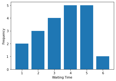
Example: The frequency distribution below is the waiting time, in minutes, of 20 customers at a fast food restaurant.
| Waiting_time | Frequency |
|---|---|
| 1 | 2 |
| 2 | 3 |
| 3 | 4 |
| 4 | 5 |
| 5 | 5 |
| 6 | 1 |
Graph a Pie Chart
import matplotlib.pyplot as plt

waiting_time = [1,2,3,4,5,6]
frequency = [2,3,4,5,5,1]
plt.pie(frequency, labels=waiting_time,autopct='%1.1f%%')
plt.xlabel("Waiting Time")
Show expected output
Text(0.5, 0, 'Waiting Time')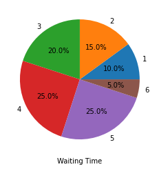
Adapted from Python for Introductory Statistics, by Simon Aman (Truman College, City Colleges of Chicago), licensed under CC BY 4.0. Changes were made: reformatted as an accessible XYZ web edition with live in-browser code cells. License: CC-BY-4.0.