
6.4 Assessing Normality
The distributions you have seen up to this point have been assumed to be normally distributed, but how do you determine if it is normally distributed. One way is to take a sample and look at the sample to determine if it appears normal. If the sample looks normal, then most likely the population is also. Here are some guidelines that are use to help make that determination.
- Histogram: Make a histogram. For a normal distribution, the histogram should be roughly bell-shaped. For small samples, this is not very accurate, and another method is needed. A distribution may not look normally distributed from the histogram, but it still may be normally distributed.
- Outliers: For a normal distribution, there should not be more than one outlier. One way to check for outliers is to use a modified box plot. Outliers are values that are shown as dots outside of the rest of the values. If you don’t have a modified box plot, outliers are those data values that are:
Above Q3, the third quartile, by an amount greater than 1.5 times the interquartile range (IQR)
Below Q1, the first quartile, by an amount greater than 1.5 times the interquartile range (IQR) - Normal quantile plot (or normal probability plot): This plot is provided through statistical software on a computer or graphing calculator. If the points lie close to a line, the data comes from a distribution that is approximately normal. If the points do not lie close to a line or they show a pattern that is not a line, the data are likely to come from a distribution that is not normally distributed.
To create a histogram on the TI-83/84:
- Go into the STAT menu, and then Chose 1: Edit
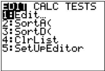
Figure : STAT Menu on TI-83/84 - Type your data values into L1.
- Now click STAT PLOT ().

Figure : STAT PLOT Menu on TI-83/84 - Use 1:Plot1. Press ENTER.
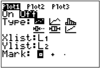
Figure : Plot1 Menu on TI-83/84 - You will see a new window. The first thing you want to do is turn the plot on. At this point you should be on On, just press ENTER. It will make On dark.
- Now arrow down to Type: and arrow right to the graph that looks like a histogram (3rd one from the left in the top row).
- Now arrow down to Xlist. Make sure this says L1. If it doesn’t, then put L1 there (2nd number 1). Freq: should be a 1.
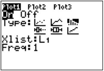
Figure : Plot1 Menu on TI-83/84 Setup for Histogram - Now you need to set up the correct window to graph on. Click on WINDOW. You need to set up the settings for the x variable. Xmin should be your smallest data value. Xmax should just be a value sufficiently above your highest data value, but not too high. Xscl is your class width that you calculated. Ymin should be 0 and Ymax should be above what you think the highest frequency is going to be. You can always change this if you need to. Yscl is just how often you would like to see a tick mark on the y-axis.
- Now press GRAPH. You will see a histogram.
To find the IQR and create a box plot on the TI-83/84:
- Go into the STAT menu, and then Choose 1:Edit
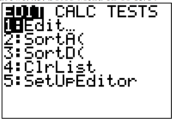
Figure : STAT Menu on TI-83/84 - Type your data values into L1. If L1 has data in it, arrow up to the name L1, click CLEAR and then press ENTER. The column will now be cleared and you can type the data in.
- Go into the STAT menu, move over to CALC and choose 1-Var Stats. Press ENTER, then type L1 (2nd 1) and then ENTER. This will give you the summary statistics. If you press the down arrow, you will see the five-number summary.
- To draw the box plot press 2nd STAT PLOT.
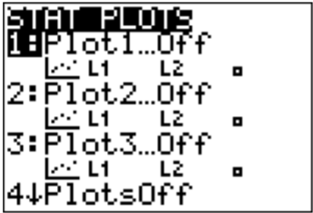
Figure : STAT PLOT Menu on TI-83/84 - Use Plot1. Press ENTER
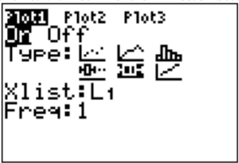
Figure : Plot1 Menu on TI-83/84 Setup for Box Plot - Put the cursor on On and press Enter to turn the plot on. Use the down arrow and the right arrow to highlight the boxplot in the middle of the second row of types then press ENTER. Set Data List to L1 (it might already say that) and leave Freq as 1.
- Now tell the calculator the set up for the units on the x-axis so you can see the whole plot. The calculator will do it automatically if you press ZOOM, which is in the middle of the top row.
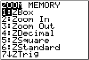
Figure : ZOOM Menu on TI-83/84
Then use the down arrow to get to 9:ZoomStat and press ENTER. The box plot will be drawn.
Figure : ZOOM Menu on TI-83/84 with ZoomStat
To create a normal quantile plot on the TI-83/84
- Go into the STAT menu, and then Chose 1:Edit
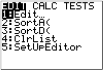
Figure : STAT Menu on TI-83/84 - Type your data values into L1. If L1 has data in it, arrow up to the name L1, click CLEAR and then press ENTER. The column will now be cleared and you can type the data in.
- Now click STAT PLOT (). You have three stat plots to choose from.
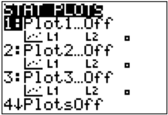
Figure : STAT PLOT Menu on TI-83/84 - Use 1:Plot1. Press ENTER.
- Put the cursor on the word On and press ENTER. This turns on the plot. Arrow down to Type: and use the right arrow to move over to the last graph (it looks like an increasing linear graph). Set Data List to L1 (it might already say that) and set Data Axis to Y. The Mark is up to you.
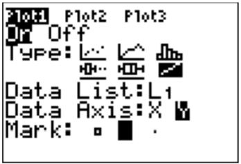
Figure : Plot1 Menu on TI-83/84 Setup for Normal Quantile Plot - Now you need to set up the correct window on which to graph. Click on WINDOW. You need to set up the settings for the x variable. Xmin should be -4. Xmax should be 4. Xscl should be 1. Ymin and Ymax are based on your data, the Ymin should be below your lowest data value and Ymax should be above your highest data value. Yscl is just how often you would like to see a tick mark on the y-axis.
- Now press GRAPH. You will see the normal quantile plot.
To create a histogram on R:
Put the variable in using variable<-c(type in the data with commas between values) using a name for the variable that makes sense for the problem. The command for histogram is hist(variable). You can then copy the histogram into a word processing program. There are options that you can put in for title, and axis labels. See section 2.2 for the commands for those.
To create a modified boxplot on R:
Put the variable in using variable<-c(type in the data with commas between values) using a name for the variable that makes sense for the problem. The command for box plot is boxplot(variable). You can then copy the box plot into a word processing program. There are options that you can put in for title, horizontal orientation, and axis labels. See section 3.3 for the commands for those.
To create a normal quantile plot on R:
Put the variable in using variable<-c(type in the data with commas between values) using a name for the variable that makes sense for the problem. The command for normal quantile plot is qqnorm(variable). You can then copy the normal quantile plot into a word processing program.
Realize that your random variable may be normally distributed, even if the sample fails the three tests. However, if the histogram definitely doesn't look symmetric and bell shaped, there are outliers that are very extreme, and the normal probability plot doesn’t look linear, then you can be fairly confident that the data set does not come from a population that is normally distributed.
Homework
Adapted from Statistics with Technology, 2nd Edition, by Kathryn Kozak (Coconino Community College), © Kathryn Kozak, licensed under CC BY-SA 4.0. Changes were made. License: CC-BY-SA-4.0.