Along with the center and the variability, another useful numerical measure is the ranking of a number. A percentile is a measure of ranking. It represents a location measurement of a data value to the rest of the values. Many standardized tests give the results as a percentile. Doctors also use percentiles to track a child’s growth.
The kth percentile is the data value that has k% of the data at or below that value.
There are special percentiles called quartiles. Quartiles are numbers that divide the data into fourths. One fourth (or a quarter) of the data falls between consecutive quartiles.
If you record the quartiles together with the maximum and minimum you have five numbers. This is known as the five-number summary. The five-number summary consists of the minimum, the first quartile (Q1), the median, the third quartile (Q3), and the maximum (in that order).
The interquartile range, IQR, is the difference between the first and third quartiles, Q1 and Q3. Half of the data (50%) falls in the interquartile range. If the IQR is “large” the data is spread out and if the IQR is “small” the data is closer together.
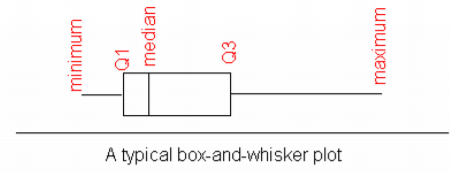
A box plot (or box-and-whisker plot) is a graphical display of the five-number summary. It can be drawn vertically or horizontally. The basic format is a box from Q1 to Q3, a vertical line across the box for the median and horizontal lines as whiskers extending out each end to the minimum and maximum. The minimum and maximum can be represented with dots. Don’t forget to label the tick marks on the number line and give the graph a title.
An alternate form of a Box-and-Whiskers Plot, known as a modified box plot, only extends the left line to the smallest value greater than the low fence, and extends the left line to the largest value less than the high fence, and displays markers (dots, circles or asterisks) for each outlier.
If the data are symmetrical, then the box plot will be visibly symmetrical. If the data distribution has a left skew or a right skew, the line on that side of the box plot will be visibly long. If the plot is symmetrical, and the four quartiles are all about the same length, then the data are likely a near uniform distribution. If a box plot is symmetrical, and both outside lines are noticeably longer than the Q1 to median and median to Q3 distance, the distribution is then probably bell-shaped.
Figure : Typical Box Plot
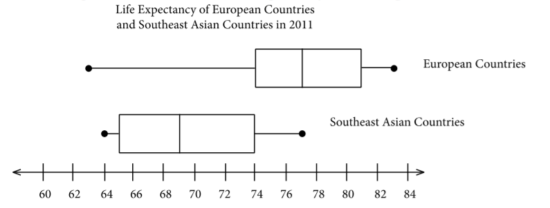
You can draw 2 box plots side by side (or one above the other) to compare 2 samples. Since you want to compare the two data sets, make sure the box plots are on the same axes. As an example, suppose you look at the box-and-whiskers plot for life expectancy for European countries and Southeast Asian countries.
Figure : Box Plot of Life Expectancy of Two Regions
Looking at the box-and-whiskers plot, you will notice that the three quartiles for life expectancy are all higher for the European countries, yet the minimum life expectancy for the European countries is less than that for the Southeast Asian countries. The life expectancy for the European countries appears to be skewed left, while the life expectancies for the Southeast Asian countries appear to be more symmetric. There are of course more qualities that can be compared between the two graphs.
To find the five-number summary using R, the command is:
variable<-c(type in data with commas)
summary(variable)
This command will give you the five number summary and the mean.
To draw the box plot the command is boxplot(variable, main="title you want", xlab="label you want", horizontal = TRUE). The horizontal = TRUE orients the box plot to be horizontal. If you leave that part off, the box plot will be vertical by default.
For Example , the command is
boxplot(expectancy, main="Life Expectancy of Southeast Asian Countries in 2011",horizontal=TRUE, xlab="Life Expectancy")
boxplot(expectancy, main="Life Expectancy of Southeast Asian Countries in 2011", horizontal=TRUE, xlab="Life Expectancy")
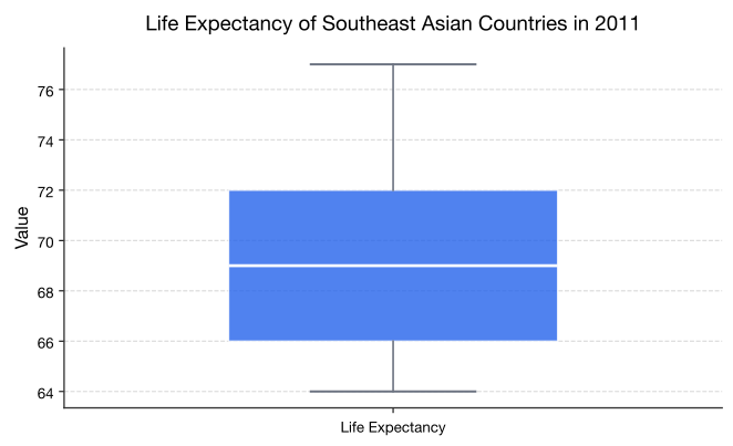
You should get the box plot in Graph 3.3.4.
Figure : Box plot for Life Expectance in Southeast Asian Countries
This is known as a modified box plot. Instead of plotting the maximum and minimum, the box plot has as a lower line Q1-1.5*IQR, and as an upper line, Q3+1.5*IQR. Any values below the lower line or above the upper line are considered outliers. Outliers are plotted as dots on the modified box plot. This data set does not have any outliers.
Olson, K., & Hanson, J. (1997). Using reiki to manage pain: a preliminary report. Cancer Prev Control, 1(2), 108-13. Retrieved from http://www.ncbi.nlm.nih.gov/pubmed/9765732
These eBooks are a prerelease and are not yet certified conformant with WCAG 2.1 AA or ADA Title II. Every page is built against an automated accessibility gate, and the published editions will meet ADA Title II requirements when they release in late September 2026. If something is unusable, please tell us.