
2.3 Other Graphical Representations of Data
There are many other types of graphs. Some of the more common ones are the frequency polygon, the dot plot, the stem plot, scatter plot, and a time-series plot. There are also many different graphs that have emerged lately for qualitative data. Many are found in publications and websites. The following is a description of the stem plot, the scatter plot, and the time-series plot.
Stem Plots
Stem plots are a quick and easy way to look at small samples of numerical data. You can look for any patterns or any strange data values. It is easy to compare two samples using stem plots.
The first step is to divide each number into 2 parts, the stem (such as the leftmost digit) and the leaf (such as the rightmost digit). There are no set rules, you just have to look at the data and see what makes sense.
You can create a stem and leaf plot on R. the command is:
stem(variable) – creates a stem and leaf plot, if you do not get a stem plot that shows all of the stems then use scale = a number. Adjust the number until you see all of the stems. So you would have stem(variable, scale = a number)
For Example , the command would be
grades<-c(62, 87, 81, 69, 87, 62, 45, 95, 76, 76, 62, 71, 65, 67, 72, 80, 40, 77, 87, 58, 84, 73, 93, 64, 89)
stem(grades, scale = 2)
grades <- c(62, 87, 81, 69, 87, 62, 45, 95, 76, 76, 62, 71, 65, 67, 72, 80, 40, 77, 87, 58, 84, 73, 93, 64, 89)stem(grades, scale = 2)Output:
The decimal point is 1 digit(s) to the right of the |
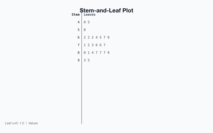
Now just put a title on the stem plot.
Scatter Plot
Sometimes you have two different variables and you want to see if they are related in any way. A scatter plot helps you to see what the relationship would look like. A scatter plot is just a plotting of the ordered pairs.
Time-Series
A time-series plot is a graph showing the data measurements in chronological order, the data being quantitative data. For example, a time-series plot is used to show profits over the last 5 years. To create a time-series plot, the time always goes on the horizontal axis, and the other variable goes on the vertical axis. Then plot the ordered pairs and connect the dots. The purpose of a time-series graph is to look for trends over time. Caution, you must realize that the trend may not continue. Just because you see an increase, doesn’t mean the increase will continue forever. As an example, prior to 2007, many people noticed that housing prices were increasing. The belief at the time was that housing prices would continue to increase. However, the housing bubble burst in 2007, and many houses lost value, and haven’t recovered.
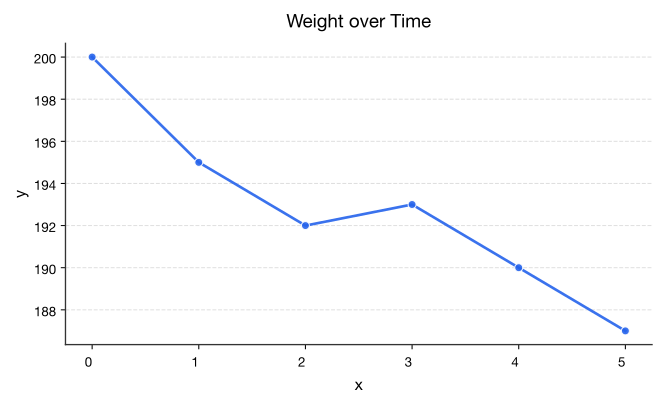
Be careful when making a graph. If you don’t start the vertical axis at 0, then the change can look much more dramatic than it really is. As an example, Graph 2.3.8 shows the Graph 2.3.7 with a different scaling on the vertical axis. Notice the decrease in weight looks much larger than it really is.
Homework
Exercise
- Students in a statistics class took their first test. The data in Example are the scores they earned. Create a stem plot.
Table : Data of Test 1 Grades 80 79 89 74 73 67 79 93 70 70 76 88 83 73 81 79 80 85 79 80 79 58 93 94 74 - Students in a statistics class took their first test. The data in Example are the scores they earned. Create a stem plot. Compare to the graph in question 1.
Table : Data of Test 1 Grades 67 67 76 47 85 70 87 76 80 72 84 98 84 64 65 82 81 81 88 74 87 83 - When an anthropologist finds skeletal remains, they need to figure out the height of the person. The height of a person (in cm) and the length of one of their metacarpal bone (in cm) were collected and are in Example ("Prediction of height," 2013). Create a scatter plot and state if there is a relationship between the height of a person and the length of their metacarpal.
Table : Data of Metacarpal versus Height Length of Metacarpal Height of Person 45 171 51 178 39 157 41 163 48 172 49 183 46 173 43 175 47 173 - Table 7 contains the value of the house and the amount of rental income in a year that the house brings in ("Capital and rental," 2013). Create a scatter plot and state if there is a relationship between the value of the house and the annual rental income.
Table : Data of House Value versus Rental Value Rental Value Rental Value Rental Value Rental 81000 6656 77000 4576 75000 7280 67500 6864 95000 7904 94000 8736 90000 6240 85000 7072 121000 12064 115000 7904 110000 7072 104000 7904 135000 8320 130000 9776 126000 6240 125000 7904 145000 8320 140000 9568 140000 9152 135000 7488 165000 13312 165000 8528 155000 7488 148000 8320 178000 11856 174000 10400 170000 9568 170000 12688 200000 12272 200000 10608 194000 11232 190000 8320 214000 8528 280000 10400 200000 10400 200000 8320 240000 10192 240000 12064 240000 11648 225000 12480 289000 11648 270000 12896 262000 10192 244500 11232 325000 12480 310000 12480 303000 12272 300000 12480 - The World Bank collects information on the life expectancy of a person in each country ("Life expectancy at," 2013) and the fertility rate per woman in the country ("Fertility rate," 2013). The data for 24 randomly selected countries for the year 2011 are in Table 8. Create a scatter plot of the data and state if there appears to be a relationship between life expectancy and the number of births per woman.
Table : Data of Life Expectancy versus Fertility Rate Life Expectancy Fertility Rate Life Expectancy Fertility rate 77.2 1.7 72.3 3.9 55.4 5.8 76.0 1.5 69.9 2.2 66.0 4.2 76.4 2.1 5.9 5.2 75.0 1.8 54.4 6.8 78.2 2.0 62.9 4.7 73.0 2.6 78.3 2.1 70.8 2.8 72.1 2.9 82.6 1.4 80.7 1.4 68.9 2.6 74.2 2.5 81.0 1.5 73.3 1.5 54.2 6.9 67.1 2.4 - The World Bank collected data on the percentage of gross domestic product (GDP) that a country spends on health expenditures ("Health expenditure," 2013) and the percentage of woman receiving prenatal care ("Pregnant woman receiving," 2013). The data for the countries where this information is available for the year 2011 is in Table 9. Create a scatter plot of the data and state if there appears to be a relationship between percentage spent on health expenditure and the percentage of woman receiving prenatal care.
Table : Data of Prenatal Care versus Health Expenditure Prenatal Care (%) Health Expenditure (% of GDP) 47.9 9.6 54.6 3.7 93.7 5.2 84.7 5.2 100.0 10.0 42.5 4.7 96.4 4.8 77.1 6.0 58.3 5.4 95.4 4.8 78.0 4.1 93.3 6.0 93.3 9.5 93.7 6.8 89.8 6.1 - The Australian Institute of Criminology gathered data on the number of deaths (per 100,000 people) due to firearms during the period 1983 to 1997 ("Deaths from firearms," 2013). The data is in Table 10. Create a time-series plot of the data and state any findings you can from the graph.
Table : Data of Year versus Number of Deaths due to Firearms Year 1983 1984 1985 1986 1987 1988 1989 1990 Rate 4.31 4.42 4.52 4.35 4.39 4.21 3.40 3.61 Year 1991 1992 1993 1994 1995 1996 1997 Rate 3.67 3.61 2.98 2.95 2.72 2.95 2.3 - The economic crisis of 2008 affected many countries, though some more than others. Some people in Australia have claimed that Australia wasn’t hurt that badly from the crisis. The bank assets (in billions of Australia dollars (AUD)) of the Reserve Bank of Australia (RBA) for the time period of March 2007 through March 2013 are contained in Table 11 ("B1 assets of," 2013). Create a time-series plot and interpret any findings.
Table : Data of Date versus RBA Assets Date Assets in Billions of AUD Mar-2006 96.9 Jun-2006 107.4 Sep-2006 107.2 Dec-2006 116.2 Mar-2007 123.7 Jun-2007 134.0 Sep-2007 123.0 Dec-2007 93.2 Mar-2008 93.7 Jun-2008 105.6 Sep-2008 101.5 Dec-2008 158.8 Mar-2009 118.7 Jun-2009 111.9 Sep-2009 87.0 Dec-2009 86.1 Mar-2010 83.4 Jun-2010 85.7 Sep-2010 74.8 Dec-2010 76.0 Mar-2011 75.7 Jun-2011 75.9 Sep-2011 75.2 Dec-2011 87.9 Mar-2012 91.0 Jun-2012 90.1 Sep-2012 83.9 Dec-2012 95.8 Mar-2013 90.5 - The consumer price index (CPI) is a measure used by the U.S. government to describe the cost of living. Table 12 gives the cost of living for the U.S. from the years 1947 through 2011, with the year 1977 being used as the year that all others are compared (DeNavas-Walt, Proctor & Smith, 2012). Create a time-series plot and interpret.
Table : Data of Time versus CPI Year CPI-U-RS1 index (December 1977=100) Year CPI-U-RS1 index (December 1977=100) 1947 37.5 1980 127.1 1948 40.5 1981 139.2 1949 40.0 1982 147.6 1950 40.5 1983 153.9 1951 43.7 1984 160.2 1952 44.5 1985 165.7 1953 44.8 1986 168.7 1954 45.2 1987 174.4 1955 45.0 1988 180.8 1956 45.7 1989 188.6 1957 47.2 1990 198.0 1958 48.5 1991 205.1 1959 48.9 1992 210.3 1960 49.7 1993 215.5 1961 50.2 1994 220.1 1962 50.7 1995 225.4 1963 51.4 1996 231.4 1964 52.1 1997 236.4 1965 52.9 1998 239.7 1966 54.4 1999 244.7 1967 56.1 2000 252.9 1968 58.3 2001 260.0 1969 60.9 2002 264.2 1970 63.9 2003 270.1 1971 66.7 2004 277.4 1972 68.7 2005 286.7 1973 73.0 2006 296.1 1974 80.3 2007 304.5 1975 86.9 2008 316.2 1976 91.9 2009 315.0 1977 97.7 2010 320.2 1978 104.4 2011 330.3 1979 114.4 - The median incomes for all households in the U.S. for the years 1967 to 2011 are given in Table 13 (DeNavas-Walt, Proctor & Smith, 2012). Create a time-series plot and interpret.
Table : Data of Time versus Median Income Year Median Income Year Median Income 1967 42,056 1990 49,950 1968 43,868 1991 48,516 1969 45,499 1992 48,117 1970 45,146 1993 47,884 1971 44,707 1994 48,418 1972 46,622 1995 49,935 1973 47,563 1996 50,661 1974 46,057 1997 51,704 1975 44,851 1998 53,582 1976 45,595 1999 54,932 1977 45,884 2000 54,841 1978 47,659 2001 53,646 1979 47,527 2002 53,019 1980 46,024 2003 52,973 1981 45,260 2004 52,788 1982 45,139 2005 53,371 1983 44,823 2006 53,768 1984 46,215 2007 54,489 1985 47,079 2008 52,546 1986 48,746 2009 52,195 1987 49,358 2010 50,831 1988 49,737 2011 50,054 1989 50,624 - State everything that makes Graph 2.3.9 a misleading or poor graph.
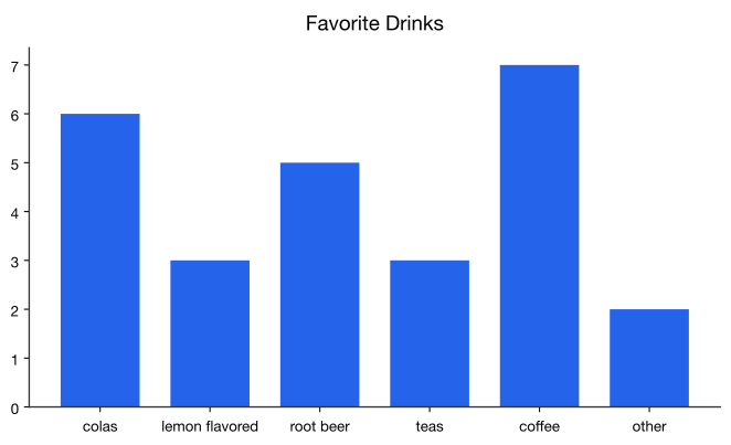
Graph 2.3.9: Example of a Poor Graph - State everything that makes Graph 2.3.10 a misleading or poor graph (Benen, 2011).
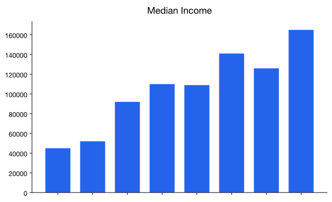
Graph 2.3.10: Example of a Poor Graph - State everything that makes Graph 2.3.11 a misleading or poor graph ("United States unemployment," 2013).
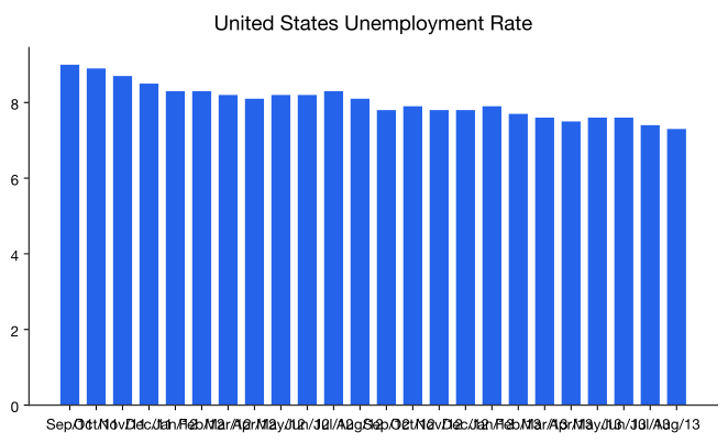
Graph 2.3.11: Example of a Poor Graph - State everything that makes Graph 2.3.12 a misleading or poor graph.
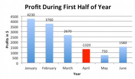
Graph 2.3.12: Example of a Poor Graph
Answer
See solutions
Data Sources:
B1 assets of financial institutions. (2013, June 27). Retrieved from www.rba.gov.au/statistics/tables/xls/b01hist.xls
Benen, S. (2011, September 02). [Web log message]. Retrieved from http://www.washingtonmonthly.com/pol...edit031960.php
Capital and rental values of Auckland properties. (2013, September 26). Retrieved from http://www.statsci.org/data/oz/rentcap.html
Contraceptive use. (2013, October 9). Retrieved from http://www.prb.org/DataFinder/Topic/...gs.aspx?ind=35
Deaths from firearms. (2013, September 26). Retrieved from http://www.statsci.org/data/oz/firearms.html
DeNavas-Walt, C., Proctor, B., & Smith, J. U.S. Department of Commerce, U.S. Census Bureau. (2012). Income, poverty, and health insurance coverage in the United States: 2011 (P60-243). Retrieved from website: www.census.gov/prod/2012pubs/p60-243.pdf
Density of people in Africa. (2013, October 9). Retrieved from http://www.prb.org/DataFinder/Topic/...249,250,251,25 2,253,254,34227,255,257,258,259,260,261,262,263,264,265,266,267,268,269,270,271,27 2,274,275,276,277,278,279,280,281,282,283,284,285,286,287,288,289,290,291,292,294, 295,296,297,298,299,300,301,302,304,305,306,307,308
Department of Health and Human Services, ASPE. (2013). Health insurance marketplace premiums for 2014. Retrieved from website: aspe.hhs.gov/health/reports/2...b_premiumsland scape.pdf
Electricity usage. (2013, October 9). Retrieved from http://www.prb.org/DataFinder/Topic/...s.aspx?ind=162
Fertility rate. (2013, October 14). Retrieved from http://data.worldbank.org/indicator/SP.DYN.TFRT.IN
Fuel oil usage. (2013, October 9). Retrieved from http://www.prb.org/DataFinder/Topic/...s.aspx?ind=164
Gas usage. (2013, October 9). Retrieved from http://www.prb.org/DataFinder/Topic/...s.aspx?ind=165
Health expenditure. (2013, October 14). Retrieved from http://data.worldbank.org/indicator/SH.XPD.TOTL.ZS Hinatov, M. U.S. Consumer Product Safety Commission, Directorate of Epidemiology. (2012). Incidents, deaths, and in-depth investigations associated with non-fire carbon monoxide from engine-driven generators and other engine-driven tools, 1999-2011. Retrieved from website: www.cpsc.gov/PageFiles/129857/cogenerators.pdf
Life expectancy at birth. (2013, October 14). Retrieved from http://data.worldbank.org/indicator/SP.DYN.LE00.IN
Median income of males. (2013, October 9). Retrieved from http://www.prb.org/DataFinder/Topic/...s.aspx?ind=137
Median income of males. (2013, October 9). Retrieved from http://www.prb.org/DataFinder/Topic/...s.aspx?ind=136
Prediction of height from metacarpal bone length. (2013, September 26). Retrieved from http://www.statsci.org/data/general/stature.html
Pregnant woman receiving prenatal care. (2013, October 14). Retrieved from http://data.worldbank.org/indicator/SH.STA.ANVC.ZS
United States unemployment. (2013, October 14). Retrieved from http://www.tradingeconomics.com/unit...mployment-rate
Weissmann, J. (2013, March 20). A truly devastating graph on state higher education spending. The Atlantic. Retrieved from http://www.theatlantic.com/business/...ending/274199/
Adapted from Statistics with Technology, 2nd Edition, by Kathryn Kozak (Coconino Community College), © Kathryn Kozak, licensed under CC BY-SA 4.0. Changes were made. License: CC-BY-SA-4.0.