The graph for quantitative data looks similar to a bar graph, except there are some major differences. First, in a bar graph the categories can be put in any order on the horizontal axis. There is no set order for these data values. You can’t say how the data is distributed based on the shape, since the shape can change just by putting the categories in different orders. With quantitative data, the data are in specific orders, since you are dealing with numbers. With quantitative data, you can talk about a distribution, since the shape only changes a little bit depending on how many categories you set up. This is called a frequency distribution.
This leads to the second difference from bar graphs. In a bar graph, the categories that you made in the frequency table were determined by you. In quantitative data, the categories are numerical categories, and the numbers are determined by how many categories (or what are called classes) you choose. If two people have the same number of categories, then they will have the same frequency distribution. Whereas in qualitative data, there can be many different categories depending on the point of view of the author.
The third difference is that the categories touch with quantitative data, and there will be no gaps in the graph. The reason that bar graphs have gaps is to show that the categories do not continue on, like they do in quantitative data. Since the graph for quantitative data is different from qualitative data, it is given a new name. The name of the graph is a histogram. To create a histogram, you must first create the frequency distribution. The idea of a frequency distribution is to take the interval that the data spans and divide it up into equal subintervals called classes.
Frequencies are helpful, but understanding the relative size each class is to the total is also useful. To find this you can divide the frequency by the total to create a relative frequency. If you have the relative frequencies for all of the classes, then you have a relative frequency distribution.
This gives you percentages of data that fall in each class.
The graph of the relative frequency is known as a relative frequency histogram. It looks identical to the frequency histogram, but the vertical axis is relative frequency instead of just frequencies.
Another useful piece of information is how many data points fall below a particular class boundary. As an example, a teacher may want to know how many students received below an 80%, a doctor may want to know how many adults have cholesterol below 160, or a manager may want to know how many stores gross less than $2000 per day. This is known as a cumulative frequency. If you want to know what percent of the data falls below a certain class boundary, then this would be a cumulative relative frequency. For cumulative frequencies you are finding how many data values fall below the upper class limit.
To create a cumulative frequency distribution, count the number of data points that are below the upper class boundary, starting with the first class and working up to the top class. The last upper class boundary should have all of the data points below it. Also include the number of data points below the lowest class boundary, which is zero.
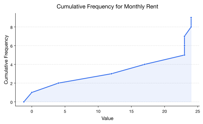
Again, it is hard to look at the data the way it is. A graph would be useful. The graph for cumulative frequency is called an ogive (o-jive). To create an ogive, first create a scale on both the horizontal and vertical axes that will fit the data. Then plot the points of the class upper class boundary versus the cumulative frequency. Make sure you include the point with the lowest class boundary and the 0 cumulative frequency. Then just connect the dots.
The usefulness of a ogive is to allow the reader to find out how many students pay less than a certain value, and also what amount of monthly rent is paid by a certain number of students. As an example, suppose you want to know how many students pay less than $1500 a month in rent, then you can go up from the $1500 until you hit the graph and then you go over to the cumulative frequency axes to see what value corresponds to this value. It appears that around 20 students pay less than $1500. (See Graph 2.2.4.)
Figure : Ogive for Monthly Rent with Example
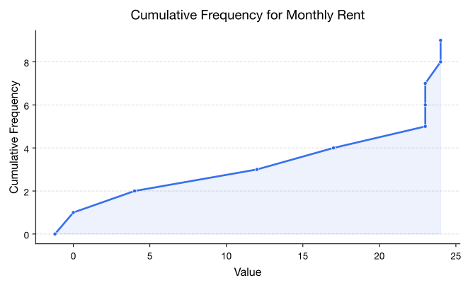
Also, if you want to know the amount that 15 students pay less than, then you start at 15 on the vertical axis and then go over to the graph and down to the horizontal axis where the line intersects the graph. You can see that 15 students pay less than about $1200 a month. (See Graph 2.2.5.)
Figure : Ogive for Monthly Rent with Example
If you graph the cumulative relative frequency then you can find out what percentage is below a certain number instead of just the number of people below a certain value.
Shapes of the distribution:
When you look at a distribution, look at the basic shape. There are some basic shapes that are seen in histograms. Realize though that some distributions have no shape. The common shapes are symmetric, skewed, and uniform. Another interest is how many peaks a graph may have. This is known as modal.
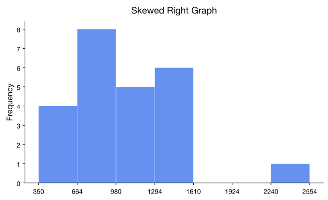
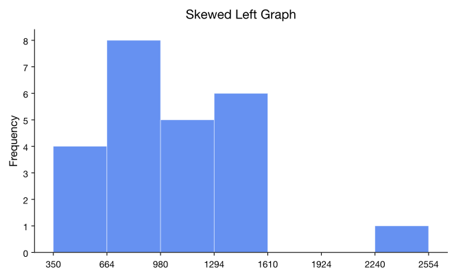
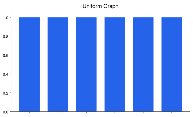
Symmetric means that you can fold the graph in half down the middle and the two sides will line up. You can think of the two sides as being mirror images of each other. Skewed means one “tail” of the graph is longer than the other. The graph is skewed in the direction of the longer tail (backwards from what you would expect). A uniform graph has all the bars the same height.
Modal refers to the number of peaks. Unimodal has one peak and bimodal has two peaks. Usually if a graph has more than two peaks, the modal information is not longer of interest.
Other important features to consider are gaps between bars, a repetitive pattern, how spread out is the data, and where the center of the graph is.
Examples of Graphs:
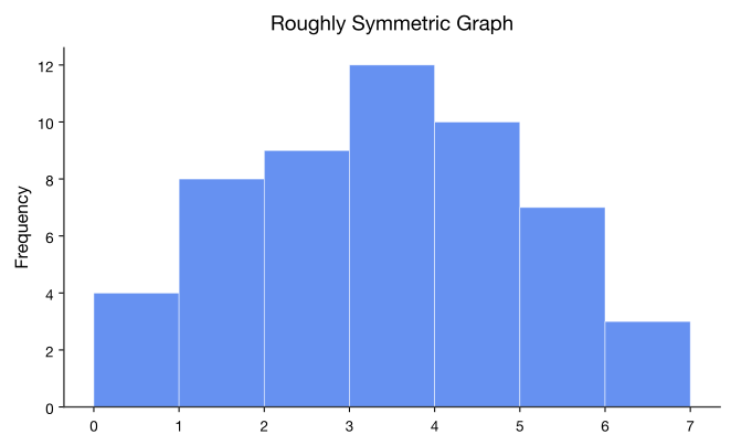
This graph is roughly symmetric and unimodal:
Figure
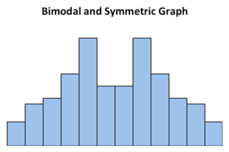
This graph is symmetric and bimodal:
Figure
This graph is skewed to the right:
Figure
This graph is skewed to the left and has a gap:
Figure
This graph is uniform since all the bars are the same height:
Figure
There are occasions where the class limits in the frequency distribution are predetermined. Example demonstrates this situation.
There are other types of graphs for quantitative data. They will be explored in the next section.
Homework
Exercise
The median incomes of males in each state of the United States, including the District of Columbia and Puerto Rico, are given in Table 9 ("Median income of," 2013). Create a frequency distribution, relative frequency distribution, and cumulative frequency distribution using 7 classes.
Table : Data of Median Income for Males
$42,951
$52,379
$42,544
$37,488
$49,281
$50,987
$60,705
$50,411
$66,760
$40,951
$43,902
$45,494
$41,528
$50,746
$45,183
$43,624
$43,993
$41,612
$46,313
$43,944
$56,708
$60,264
$50,053
$50,580
$40,202
$43,146
$41,635
$42,182
$41,803
$53,033
$60,568
$41,037
$50,388
$41,950
$44,660
$46,176
$41,420
$45,976
$47,956
$22,529
$48,842
$41,464
$40,285
$41,309
$43,160
$47,573
$44,057
$52,805
$53,046
$42,125
$46,214
$51,630
The median incomes of females in each state of the United States, including the District of Columbia and Puerto Rico, are given in Table 10 ("Median income of," 2013). Create a frequency distribution, relative frequency distribution, and cumulative frequency distribution using 7 classes.
Table : Data of Median Income for Females
$31,862
$40,550
$36,048
$30,752
$41,817
$40,236
$47,476
$40,500
$60,332
$33,823
$35,438
$37,242
$31,238
$39,150
$34,023
$33,745
$33,269
$32,684
$31,844
$34,599
$48,748
$46,185
$36,931
$40,416
$29,548
$33,865
$31,067
$33,424
$35,484
$41,021
$47,155
$32,316
$42,113
$33,459
$32,462
$35,746
$31,274
$36,027
$37,089
$22,117
$41,412
$31,330
$31,329
$33,184
$35,301
$32,843
$38,177
$40,969
$40,993
$29,688
$35,890
$34,381
The density of people per square kilometer for African countries is in Example ("Density of people," 2013). Create a frequency distribution, relative frequency distribution, and cumulative frequency distribution using 8 classes.
Table : Data of Density of People per Square Kilometer
15
16
81
3
62
367
42
123
8
9
337
12
29
70
39
83
26
51
79
6
157
105
42
45
72
72
37
4
36
134
12
3
630
563
72
29
3
13
176
341
415
187
65
194
75
16
41
18
69
49
103
65
143
2
18
31
The Affordable Care Act created a market place for individuals to purchase health care plans. In 2014, the premiums for a 27 year old for the bronze level health insurance are given in Example ("Health insurance marketplace," 2013). Create a frequency distribution, relative frequency distribution, and cumulative frequency distribution using 5 classes.
Table : Data of Health Insurance Premiums
$114
$119
$121
$125
$132
$139
$139
$141
$143
$145
$151
$153
$156
$159
$162
$163
$165
$166
$170
$170
$176
$177
$181
$185
$185
$186
$186
$189
$190
$192
$196
$203
$204
$219
$254
$286
Create a histogram and relative frequency histogram for the data in Table 9. Describe the shape and any findings you can from the graph.
Create a histogram and relative frequency histogram for the data in Table 10. Describe the shape and any findings you can from the graph.
Create a histogram and relative frequency histogram for the data in Example . Describe the shape and any findings you can from the graph.
Create a histogram and relative frequency histogram for the data in Example . Describe the shape and any findings you can from the graph.
Create an ogive for the data in Table 9. Describe any findings you can from the graph.
Create an ogive for the data in Table 10. Describe any findings you can from the graph.
Create an ogive for the data in Example . Describe any findings you can from the graph.
Create an ogive for the data in Example . Describe any findings you can from the graph.
Students in a statistics class took their first test. The following are the scores they earned. Create a frequency distribution and histogram for the data using class limits that make sense for grade data. Describe the shape of the distribution.
Table : Data of Test 1 Grades
80
79
89
74
73
67
79
93
70
70
76
88
83
73
81
79
80
85
79
80
79
58
93
94
74
Students in a statistics class took their first test. The following are the scores they earned. Create a frequency distribution and histogram for the data using class limits that make sense for grade data. Describe the shape of the distribution. Compare to the graph in question 13.
These eBooks are a prerelease and are not yet certified conformant with WCAG 2.1 AA or ADA Title II. Every page is built against an automated accessibility gate, and the published editions will meet ADA Title II requirements when they release in late September 2026. If something is unusable, please tell us.