
2.1 Qualitative Data
Remember, qualitative data are words describing a characteristic of the individual. There are several different graphs that are used for qualitative data. These graphs include bar graphs, Pareto charts, and pie charts.
Pie charts and bar graphs are the most common ways of displaying qualitative data. A spreadsheet program like Excel can make both of them. The first step for either graph is to make a frequency or relative frequency table. A frequency table is a summary of the data with counts of how often a data value (or category) occurs.
Bar graphs or charts consist of the frequencies on one axis and the categories on the other axis. Then you draw rectangles for each category with a height (if frequency is on the vertical axis) or length (if frequency is on the horizontal axis) that is equal to the frequency. All of the rectangles should be the same width, and there should be equally width gaps between each bar.
Another type of graph for qualitative data is a pie chart. A pie chart is where you have a circle and you divide pieces of the circle into pie shapes that are proportional to the size of the relative frequency. There are 360 degrees in a full circle. Relative frequency is just the percentage as a decimal. All you have to do to find the angle by multiplying the relative frequency by 360 degrees. Remember that 180 degrees is half a circle and 90 degrees is a quarter of a circle
Pie charts are useful for comparing sizes of categories. Bar charts show similar information. It really doesn’t matter which one you use. It really is a personal preference and also what information you are trying to address. However, pie charts are best when you only have a few categories and the data can be expressed as a percentage. The data doesn’t have to be percentages to draw the pie chart, but if a data value can fit into multiple categories, you cannot use a pie chart. As an example, if you are asking people about what their favorite national park is, and you say to pick the top three choices, then the total number of answers can add up to more than 100% of the people involved. So you cannot use a pie chart to display the favorite national park.
A third type of qualitative data graph is a Pareto chart, which is just a bar chart with the bars sorted with the highest frequencies on the left. Here is the Pareto chart for the data in Example .
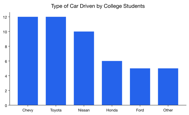
The advantage of Pareto charts is that you can visually see the more popular answer to the least popular. This is especially useful in business applications, where you want to know what services your customers like the most, what processes result in more injuries, which issues employees find more important, and other type of questions like these.
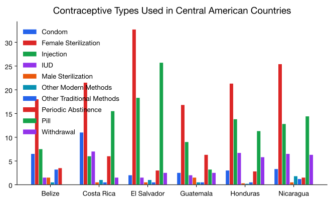
There are many other types of graphs that can be used on qualitative data. There are spreadsheet software packages that will create most of them, and it is better to look at them to see what can be done. It depends on your data as to which may be useful. The next example illustrates one of these types known as a multiple bar graph.
The usefulness of a multiple bar graph is the ability to compare several different categories over another variable, in Example the variable would be time. This allows a person to interpret the data with a little more ease.
Homework
Exercise
- Eyeglassomatic manufactures eyeglasses for different retailers. The number of lenses for different activities is in Example .
Table : Data for Eyeglassomatic
Grind means that they ground the lenses and put them in frames, multicoat means that they put tinting or scratch resistance coatings on lenses and then put them in frames, assemble means that they receive frames and lenses from other sources and put them together, make frames means that they make the frames and put lenses in from other sources, receive finished means that they received glasses from other source, and unknown means they do not know where the lenses came from. Make a bar chart and a pie chart of this data. State any findings you can see from the graphs.Activity Grind Multicoat Assemble Make frames Receive finished Unknown Number of lenses 18872 12105 4333 25880 26991 1508 - To analyze how Arizona workers ages 16 or older travel to work the percentage of workers using carpool, private vehicle (alone), and public transportation was collected. Create a bar chart and pie chart of the data in Example . State any findings you can see from the graphs.
Table : Data of Travel Mode for Arizona Workers Transportation type Percentage Carpool 11.6% Private Vehicle (Alone) 75.8% Public Transportation 2.0% Other 10.6% - The number of deaths in the US due to carbon monoxide (CO) poisoning from generators from the years 1999 to 2011 are in table #2.1.6 (Hinatov, 2012). Create a bar chart and pie chart of this data. State any findings you see from the graphs.
Table : Data of Number of Deaths Due to CO Poisoning Region Number of Deaths from CO While Using a Generator Urban Core 401 Sub-Urban 97 Large Rural 86 Small Rural/Isolated 111 - In Connecticut households use gas, fuel oil, or electricity as a heating source. Table 7 shows the percentage of households that use one of these as their principle heating sources ("Electricity usage," 2013), ("Fuel oil usage," 2013), ("Gas usage," 2013). Create a bar chart and pie chart of this data. State any findings you see from the graphs.
Table : Data of Household Heating Sources Heating Source Percentage Electricity 15.3% Fuel Oil 46.3% Gas 35.6% Other 2.85 - Eyeglassomatic manufactures eyeglasses for different retailers. They test to see how many defective lenses they made during the time period of January 1 to March 31. Table 8 gives the defect and the number of defects. Create a Pareto chart of the data and then describe what this tells you about what causes the most defects.
Table : Data of Defect Type Defect type Number of defects Scratch 5865 Right shaped - small 4613 Flaked 1992 Wrong axis 1838 Chamfer wrong 1596 Crazing, cracks 1546 Wrong shape 1485 Wrong PD 1398 Spots and bubbles 1371 Wrong height 1130 Right shape - big 1105 Lost in lab 976 Spots/bubble - intern 976 - People in Bangladesh were asked to state what type of birth control method they use. The percentages are given in Table 9 ("Contraceptive use," 2013). Create a Pareto chart of the data and then state any findings you can from the graph.
Table : Data of Birth Control Type Method Percentage Condom 4.50% Pill 28.50% Periodic Abstinence 4.90% Injection 7.00% Female Sterilization 5.00% IUD 0.90% Male Sterilization 0.70% Withdrawal 2.90% Other Modern Methods 0.70% Other Traditional Methods 0.60% - The percentages of people who use certain contraceptives in Central American countries are displayed in Graph 2.1.6 ("Contraceptive use," 2013). State any findings you can from the graph.
Answer
See solutions
Adapted from Statistics with Technology, 2nd Edition, by Kathryn Kozak (Coconino Community College), © Kathryn Kozak, licensed under CC BY-SA 4.0. Changes were made. License: CC-BY-SA-4.0.