
2.3 Graphical Displays
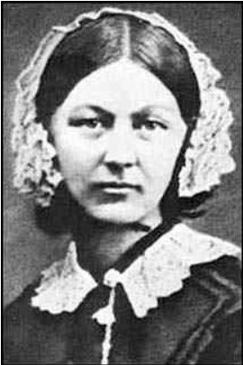
Statistical graphs are useful in getting the audience’s attention in a publication or presentation. Data presented graphically is easier to summarize at a glance compared to frequency distributions or numerical summaries. Graphs are useful to reinforce a critical point, summarize a data set, or discover patterns or trends over a period of time. Florence Nightingale (1820-1910) was one of the first people to use graphical representations to present data. Nightingale was a nurse in the Crimean War and used a type of graph that she called polar area diagram, or coxcombs to display mortality figures for contagious diseases such as cholera and typhus.
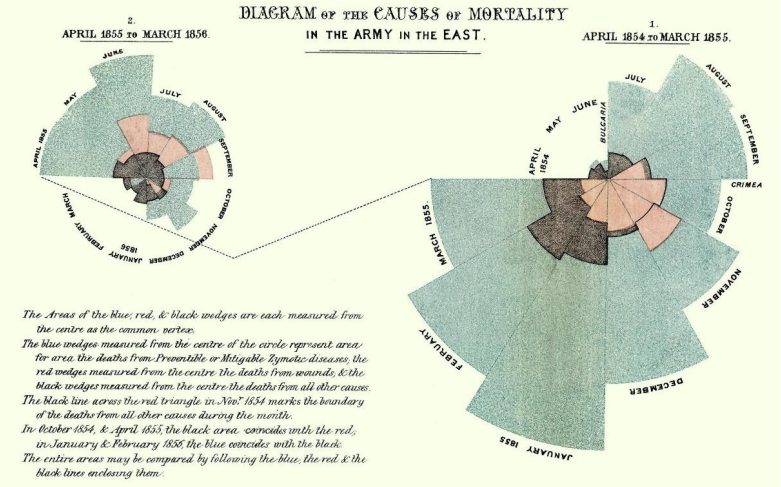
Nightingale-mortality.jpg. (2021, May 18). Wikimedia Commons, the free media repository. Retrieved July 2021 from https://commons.wikimedia.org/w/index.php?title=File:Nightingale-mortality.jpg&oldid=561529217.
It is hard to provide a complete overview of the most recent developments in data visualization with the onset of technology. The development of a variety of highly interactive software has accelerated the pace and variety of graphical displays across a wide range of disciplines.
2.3.1 Stem-and-Leaf Plot
Stem-and-leaf plots (or stemplots) are a useful way of getting a quick picture of the shape of a distribution by hand. Turn the graph sideways and you can see the shape of your data. You can now easily identify outliers. Each observation is divided into two pieces; the stem and the leaf. If the number is just two digits then the stem would be the tens digit and the leaf would be the ones digit. When a number is more than two digits then the cut point should split the data into enough classes that is useful to see the shape of the data.
To create a stem-and-leaf plot:
- Separate each observation into a stem and a leaf.
- Write the stems in a vertical column in ascending order (from smallest to largest). Fill in missing numbers even if there are gaps in the data. Draw a vertical line to the right of this column.
- Write each leaf in the row to the right of its stem, in increasing order.
2.3.2 Histogram
A histogram is a graph for quantitative data (we call these bar graphs for qualitative data). The data is divided into a number of classes. The class limits become the horizontal axis demarcated with a number line and the vertical axis is either the frequency or the relative frequency of each class. Figure 2-9 is an example of a histogram.
The histogram for quantitative data looks similar to a bar graph, except there are some major differences.
First, in a bar graph the categories can be put in any order on the horizontal axis. There is no set order for these nominal data. You cannot say how the data is distributed based on the shape, since the shape can change just by putting the categories in different orders. With quantitative data, the data are in a specific order, since you are dealing with numbers. With quantitative data, you can talk about a distribution shape.
This leads to the second difference from bar graphs. In a bar graph, the categories that you made in the frequency table were the words used for the category name. In quantitative data, the categories are numerical categories, and the numbers are determined by how many classes you choose. If two people have the same number of categories, then they will have the same frequency distribution. Whereas in qualitative data, there can be many different categories depending on the point of view of the author.
The third difference is that the bars touch with quantitative data, and there will be no gaps in the graph. The reason that bar graphs have gaps is to show that the categories do not continue on, as they do in quantitative data. Since the graph for quantitative data is different from qualitative data, it is given a different name of histogram.
Some key features of a histogram:
- Equal spacing on each axis
- Bars are the same width
- Label each axis and title the graph
- Show the scale on the frequency axis
- Label the categories on the category axis
- The bars should touch at the class boundaries
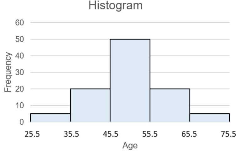
To create a histogram, you must first create a frequency distribution. Software and calculators can create histograms easily when a large amount of sample data is being analyzed.
Excel
To create a histogram in Excel you will need to first install the Data Analysis tool.
If your Data Analysis is not showing in the Data tab, follow the directions for installing the free add-in here: https://support.office.com/en-us/article/Load-the-Analysis-ToolPak-in-Excel-6a63e598-cd6d-42e3-9317- 6b40ba1a66b4.
Type in the data into one blank column in any order. If you want to have class widths other than Excel’s default setting, type in a new column the endpoints of each class found in your frequency distribution, these are called the bins in Excel.
TI-84: To make a histogram, enter the data by pressing [STAT]. The first option is already highlighted (1:Edit) so you can either press [ENTER] or [1]. Make sure the cursor is in the list, not on the list name and type the desired values pressing [ENTER] after each one.
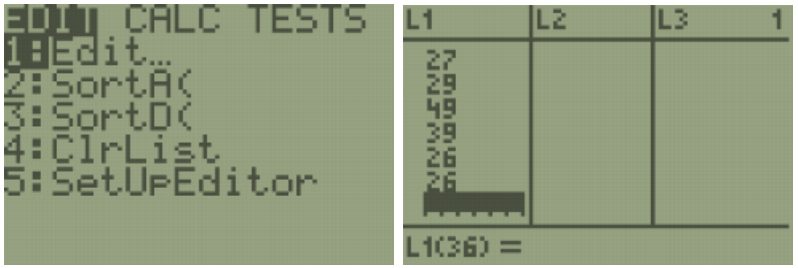
Press [2nd] [QUIT] to return to the home screen. To clear a previously stored list of data values, arrow up to the list name you want to clear, press [CLEAR], and then press enter. An alternative way is press [STAT], press 4 for 4:ClrList, press [2nd], then press the number key corresponding to the data list you wish to clear, for example, [2nd] [1] will clear L1, then press [ENTER]. After you enter the data, press [2nd] [STAT PLOT]. Select the first plot by hitting [Enter] or the number [1:Plot 1]. Turn the plot [On] by moving the cursor to On and selecting Enter. Select the Histogram option using the right arrow keys. Select [Zoom], then [ZoomStat].
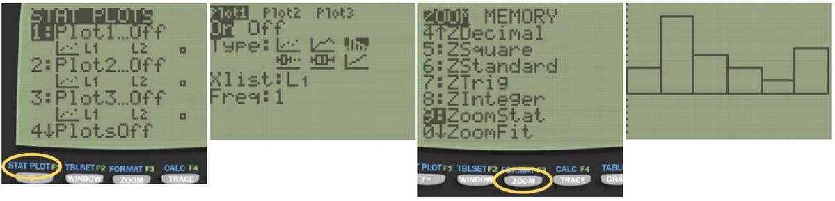
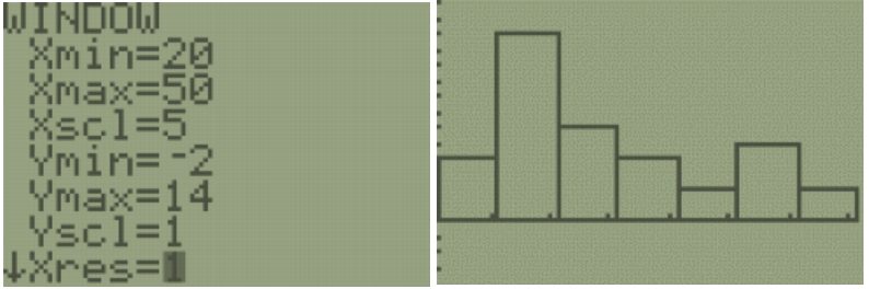
You can see and change the class width by selecting [Window], then change the minimum x value Xmin=20, the maximum x value Xmax=50, the x-scale to Xscl=5 and the minimum y value Ymin=-6.5 and the maximum y value to Ymax=14. Select the [GRAPH] button. We get a similar looking Histogram compared to the stem-and-leaf plot and Excel histogram. Select the [TRACE] button to see the height of each bar and the classes.
TI-89: First, enter the data into the Stat/List editor under list 1. Press [APP] then scroll down to Stat/List Editor, on the older style TI-89 calculators, go into the Flash/App menu, and then scroll down the list. Make sure the cursor is in the list, not on the list name, and type the desired values pressing [ENTER] after each one. To clear a previously stored list of data values, arrow up to the list name you want to clear, press [CLEAR], and then press enter. After you enter the data, select Press [F2] Plots, scroll down to [1: Plot Setup] and press [Enter].

Select [F1] Define. Use your arrow keys to select Histogram for Type, and then scroll down to the x-variable box. Press [2nd] [Var-Link] this key is above the [+] sign. Then arrow down until you find your List1 name under the Main file folder. Then press [Enter] and this will bring the name List1 back to the menu. You will now see that Plot1 has a small picture of a histogram. To view the histogram, select [F5] [Zoom Data].

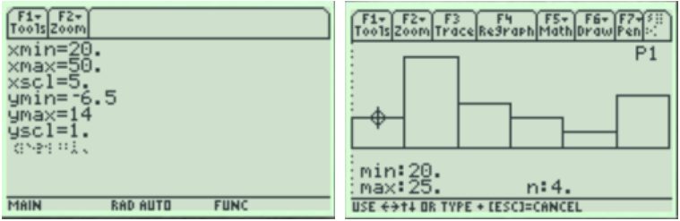
The histogram looks a little different from Excel; you can change the settings for the bucket to match your table. Press [♦] [F2:Window]. Change the minimum x value xmin=20, the maximum x value xmax=50, the x-scale to xscl=5 and the minimum y value ymin=-6.5 and the maximum y value to ymax=14. Then press the [♦] [F3:GRAPH] button. Select [F3:Trace] to see the frequency for each bar. Then use your left and right arrow keys to move to the other bars.
An outlier is a data value that is far from the rest of the values. It may be an unusual value or a mistake. It is a data value that should be investigated. In this case, the student lives in a very expensive part of town, thus the value is not a mistake, and is just very unusual. There are other aspects that can be discussed, but first some other concepts need to be introduced.
2.3.3 Ogive
The line graph for the cumulative or cumulative relative frequency is called an ogive (oh-jyve). To create an ogive, first create a scale on both the horizontal and vertical axes that will fit the data. Then plot the points of the upper class boundary versus the cumulative (or cumulative relative) frequency. Make sure you include the point with the lowest class and the zero cumulative frequency. Then just connect the dots.
The steeper the line the more accumulation occurs across the corresponding class. If the line is flat then the frequency for that class is zero. The ogive graph will always be going uphill from left to right and should never dip below the previous point. Figure 2-14 is an example of an ogive.
Ogive comes from the uphill shape used in architecture. Here is an example of an ogive in the East Hall staircase at PSU.
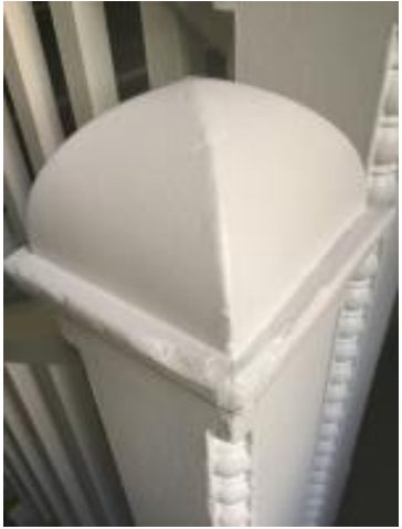
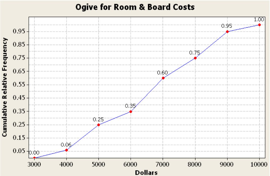
Figure 2-14
2.3.4 Pie Chart
You cannot make stem-and-leaf plots, histograms, ogives or time series graphs for qualitative data. Instead, we use bar or pie charts for a qualitative variable, which lists the categories and gives either the frequency (count) or the relative frequency (percent) of individual items that fall into each category.
A pie chart or pie graph is a very common and easy-to-construct graph for qualitative data. A pie chart takes a circle and divides the circle into pie shaped wedges that are proportional to the size of the relative frequency. There are 360 degrees in a full circle. Relative frequency is just the percentage as a decimal. To find the angle for each pie wedge, multiply the relative frequency for each category by 360 degrees. Figure 2-19 is an example of a pie chart.
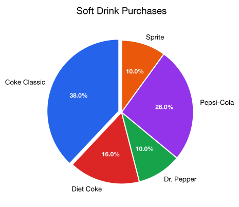
Figure 2-19
2.3.5 Bar Graph
A bar graph (column graph or bar chart) is another graph of a distribution for qualitative data. Bar graphs or charts consist of frequencies on one axis and categories on the other axis. Then you draw rectangles for each category with a height (if frequency is on the vertical axis) or length (if frequency is on the horizontal axis) that is equal to the frequency. All of the rectangles should be the same width, and there should be equally wide gaps between each bar. Figure 2-20 is an example of a bar chart.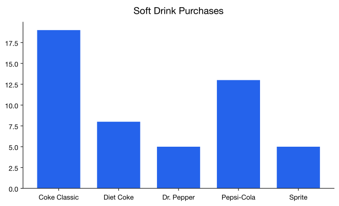
Figure 2-20
Some key features of a bar graph:
- Equal spacing on each axis
- Bars are the same width
- Label each axis and title the graph
- Show the scale on the frequency axis
- Label the categories on the category axis
- The bars do not touch.
You can draw a bar graph with frequency or relative frequency on the vertical axis. The relative frequency is useful when you want to compare two samples with different sample sizes. The relative frequency graph and the frequency graph should look the same, except for the scaling on the frequency axis.
2.3.6 Pareto Chart
A Pareto (pronounced pə-RAY-toh) chart is a bar graph that starts from the most frequent class to the least frequent class. The advantage of Pareto charts is that you can visually see the more popular answer to the least popular. This is especially useful in business applications, where you want to know what services your customers like the most, what processes result in more injuries, which issues employees find more important, and other type of questions where you are interested in comparing frequency. Figure 2-21 is an example of a Pareto chart.
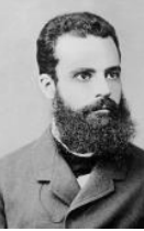
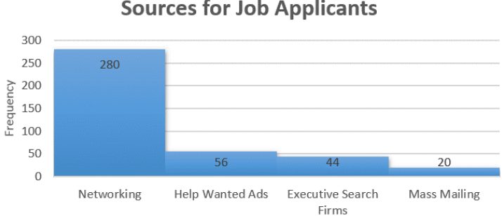
Figure 2-21
2.3.7 Stacked Column Chart
The next example illustrates one of these types known as a stacked column chart. Stacked column (bar) charts are used when we need to show the ratio between a total and its parts. Each color shows the different series as a part of the same single bar, where the entire bar is used as a total.
2.3.8 Multiple or Side-by-Side Bar Graph
A multiple bar graph, also called a side-by-side bar graph, allows comparisons of several different categories over another variable.
2.3.9 Time-Series Plot
A time-series plot is a graph showing the data measurements in chronological order, where the data is quantitative data. For example, a time-series plot is used to show profits over the last 5 years. To create a time-series plot, time always goes on the horizontal axis, and the frequency or relative frequency goes on the vertical axis. Then plot the ordered pairs and connect the dots. A time series allows you to see trends over time. Caution: You must realize that the trend may not continue. Just because you see an increase does not mean the increase will continue forever. As an example, prior to 2007, many people noticed that housing prices were increasing. The belief at the time was that housing prices would continue to increase. However, the housing bubble burst in 2007, and many houses lost value during the recession.
2.3.10 Scatter Plot
Sometimes you have two quantitative variables and you want to see if they are related in any way. A scatter plot helps you to see what the relationship may look like. A scatter plot is just a plotting of the ordered pairs.
- When you see the dots increasing from left to right then there is a positive relationship between the two quantitative variables.
- If the dots are decreasing from left to right then there is a negative relationship.
- If there is no apparent pattern going up or down, then we say there is no relationship between the two variables.
Is there any relationship between elevation and high temperature on a given day? The following data are the high temperatures at various cities on a single day and the elevation of the city.
2.3.11 Misleading Graphs
One thing to be aware of as a consumer, data in the media may be represented in misleading graphs. Misleading graphs not only misrepresent the data, they can lead the reader to false conclusions. There are many ways that graphs can be misleading. One way to mislead is to use picture graphs or 3D graphs that exaggerate differences and should be used with caution. Leaving off units and labels can result in a misleading graph. Another more common example is to rescale or reverse the vertical axis to try to show a large difference between categories. Not starting the vertical axes at zero will show a more dramatic rate of change. Other ways that graphs can be misleading is to change the horizontal axis labels so that they are out of time sequence, using inappropriate graphs, not showing the base population.
Adapted from Mostly Harmless Statistics by Rachel Webb (Portland State University, https://mostlyharmlessstat.wixsite.com/webpage), © Rachel Webb, licensed under CC BY-SA 4.0. Changes were made. License: CC-BY-SA-4.0.