
13.3 Statistical Inference
13.3.1 Randomization Test
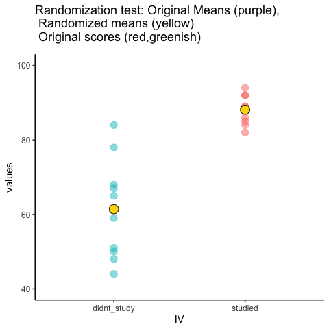
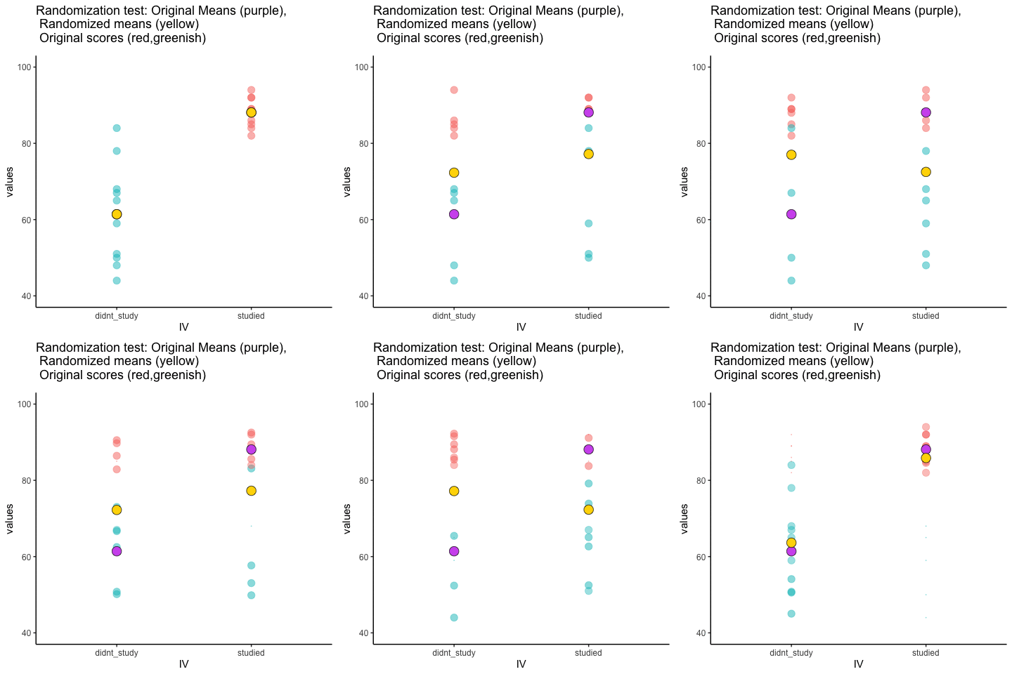
This is an attempt at visualizing a randomization test. Samples are taken under two conditions of the IV (A and B). At the beginning of the animation, the original scores in the first condition are shown as green dots on the left, and the original scores in the second condition are the red dots on the right. The means for each group are the purple dots. During the randomization, the original scores are shuffled randomly between the two conditions. After each shuffle, two new means are computed and displayed as the yellow dots. This occurs either for all permutations, or for a large random sample of them. The animation shows the original scores being shuffled around across the randomizations (the colored dots switch their original condition, appearing from side to side).
For intuitive inference, one might look at the range of motion of the yellow dots. This is how the mean difference between group 1 and group 2 behaves under randomization. It’s what chance can do. If the difference between the purple dots is well outside the range of motion of the yellow dots, then the mean difference observed in the beginning is not likely produced by chance.
Source R listing: this example needs additional R packages not bundled with the browser runtime. The original code is preserved for use in a local R session; it is not a browser Run cell.
study<-round(runif(10,80,100))
no_study<-round(runif(10,40,90))

study_df<-data.frame(student=seq(1:10),study,no_study)
mean_original<-data.frame(IV=c("studied","didnt_study"),
                          means=c(mean(study),mean(no_study)))
t_df<-data.frame(sims=rep(1,20),
                 IV=rep(c("studied","didnt_study"),each=10),
                 values=c(study,no_study),
                 rand_order=rep(c(0,1),each=10))

raw_df<-t_df
for(i in 2:10){
  new_index<-sample(1:20)
  t_df$values<-t_df$values[new_index]
  t_df$rand_order<-t_df$rand_order[new_index]
  t_df$sims<-rep(i,20)
  raw_df<-rbind(raw_df,t_df)
}

raw_df$rand_order<-as.factor(raw_df$rand_order)
rand_df<-aggregate(values~sims*IV,raw_df,mean)
names(rand_df)<-c("sims","IV","means")


a<-ggplot(raw_df,aes(x=IV,y=values,color=rand_order,size=3))+
  geom_point(stat="identity",alpha=.5)+
  geom_point(data=mean_original,aes(x=IV,y=means),stat="identity",shape=21,size=6,color="black",fill="mediumorchid2")+
  geom_point(data=rand_df,aes(x=IV,y=means),stat="identity",shape=21,size=6,color="black",fill="gold")+
  theme_classic(base_size = 15)+
  coord_cartesian(ylim=c(40, 100))+
  theme(legend.position="none") +
  ggtitle("Randomization test: Original Means (purple),
          \n Randomized means (yellow)
          \n Original scores (red,greenish)")+
  transition_states(
    sims,
    transition_length = 1,
    state_length = 2
  )+enter_fade() +
  exit_shrink() +
  ease_aes('sine-in-out')

animate(a,nframes=100,fps=5)
13.3.2 Independent t-test Null
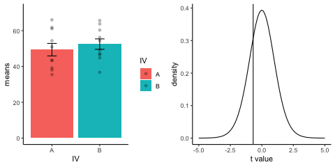
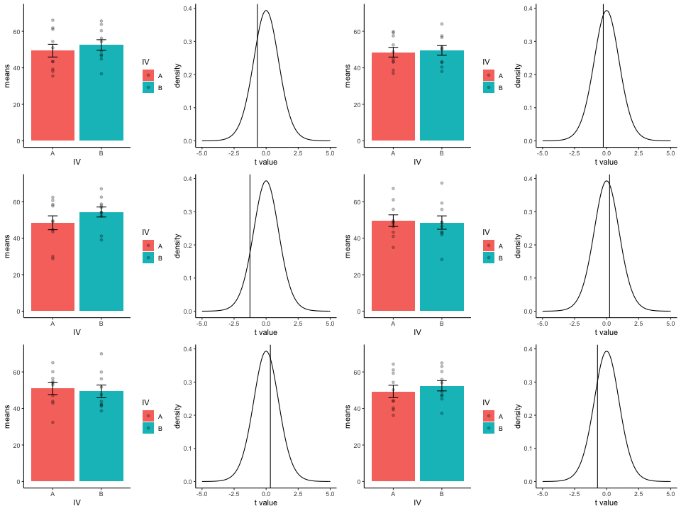
This is a simulation of the null distribution for an independent samples t-test, two groups, 10 observations per group.
This animation has two panels. The left panel shows means for group A and B, sampled from the same normal distribution (mu=50, sd =10). The dots represent individual scores for each of 10 observations per group.
The right panel shows a t-distribution (df=18) along with the observed t-statistic for each simulation.
gganimate does not yet directly support multiple panels as shown in this gif. I hacked together these two gifs using the magick package. Apologies for the hackiness.
Source R listing: this example needs additional R packages not bundled with the browser runtime. The original code is preserved for use in a local R session; it is not a browser Run cell.
library(dplyr)
library(ggplot2)
library(magick)
library(gganimate)

A<-rnorm(100,50,10)
B<-rnorm(100,50,10)
DV <- c(A,B)
IV <- rep(c("A","B"),each=100)
sims <- rep(rep(1:10,each=10),2)
df<-data.frame(sims,IV,DV)

means_df <- df %>%
               group_by(sims,IV) %>%
               summarize(means=mean(DV),
                         sem = sd(DV)/sqrt(length(DV)))

stats_df <- df %>%
              group_by(sims) %>%
              summarize(ts = t.test(DV~IV,var.equal=TRUE)$statistic)

a<-ggplot(means_df, aes(x=IV,y=means, fill=IV))+
  geom_bar(stat="identity")+
  geom_point(data=df,aes(x=IV, y=DV), alpha=.25)+
  geom_errorbar(aes(ymin=means-sem, ymax=means+sem),width=.2)+
  theme_classic()+
  transition_states(
    states=sims,
    transition_length = 2,
    state_length = 1
  )+enter_fade() +
  exit_shrink() +
  ease_aes('sine-in-out')

a_gif<-animate(a, width = 240, height = 240)

b<-ggplot(stats_df,aes(x=ts))+
  geom_vline(aes(xintercept=ts, frame=sims))+
  geom_line(data=data.frame(x=seq(-5,5,.1),
                            y=dt(seq(-5,5,.1),df=18)),
            aes(x=x,y=y))+
  theme_classic()+
  ylab("density")+
  xlab("t value")+
  transition_states(
    states=sims,
    transition_length = 2,
    state_length = 1
  )+enter_fade() +
  exit_shrink() +
  ease_aes('sine-in-out')

b_gif<-animate(b, width = 240, height = 240)


d<-image_blank(240*2,240)

the_frame<-d
for(i in 2:100){
  the_frame<-c(the_frame,d)
}

a_mgif<-image_read(a_gif)
b_mgif<-image_read(b_gif)

new_gif<-image_append(c(a_mgif[1], b_mgif[1]))
for(i in 2:100){
  combined <- image_append(c(a_mgif[i], b_mgif[i]))
  new_gif<-c(new_gif,combined)
}

new_gif
13.3.3 Independent t-test True
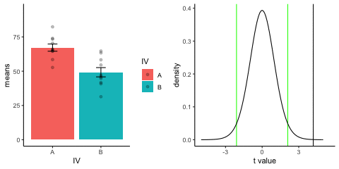
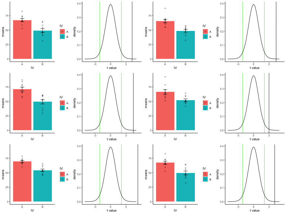
This is a simulation of an independent samples t-test, two groups, 10 observations per group, assuming a true difference of 2 standard deviations between groups
This animation has two panels. The left panel shows means for group A (normal, mu=70, sd=10) and B (normal, mu=50, sd=10). The dots represent individual scores for each of 10 observations per group.
The right panel shows a t-distribution (df=18) along with the observed t-statistic for each simulation.
Source R listing: this example needs additional R packages not bundled with the browser runtime. The original code is preserved for use in a local R session; it is not a browser Run cell.
library(dplyr)
library(ggplot2)
library(magick)
library(gganimate)

A<-rnorm(100,70,10)
B<-rnorm(100,50,10)
DV <- c(A,B)
IV <- rep(c("A","B"),each=100)
sims <- rep(rep(1:10,each=10),2)
df<-data.frame(sims,IV,DV)

means_df <- df %>%
               group_by(sims,IV) %>%
               summarize(means=mean(DV),
                         sem = sd(DV)/sqrt(length(DV)))

stats_df <- df %>%
              group_by(sims) %>%
              summarize(ts = t.test(DV~IV,var.equal=TRUE)$statistic)

a<-ggplot(means_df, aes(x=IV,y=means, fill=IV))+
  geom_bar(stat="identity")+
  geom_point(data=df,aes(x=IV, y=DV), alpha=.25)+
  geom_errorbar(aes(ymin=means-sem, ymax=means+sem),width=.2)+
  theme_classic()+
  transition_states(
    states=sims,
    transition_length = 2,
    state_length = 1
  )+enter_fade() +
  exit_shrink() +
  ease_aes('sine-in-out')

a_gif<-animate(a, width = 240, height = 240)

b<-ggplot(stats_df,aes(x=ts))+
  geom_vline(aes(xintercept=ts, frame=sims))+
  geom_vline(xintercept=qt(c(.025, .975), df=18),color="green")+
  geom_line(data=data.frame(x=seq(-5,5,.1),
                            y=dt(seq(-5,5,.1),df=18)),
            aes(x=x,y=y))+
  theme_classic()+
  ylab("density")+
  xlab("t value")+
  transition_states(
    states=sims,
    transition_length = 2,
    state_length = 1
  )+enter_fade() +
  exit_shrink() +
  ease_aes('sine-in-out')

b_gif<-animate(b, width = 240, height = 240)


d<-image_blank(240*2,240)

the_frame<-d
for(i in 2:100){
  the_frame<-c(the_frame,d)
}

a_mgif<-image_read(a_gif)
b_mgif<-image_read(b_gif)

new_gif<-image_append(c(a_mgif[1], b_mgif[1]))
for(i in 2:100){
  combined <- image_append(c(a_mgif[i], b_mgif[i]))
  new_gif<-c(new_gif,combined)
}

new_gif
13.3.4 T-test True sample-size
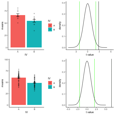
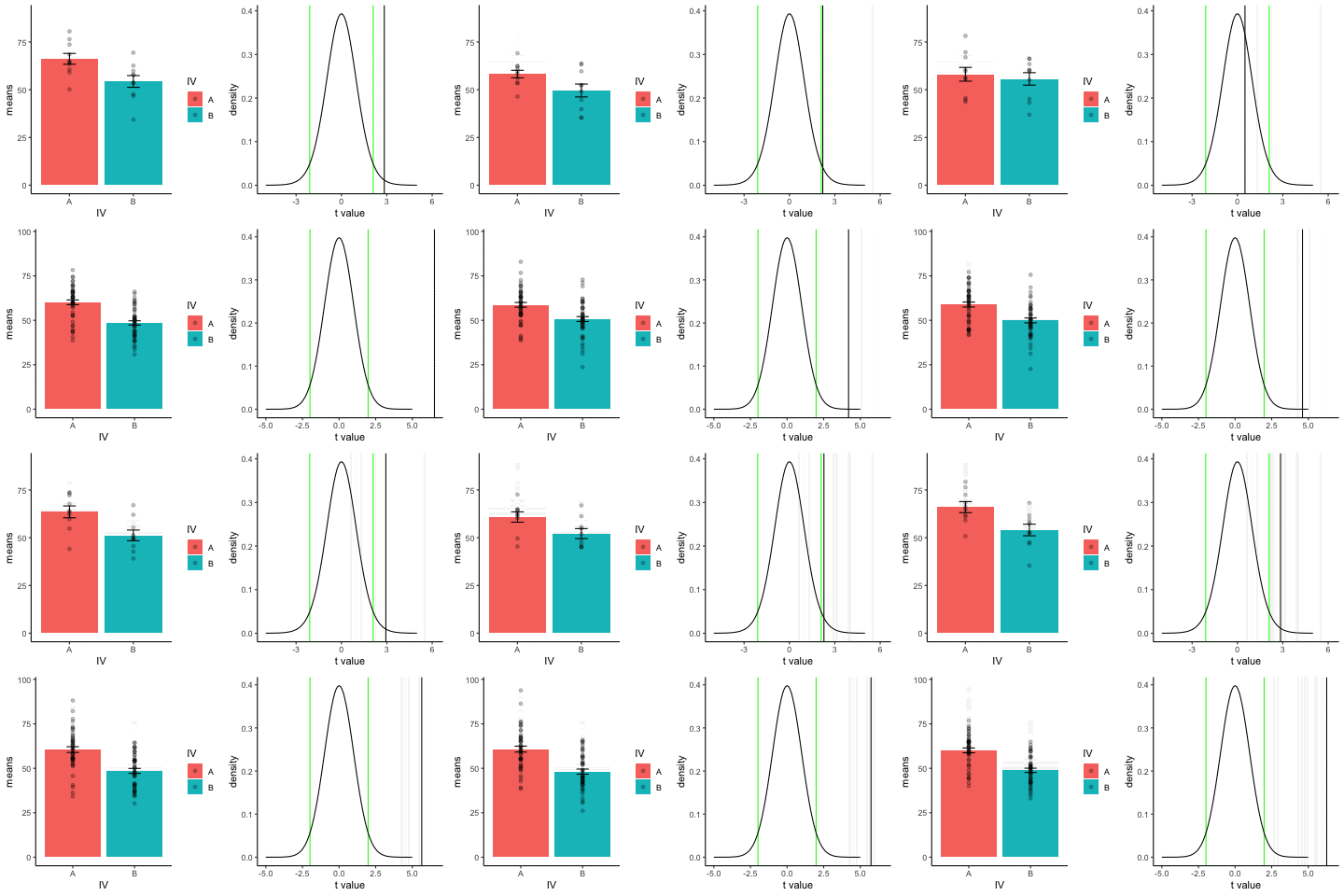
The top row shows 10 simulations of an independent sample t-test, with N=10, and true difference of 1 sd.
The bottom row shows 10 simulations with N=50.
The observed t-value occurs past the critical value (green) line much more reliably and often when sample size is larger than smaller.
Source R listing: this example needs additional R packages not bundled with the browser runtime. The original code is preserved for use in a local R session; it is not a browser Run cell.
library(dplyr)
library(ggplot2)
library(magick)
library(gganimate)

A<-rnorm(100,60,10)
B<-rnorm(100,50,10)
DV <- c(A,B)
IV <- rep(c("A","B"),each=100)
sims <- rep(rep(1:10,each=10),2)
df<-data.frame(sims,IV,DV)

means_df <- df %>%
               group_by(sims,IV) %>%
               summarize(means=mean(DV),
                         sem = sd(DV)/sqrt(length(DV)))

stats_df <- df %>%
              group_by(sims) %>%
              summarize(ts = t.test(DV~IV,var.equal=TRUE)$statistic)

a<-ggplot(means_df, aes(x=IV,y=means, fill=IV))+
  geom_bar(stat="identity")+
  geom_point(data=df,aes(x=IV, y=DV), alpha=.25)+
  geom_errorbar(aes(ymin=means-sem, ymax=means+sem),width=.2)+
  theme_classic()+
  transition_states(
    states=sims,
    transition_length = 2,
    state_length = 1
  )+enter_fade() +
  exit_shrink() +
  ease_aes('sine-in-out')

a_gif<-animate(a, width = 240, height = 240)

b<-ggplot(stats_df,aes(x=ts))+
  geom_vline(aes(xintercept=ts, frame=sims))+
  geom_vline(xintercept=qt(c(.025, .975), df=18),color="green")+
  geom_line(data=data.frame(x=seq(-5,5,.1),
                            y=dt(seq(-5,5,.1),df=18)),
            aes(x=x,y=y))+
  theme_classic()+
  ylab("density")+
  xlab("t value")+
  transition_states(
    states=sims,
    transition_length = 2,
    state_length = 1
  )+enter_fade() +
  exit_shrink() +
  ease_aes('sine-in-out')

b_gif<-animate(b, width = 240, height = 240)


d<-image_blank(240*2,240)

the_frame<-d
for(i in 2:100){
  the_frame<-c(the_frame,d)
}

a_mgif<-image_read(a_gif)
b_mgif<-image_read(b_gif)

new_gif<-image_append(c(a_mgif[1], b_mgif[1]))
for(i in 2:100){
  combined <- image_append(c(a_mgif[i], b_mgif[i]))
  new_gif<-c(new_gif,combined)
}

new_gif

## increase sample-size

A<-rnorm(50*10,60,10)
B<-rnorm(50*10,50,10)
DV <- c(A,B)
IV <- rep(c("A","B"),each=50*10)
sims <- rep(rep(1:10,each=50),2)
df<-data.frame(sims,IV,DV)

means_df <- df %>%
               group_by(sims,IV) %>%
               summarize(means=mean(DV),
                         sem = sd(DV)/sqrt(length(DV)))

stats_df <- df %>%
              group_by(sims) %>%
              summarize(ts = t.test(DV~IV,var.equal=TRUE)$statistic)

a<-ggplot(means_df, aes(x=IV,y=means, fill=IV))+
  geom_bar(stat="identity")+
  geom_point(data=df,aes(x=IV, y=DV), alpha=.25)+
  geom_errorbar(aes(ymin=means-sem, ymax=means+sem),width=.2)+
  theme_classic()+
  transition_states(
    states=sims,
    transition_length = 2,
    state_length = 1
  )+enter_fade() +
  exit_shrink() +
  ease_aes('sine-in-out')

a_gif<-animate(a, width = 240, height = 240)

b<-ggplot(stats_df,aes(x=ts))+
  geom_vline(aes(xintercept=ts, frame=sims))+
  geom_vline(xintercept=qt(c(.025, .975), df=98),color="green")+
  geom_line(data=data.frame(x=seq(-5,5,.1),
                            y=dt(seq(-5,5,.1),df=98)),
            aes(x=x,y=y))+
  theme_classic()+
  ylab("density")+
  xlab("t value")+
  transition_states(
    states=sims,
    transition_length = 2,
    state_length = 1
  )+enter_fade() +
  exit_shrink() +
  ease_aes('sine-in-out')

b_gif<-animate(b, width = 240, height = 240)


d<-image_blank(240*2,240)

the_frame<-d
for(i in 2:100){
  the_frame<-c(the_frame,d)
}

a_mgif<-image_read(a_gif)
b_mgif<-image_read(b_gif)

new_gif2<-image_append(c(a_mgif[1], b_mgif[1]))
for(i in 2:100){
  combined <- image_append(c(a_mgif[i], b_mgif[i]))
  new_gif2<-c(new_gif2,combined)
}

## add new row

final_gif <- image_append(c(new_gif[1], new_gif2[1]),stack=TRUE)
for(i in 2:100){
  combined <- image_append(c(new_gif[i], new_gif2[i]),stack=TRUE)
  final_gif<-c(final_gif,combined)
}

final_gif
13.3.5 one-factor ANOVA Null
Three groups, N=10, all observations sampled from same normal distribution (mu=50, sd = 10)
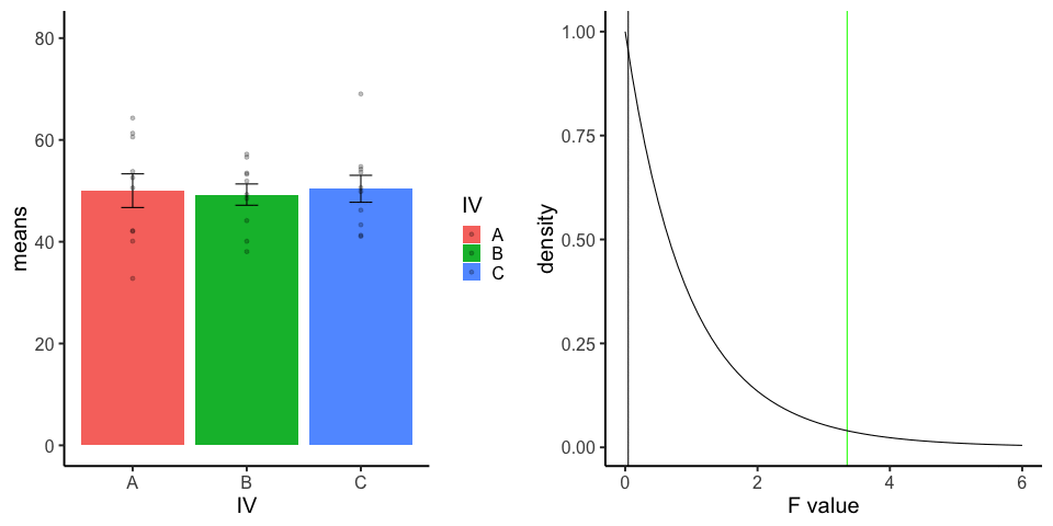
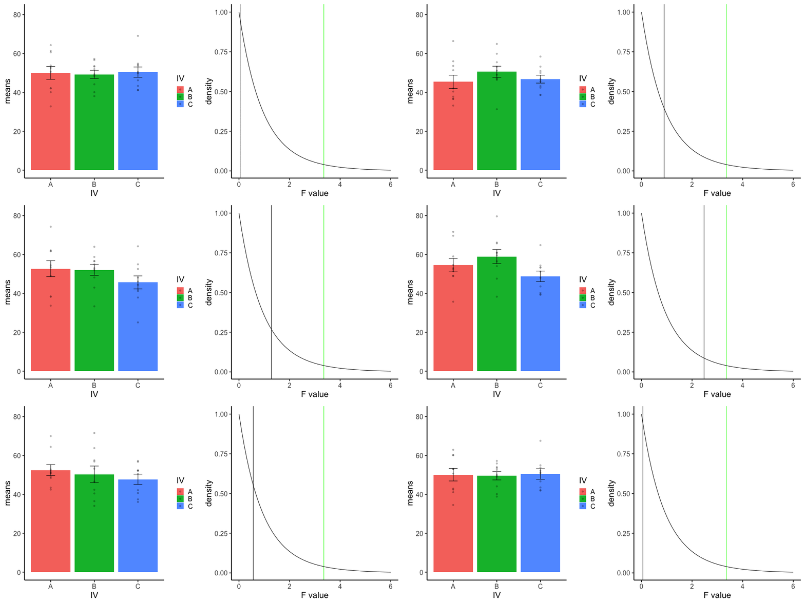
Source R listing: this example needs additional R packages not bundled with the browser runtime. The original code is preserved for use in a local R session; it is not a browser Run cell.
library(dplyr)
library(ggplot2)
library(magick)
library(gganimate)


A<-rnorm(100,50,10)
B<-rnorm(100,50,10)
C<-rnorm(100,50,10)
DV <- c(A,B,C)
IV <- rep(rep(c("A","B","C"),each=10),10)
sims <- rep(1:10,each=30)
df<-data.frame(sims,IV,DV)

means_df <- df %>%
  group_by(sims,IV) %>%
  summarize(means=mean(DV),
            sem = sd(DV)/sqrt(length(DV)))

stats_df <- df %>%
  group_by(sims) %>%
  summarize(Fs = summary(aov(DV~IV))[[1]][[4]][1])

a<-ggplot(means_df, aes(x=IV,y=means, fill=IV))+
  geom_bar(stat="identity")+
  geom_point(data=df,aes(x=IV, y=DV), alpha=.25)+
  geom_errorbar(aes(ymin=means-sem, ymax=means+sem),width=.2)+
  theme_classic(base_size = 20)+
  transition_states(
    states=sims,
    transition_length = 2,
    state_length = 1
  )+enter_fade() +
  exit_shrink() +
  ease_aes('sine-in-out')

b<-ggplot(stats_df,aes(x=Fs))+
  geom_vline(aes(xintercept=Fs))+
  geom_vline(xintercept=qf(.95, df1=2,df2=27),color="green")+
  geom_line(data=data.frame(x=seq(0,6,.1),
                            y=df(seq(0,6,.1),df1=2,df2=27)),
            aes(x=x,y=y))+
  theme_classic(base_size = 20)+
  ylab("density")+
  xlab("F value")+
  transition_states(
    states=sims,
    transition_length = 2,
    state_length = 1
  )+enter_fade() +
  exit_shrink() +
  ease_aes('sine-in-out')

a_gif<-animate(a,width=480,height=480)
b_gif<-animate(b,width=480,height=480)

a_mgif<-image_read(a_gif)
b_mgif<-image_read(b_gif)

new_gif<-image_append(c(a_mgif[1], b_mgif[1]))
for(i in 2:100){
  combined <- image_append(c(a_mgif[i], b_mgif[i]))
  new_gif<-c(new_gif,combined)
}

new_gif
13.3.6 Factorial Null
10 simulations, N=10 in each of 4 conditions in a 2x2 (between-subjects). All observations taken from the same normal distribution (mu=50, sd =10).
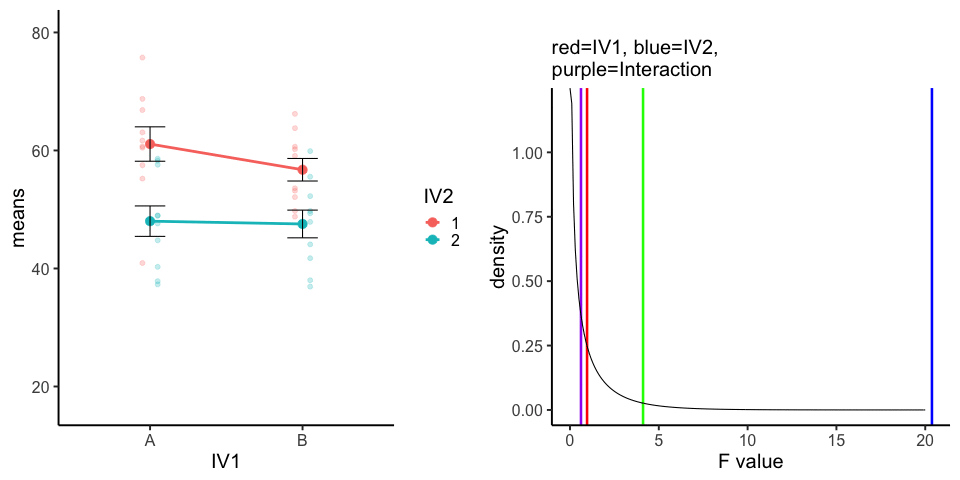
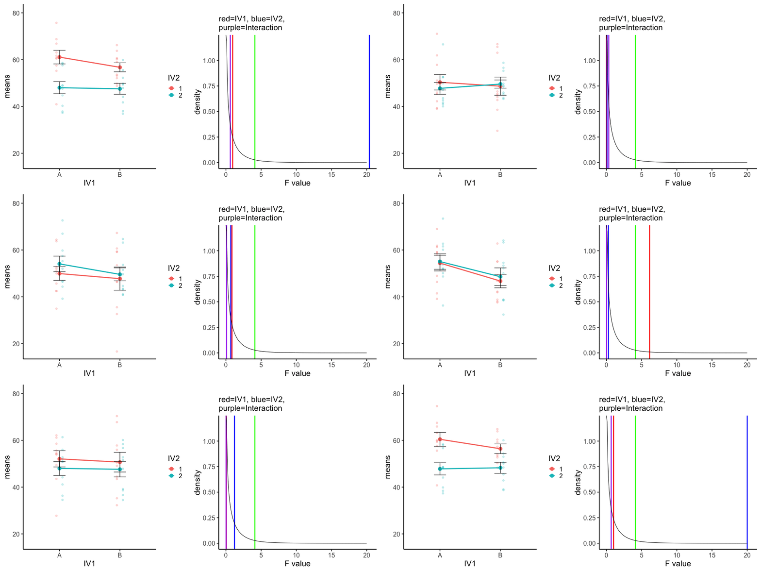
Source R listing: this example needs additional R packages not bundled with the browser runtime. The original code is preserved for use in a local R session; it is not a browser Run cell.
A<-rnorm(100,50,10)
B<-rnorm(100,50,10)
C<-rnorm(100,50,10)
D<-rnorm(100,50,10)
DV <- c(A,B,C,D)
IV1 <- rep(c("A","B"),each=200)
IV2<-rep(rep(c("1","2"),each=100),2)
sims <- rep(1:10,40)
df<-data.frame(sims,IV1,IV2,DV)

means_df <- df %>%
  group_by(sims,IV1,IV2) %>%
  summarize(means=mean(DV),
            sem = sd(DV)/sqrt(length(DV)))

stats_df <- df %>%
  group_by(sims) %>%
  summarize(FIV1 = summary(aov(DV~IV1*IV2))[[1]][[4]][1],
            FIV2 = summary(aov(DV~IV1*IV2))[[1]][[4]][2],
            F1x2 = summary(aov(DV~IV1*IV2))[[1]][[4]][3]
            )

a<-ggplot(means_df, aes(x=IV1,y=means,
                                           group=IV2,
                                           color=IV2))+
  geom_point(data=df,aes(x=IV1, y=DV,group=IV2),
             position=position_dodge(width=.2),
             size=2,
             alpha=.25)+
  geom_point(size=4)+
  geom_line(size=1.3)+
  geom_errorbar(aes(ymin=means-sem, ymax=means+sem),width=.2,
                color="black")+
  theme_classic(base_size = 20)+
  transition_states(
    states=sims,
    transition_length = 2,
    state_length = 1
  )+enter_fade() +
  exit_shrink() +
  ease_aes('sine-in-out')

b<-ggplot(stats_df,aes(x=FIV1))+
  geom_vline(aes(xintercept=FIV1),color="red",size=1.2)+
  geom_vline(aes(xintercept=FIV2),color="blue",size=1.2)+
  geom_vline(aes(xintercept=F1x2),color="purple",size=1.2)+
  geom_vline(xintercept=qf(.95, df1=1,df2=36),color="green",size=1.2)+
  geom_line(data=data.frame(x=seq(0,20,.1),
                            y=df(seq(0,20,.1),df1=1,df2=36)),
            aes(x=x,y=y))+
  theme_classic(base_size = 20)+
  ylab("density")+
  xlab("F value")+
  ggtitle(label="",subtitle="red=IV1, blue=IV2, \n purple=Interaction")+
  transition_states(
    states=sims,
    transition_length = 2,
    state_length = 1
  )

a_gif<-animate(a,width=480,height=480)
b_gif<-animate(b,width=480,height=480)

a_mgif<-image_read(a_gif)
b_mgif<-image_read(b_gif)

new_gif<-image_append(c(a_mgif[1], b_mgif[1]))
for(i in 2:100){
  combined <- image_append(c(a_mgif[i], b_mgif[i]))
  new_gif<-c(new_gif,combined)
}

image_animate(new_gif, fps = 10,dispose="none")Adapted from Answering Questions with Data: Introductory Statistics for Psychology Students, by Matthew J. C. Crump (Brooklyn College of CUNY), crumplab.com/statistics, licensed under CC BY-SA 4.0. Portions adapt Danielle Navarro's Learning Statistics with R (CC BY-SA). Changes were made; this adaptation is distributed under the same license. License: CC-BY-SA-4.0.