
13.1 Correlation GIFs
Note regression lines and confidence bands can be added using geom_smooth(method=lm, se=T)
13.1.1 N=10, both variables drawn from a uniform distribution
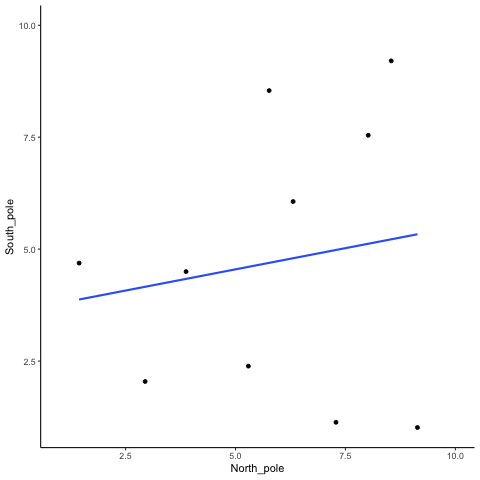
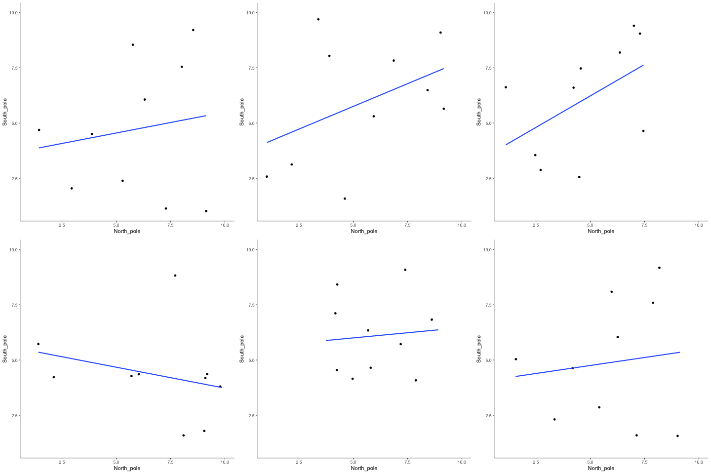
Source R listing: this example needs additional R packages not bundled with the browser runtime. The original code is preserved for use in a local R session; it is not a browser Run cell.
all_df<-data.frame()
for(sim in 1:10){
  North_pole <- runif(10,1,10)
  South_pole <- runif(10,1,10)
  t_df<-data.frame(simulation=rep(sim,10),
                                  North_pole,
                                  South_pole)
  all_df<-rbind(all_df,t_df)
}


ggplot(all_df,aes(x=North_pole,y=South_pole))+
  geom_point()+
  geom_smooth(method=lm, se=FALSE)+
  theme_classic()+
  transition_states(
    simulation,
    transition_length = 2,
    state_length = 1
  )+enter_fade() +
  exit_shrink() +
  ease_aes('sine-in-out')
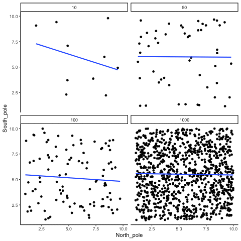
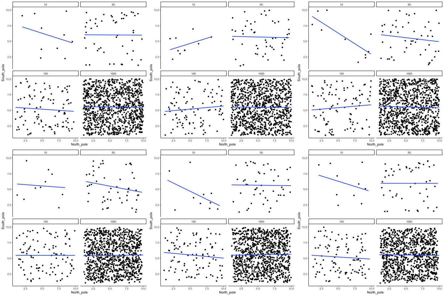
13.1.2 Correlation between random deviates from uniform distribution across four sample sizes
N= 10,50,100,1000 All values sampled from a uniform distribution
Source R listing: this example needs additional R packages not bundled with the browser runtime. The original code is preserved for use in a local R session; it is not a browser Run cell.
all_df<-data.frame()
for(sim in 1:10){
  for(n in c(10,50,100,1000)){
  North_pole <- runif(n,1,10)
  South_pole <- runif(n,1,10)
  t_df<-data.frame(nsize=rep(n,n),
                   simulation=rep(sim,n),
                                  North_pole,
                                  South_pole)
  all_df<-rbind(all_df,t_df)
  }
}


ggplot(all_df,aes(x=North_pole,y=South_pole))+
  geom_point()+
  geom_smooth(method=lm, se=FALSE)+
  theme_classic()+
  facet_wrap(~nsize)+
  transition_states(
    simulation,
    transition_length = 2,
    state_length = 1
  )+enter_fade() +
  exit_shrink() +
  ease_aes('sine-in-out')
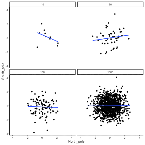
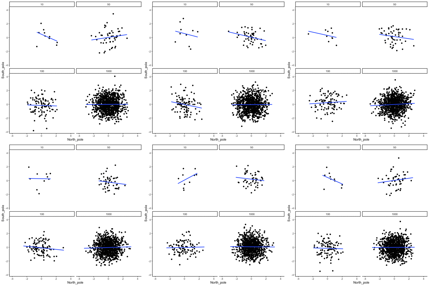
13.1.3 Correlation between random deviates from normal distribution across four sample sizes
N= 10,50,100,1000 All values sampled from the same normal distribution (mean=0, sd=1)
Source R listing: this example needs additional R packages not bundled with the browser runtime. The original code is preserved for use in a local R session; it is not a browser Run cell.
all_df<-data.frame()
for(sim in 1:10){
  for(n in c(10,50,100,1000)){
  North_pole <- rnorm(n,0,1)
  South_pole <- rnorm(n,0,1)
  t_df<-data.frame(nsize=rep(n,n),
                   simulation=rep(sim,n),
                                  North_pole,
                                  South_pole)
  all_df<-rbind(all_df,t_df)
  }
}


ggplot(all_df,aes(x=North_pole,y=South_pole))+
  geom_point()+
  geom_smooth(method=lm, se=FALSE)+
  theme_classic()+
  facet_wrap(~nsize)+
  transition_states(
    simulation,
    transition_length = 2,
    state_length = 1
  )+enter_fade() +
  exit_shrink() +
  ease_aes('sine-in-out')
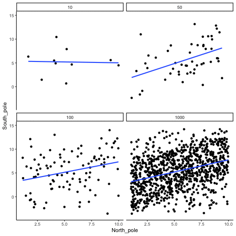
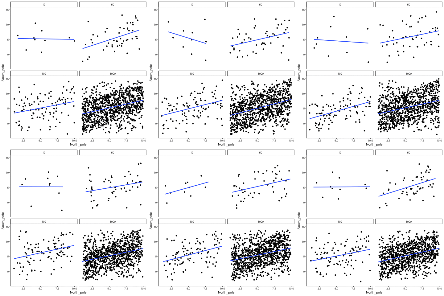
13.1.4 Correlation between X and Y variables that have a true correlation as a function of sample-size
Source R listing: this example needs additional R packages not bundled with the browser runtime. The original code is preserved for use in a local R session; it is not a browser Run cell.
library(MASS)
r<-.7

proportional_permute<-function(x,prop){
  indices<-seq(1:length(x))
  s_indices<-sample(indices)
  n_shuffle<-round(length(x)*prop)
  switch<-sample(indices)
  x[s_indices[1:n_shuffle]]<-x[switch[1:n_shuffle]]
  return(x)
}

all_df<-data.frame()
for(sim in 1:10){
  for(samples in c(10,50,100,1000)){
    #data <- mvrnorm(n=samples, mu=c(0, 0), Sigma=matrix(c(1, r, r, 1), nrow=2), empirical=TRUE)
    #North_pole <- data[, 1]  # standard normal (mu=0, sd=1)
    #South_pole <- data[, 2]

    North_pole <- runif(samples,1,10)
    South_pole <- proportional_permute(North_pole,.5)+runif(samples,-5,5)

    t_df<-data.frame(nsize=rep(samples,samples),
                   simulation=rep(sim,samples),
                                  North_pole,
                                  South_pole)
  all_df<-rbind(all_df,t_df)
  }
}

ggplot(all_df,aes(x=North_pole,y=South_pole))+
  geom_point()+
  geom_smooth(method=lm, se=FALSE)+
  theme_classic()+
  facet_wrap(~nsize)+
  transition_states(
    simulation,
    transition_length = 2,
    state_length = 1
  )+enter_fade() +
  exit_shrink() +
  ease_aes('sine-in-out')
13.1.5 Type I errors, sampling random deviates from normal distribution with regression lines
These scatter plots only show what would be type I errors (assuming alpha=.05). The X and Y values were both sampled from the same normal distribution (mean = 0, sd=1). 1000 simulations were conducted for each sample size (10,50,100,1000). For each, the animation shows 10 scatter plots where the observed “correlation” would have passed a significance test. According to definition, these correlations only arise from random normal deviates 5% of the time, but when they do arise for small sample sizes, they look fairly convincing.


Source R listing: this example needs additional R packages not bundled with the browser runtime. The original code is preserved for use in a local R session; it is not a browser Run cell.
all_df<-data.frame()
for(n in c(10,50,100,1000)){
  count_sims<-0
  for(sim in 1:1000){
    North_pole <- rnorm(n,0,1)
    South_pole <- rnorm(n,0,1)
    if(cor.test(North_pole,South_pole)$p.value<.05){
      count_sims<-count_sims+1
    t_df<-data.frame(nsize=rep(n,n),
                     simulation=rep(count_sims,n),
                     North_pole,
                     South_pole)
    all_df<-rbind(all_df,t_df)

    if(count_sims==10){
      break
    }
    }
  }
}


ggplot(all_df,aes(x=North_pole,y=South_pole))+
  geom_point()+
  geom_smooth(method=lm, se=TRUE)+
  theme_classic()+
  facet_wrap(~nsize)+
  transition_states(
    simulation,
    transition_length = 2,
    state_length = 1
  )+enter_fade() +
  exit_shrink() +
  ease_aes('sine-in-out')
13.1.6 Cell-size and correlation
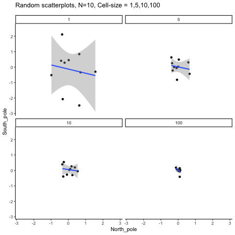
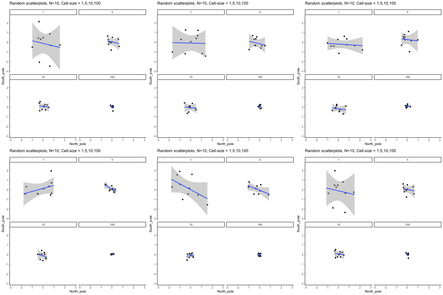
This simulation illustrates how the behavior of correlating two random normal samples as a function of cell-size. The sample-size is always set at N=10. For each panel, the simulation uses an increasing cell-size to estimate the mean for X and Y. When cell-size is 1, 10 X and Y values are drawn from the same normal (u=0, sd=1). When cell-size is 5, for each X,Y score in the plot, 5 samples were drawn from the same normal, and then the mean of the samples is plotted. The effect of cell-size shrinks the dot cloud, as both X and Y scores provide better estimates of the population mean = 0. Cell-size has no effect on the behavior of r, which swings around because sample-size N is small. These are all random, so there is always a 5% type I error rate (alpha =.05).
Source R listing: this example needs additional R packages not bundled with the browser runtime. The original code is preserved for use in a local R session; it is not a browser Run cell.
get_sampling_means<-function(m,sd,cell_size,s_size){
  save_means<-length(s_size)
  for(i in 1:s_size){
    save_means[i]<-mean(rnorm(cell_size,m,sd))
  }
  return(save_means)
}

all_df<-data.frame()
for(n in c(1,5,10,100)){
  count_sims<-0
  for(sim in 1:10){
    North_pole <- get_sampling_means(0,1,n,10)
    South_pole <- get_sampling_means(0,1,n,10)
      count_sims<-count_sims+1
      t_df<-data.frame(nsize=rep(n,10),
                       simulation=rep(count_sims,10),
                       North_pole,
                       South_pole)
      all_df<-rbind(all_df,t_df)
  }
}


ggplot(all_df,aes(x=North_pole,y=South_pole))+
  geom_point()+
  geom_smooth(method=lm, se=TRUE)+
  theme_classic()+
  facet_wrap(~nsize)+
  ggtitle("Random scatterplots, N=10, Cell-size = 1,5,10,100")+
  transition_states(
    simulation,
    transition_length = 2,
    state_length = 1
  )+enter_fade() +
  exit_shrink() +
  ease_aes('sine-in-out')
13.1.7 Regression
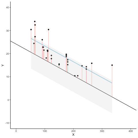
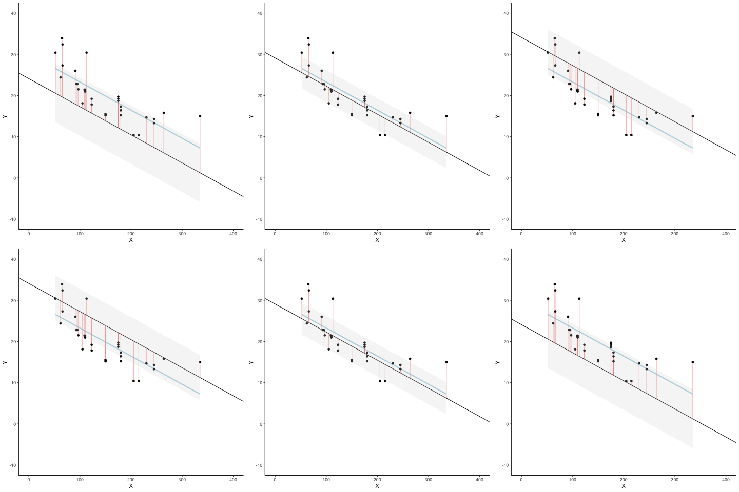
We look at how the residuals (error from points to line) behave as the regression lines moves above and below it’s true value. The total error associated with all of the red lines is represents by the grey area. This total error is smallest (minimized) when the black line overlaps with the blue regression line (the best fit line). The total error expands as the black line moves away from the regression. That’s why the regression line is the least wrong (best fit) line to skewer the data (according to least squares definition)
Source R listing: this example needs additional R packages not bundled with the browser runtime. The original code is preserved for use in a local R session; it is not a browser Run cell.
d <- mtcars
fit <- lm(mpg ~ hp, data = d)
d$predicted <- predict(fit)   # Save the predicted values
d$residuals <- residuals(fit) # Save the residual values

coefs<-coef(lm(mpg ~ hp, data = mtcars))
coefs[1]
coefs[2]

x<-d$hp
move_line<-c(seq(-6,6,.5),seq(6,-6,-.5))
total_error<-length(length(move_line))
cnt<-0
for(i in move_line){
  cnt<-cnt+1
  predicted_y <- coefs[2]*x + coefs[1]+i
  error_y <- (predicted_y-d$mpg)^2
  total_error[cnt]<-sqrt(sum(error_y)/32)
}

move_line_sims<-rep(move_line,each=32)
total_error_sims<-rep(total_error,each=32)
sims<-rep(1:50,each=32)

d<-d %>% slice(rep(row_number(), 50))

d<-cbind(d,sims,move_line_sims,total_error_sims)


anim<-ggplot(d, aes(x = hp, y = mpg, frame=sims)) +
  geom_smooth(method = "lm", se = FALSE, color = "lightblue") +
  geom_abline(intercept = 30.09886+move_line_sims, slope = -0.06822828)+
  lims(x = c(0,400), y = c(-10,40))+
  geom_segment(aes(xend = hp, yend = predicted+move_line_sims, color="red"), alpha = .5) +
  geom_point() +
  geom_ribbon(aes(ymin = predicted+move_line_sims - total_error_sims, ymax = predicted+move_line_sims + total_error_sims), fill = "lightgrey", alpha=.2)+
  theme_classic()+
  theme(legend.position="none")+
  xlab("X")+ylab("Y")+
  transition_manual(frames=sims)+
  enter_fade() +
  exit_fade()+
  ease_aes('sine-in-out')

animate(anim,fps=5)Adapted from Answering Questions with Data: Introductory Statistics for Psychology Students, by Matthew J. C. Crump (Brooklyn College of CUNY), crumplab.com/statistics, licensed under CC BY-SA 4.0. Portions adapt Danielle Navarro's Learning Statistics with R (CC BY-SA). Changes were made; this adaptation is distributed under the same license. License: CC-BY-SA-4.0.