
13.2 Sampling distributions
13.2.1 Sampling from a uniform distribution
Animation shows histograms for N=20, sampled from a uniform distribution, along with mean (red line). Uniform distribution in this case is integer values from 1 to 10.
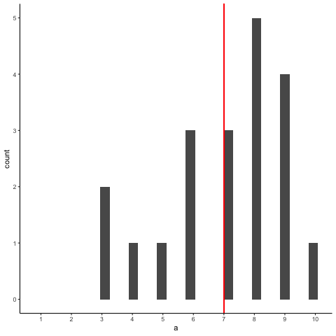
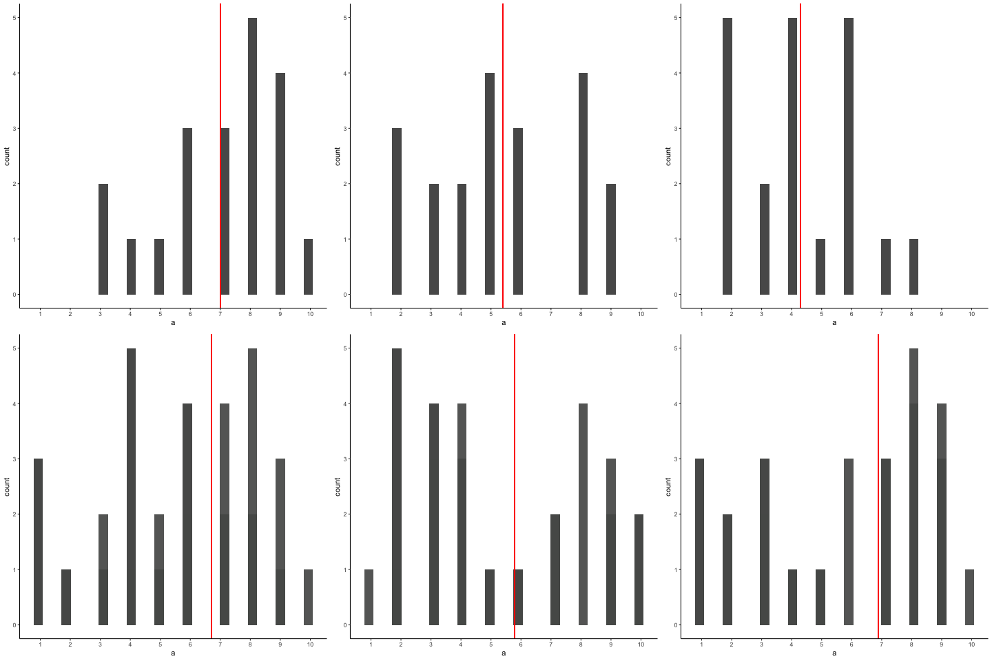
Source R listing: this example needs additional R packages not bundled with the browser runtime. The original code is preserved for use in a local R session; it is not a browser Run cell.
a<-round(runif(20*10,1,10))
df<-data.frame(a,sample=rep(1:10,each=20))
df2<-aggregate(a~sample,df,mean)
df<-cbind(df,mean_loc=rep(df2$a,each=20))

library(gganimate)

ggplot(df,aes(x=a, group=sample,frame=sample)) +
  geom_histogram() +
  geom_vline(aes(xintercept=mean_loc,frame = sample),color="red")+
  scale_x_continuous(breaks=seq(1,10,1))+
  theme_classic()+
  transition_states(
    sample,
    transition_length = 2,
    state_length = 1
  )+enter_fade() +
  exit_shrink() +
  ease_aes('sine-in-out')
13.2.2 Sampling from uniform with line showing expected value for each number
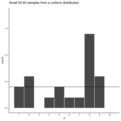
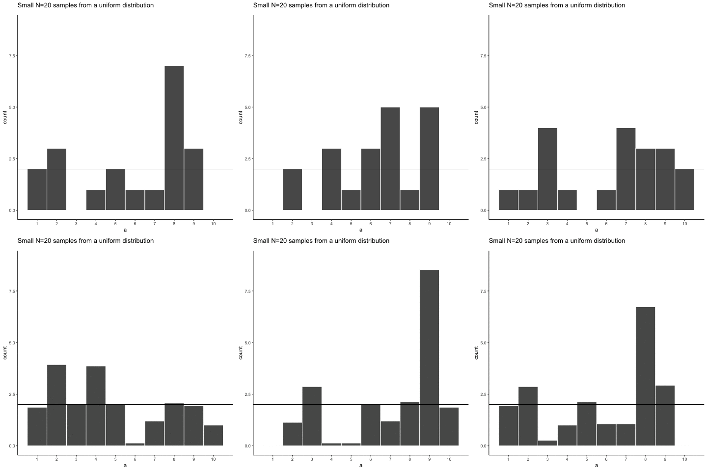
Source R listing: this example needs additional R packages not bundled with the browser runtime. The original code is preserved for use in a local R session; it is not a browser Run cell.
a<-round(runif(20*10,1,10))
df<-data.frame(a,sample=rep(1:10,each=20))


library(gganimate)
ggplot(df,aes(x=a))+
  geom_histogram(bins=10, color="white")+
  theme_classic()+
  scale_x_continuous(breaks=seq(1,10,1))+
  geom_hline(yintercept=2)+
  ggtitle("Small N=20 samples from a uniform distribution")+
  transition_states(
    sample,
    transition_length = 2,
    state_length = 1
  )+enter_fade() +
  exit_shrink() +
  ease_aes('sine-in-out')
13.2.3 Sampling distribution of the mean, Normal population distribution and sample histograms
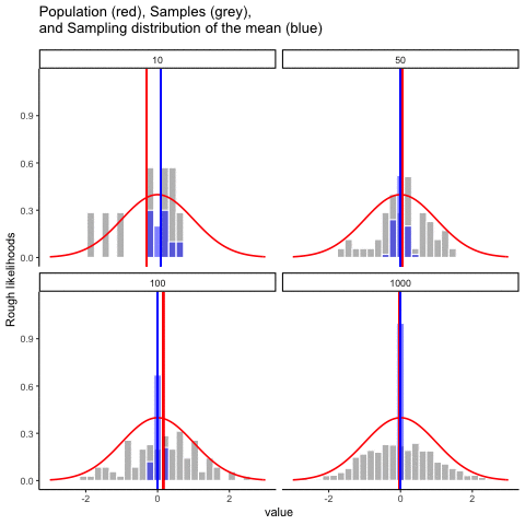
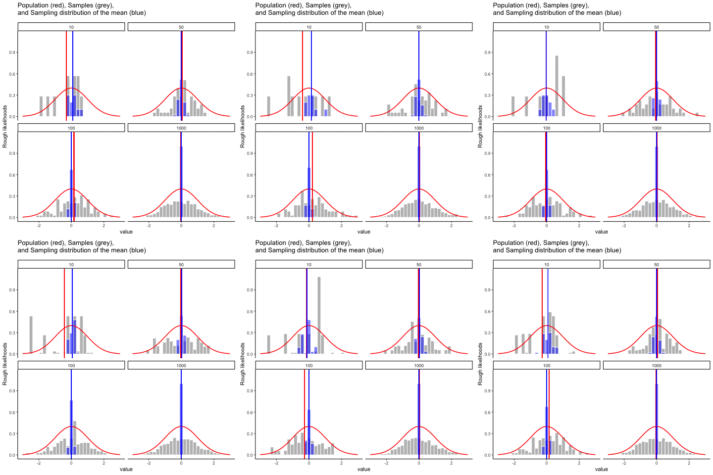
This animation illustrates the relationship between a distribution (population), samples from the distribution, and the sampling distribution of the sample means, all as a function of n
Normal distribution in red. Individual sample histograms in grey. Vertical red line is mean of individual sample. Histograms for sampling distribution of the sample mean in blue. Vertical blue line is mean of the sampling distribution of the sample mean.
Note: for purposes of the animation (and because it was easier to do this way), the histograms for the sampling distribution of the sample means have different sizes. When sample-size = 10, the histogram shows 10 sample means. When sample size=100, the histogram shows 100 sample means. I could have simulated many more sample means (say 10000) for each, but then the histograms for the sample means would be static.
The y-axis is very rough. The heights of the histograms and distributions were scaled to be in the same range for the animation.
Source R listing: this example needs additional R packages not bundled with the browser runtime. The original code is preserved for use in a local R session; it is not a browser Run cell.
get_sampling_means<-function(m,sd,s_size){
  save_means<-length(s_size)
  for(i in 1:s_size){
    save_means[i]<-mean(rnorm(s_size,m,sd))
  }
  return(save_means)
}

all_df<-data.frame()
for(sims in 1:10){
  for(n in c(10,50,100,1000)){
    sample<-rnorm(n,0,1)
    sample_means<-get_sampling_means(0,1,n)
    t_df<-data.frame(sims=rep(sims,n),
                     sample,
                     sample_means,
                     sample_size=rep(n,n),
                     sample_mean=rep(mean(sample),n),
                     sampling_mean=rep(mean(sample_means),n)
                     )
    all_df<-rbind(all_df,t_df)
  }
}


ggplot(all_df, aes(x=sample))+
  geom_histogram(aes(y=(..density..)/max(..density..)^.8),color="white",fill="grey")+
  geom_histogram(aes(x=sample_means,y=(..density..)/max(..density..)),fill="blue",color="white",alpha=.5)+
  stat_function(fun = dnorm,
                args = list(mean = 0, sd = 1),
                lwd = .75,
                col = 'red')+
  geom_vline(aes(xintercept=sample_mean,frame=sims),color="red")+
  geom_vline(aes(xintercept=sampling_mean,frame=sims),color="blue")+
  facet_wrap(~sample_size)+xlim(-3,3)+
  theme_classic()+ggtitle("Population (red), Samples (grey), \n and Sampling distribution of the mean (blue)")+ylab("Rough likelihoods")+
  xlab("value")+
  transition_states(
    sims,
    transition_length = 2,
    state_length = 1
  )+enter_fade() +
  exit_shrink() +
  ease_aes('sine-in-out')
13.2.4 Null and True effect samples and sampling means
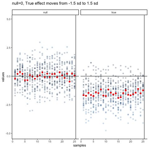
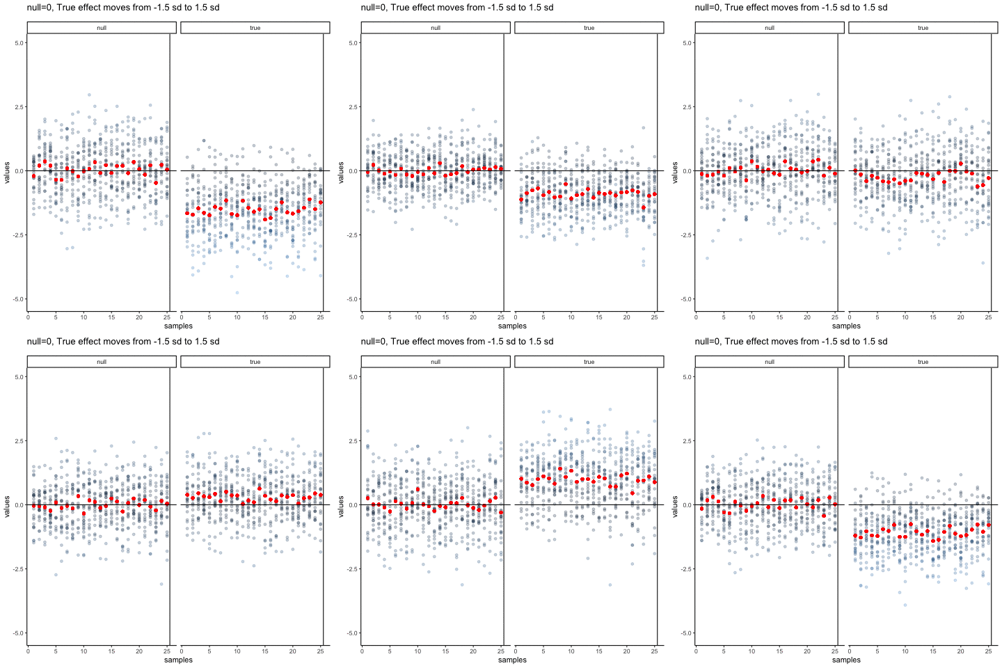
The null dots show 25 different samples, with the red dot as the mean for each sample. Null dots are all sampled from normal (u=0, sd=1). The true dots show 25 more samples, with red dots for their means. However, the mean of the true shifts between -1.5 and +1.5 standard deviations of 0. This illustrates how a true effect moves in and out of the null range.
Source R listing: this example needs additional R packages not bundled with the browser runtime. The original code is preserved for use in a local R session; it is not a browser Run cell.
all_df<-data.frame()
all_df_means<-data.frame()
dif_sim<-seq(-1.5,1.5,.25)
for(sim in 1:13){
  values<-c(rnorm(25*25,0,1),rnorm(25*25,dif_sim[sim],1))
  samples<-c(rep(seq(1:25),each=25),rep(seq(1:25),each=25))
  df<-data.frame(samples,values,sims=rep(sim,50*25),type=rep(c("null","true"),each=625))
  df_means<-aggregate(values~samples*type,df,mean, sims=rep(sim,50))
  all_df<-rbind(all_df,df)
  all_df_means<-rbind(all_df_means,df_means)
}

all_df<-cbind(all_df,means=rep(all_df_means$values,each=25))

ggplot(all_df,aes(y=values,x=samples))+
  geom_point(aes(color=abs(values)), alpha=.25)+
  geom_point(aes(y=means,x=samples),color="red")+
  theme_classic()+
  geom_vline(xintercept=25.5)+
  facet_wrap(~type)+
  geom_hline(yintercept=0)+
  theme(legend.position="none") +
  ggtitle("null=0, True effect moves from -1.5 sd to 1.5 sd")+
  transition_states(
    sims,
    transition_length = 2,
    state_length = 1
  )+enter_fade() +
  exit_shrink() +
ease_aes('sine-in-out')Adapted from Answering Questions with Data: Introductory Statistics for Psychology Students, by Matthew J. C. Crump (Brooklyn College of CUNY), crumplab.com/statistics, licensed under CC BY-SA 4.0. Portions adapt Danielle Navarro's Learning Statistics with R (CC BY-SA). Changes were made; this adaptation is distributed under the same license. License: CC-BY-SA-4.0.