
10.2 Simple Linear Regression
In simple linear regression, we are given data consisting of two variables, typically denoted and , where the value of one () depends on the other (). For example, consider the following data of heights () and shoe sizes () of a small number of individuals1 shown in Table 10.1 and Figure 10.1. By eye we can see a direct correlation - the taller the person the larger shoe size.
| Height [inches] | Shoe Size |
|---|---|
| 64.0 | 7 |
| 70.0 | 9 |
| 64.0 | 8 |
| 71.0 | 11 |
| 69.0 | 12 |
| 68.0 | 9 |
| 69.0 | 10 |
| 61.0 | 6 |
| 68.0 | 10 |
| 70.0 | 9 |
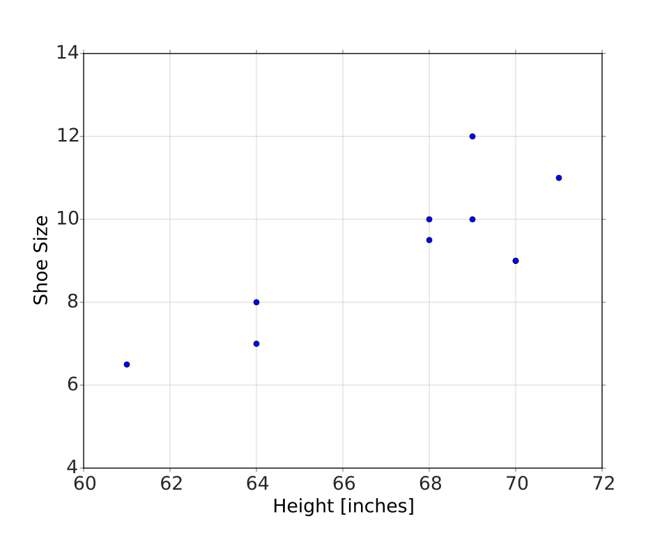
We propose a model of this data of the following linear form:
where is the slope and is the intercept. Clearly this data doesn't form a perfect line, so there is some uncertainty in the slope, intercept, and predicted values. We assume a Normal distribution for the uncertainties in the data, so the statistical model looks like, for each data point,
where we want to obtain estimates, and , of the “true” values of the slope and intercept, respectively, as well as their uncertainties. This is obtained by getting the posterior probability of the parameters,
Following our standard procedure,
- Specify the prior probabilities for the parameters being considered. For most simple cases we begin with absolutely no knowledge of its value, and thus use a uniform prior probability for each parameter.
- Write the top of Bayes' Rule,
- Add up the values, and divide by this sum to get the final posterior probabilities. This is done by the mathematicians, and we simply summarize the results here.
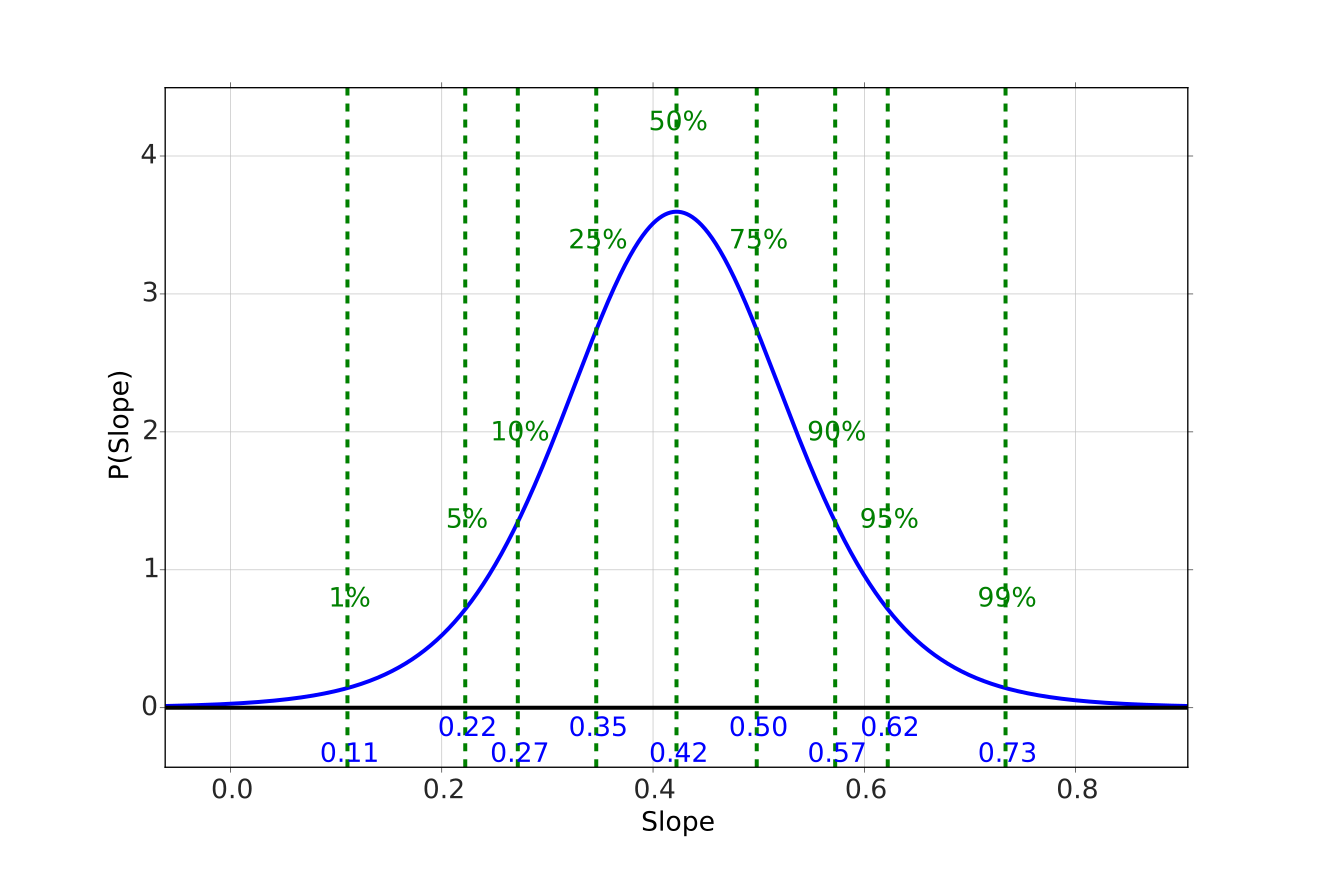
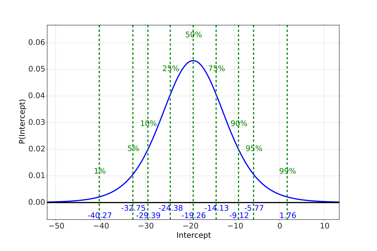
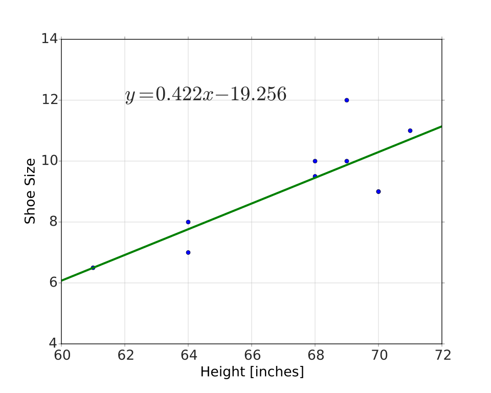
we obtain the posterior distributions for the parameters and . The calculations get too detailed to do by hand, but are very easy with the computer. For the shoe size data in Table 10.1 we get the distributions shown in Figures 10.2 and 10.3 for the slope and intercept, respectively. The most probable values then lead to the best fit, shown in Figure 10.4.
The Student- test clearly shows that the slope is non-zero (well over 95% of the distribution lies to the right of zero), denoting a statistically significant effect on shoe size from height. The magnitude of the slope, , can be interpreted that every inch of height leads to a 0.42 increase in shoe size on average.
Mean Squared Error
Another way of looking at the same idea is to introduce the notion of Mean Squared Error (MSE). This is defined to be the number resulting from taking the predicted values minus the observed values, squaring them, and taking their mean. The squaring ensures that deviations from the predictions both too high and too low are considered the same. The closer the prediction overall, the smaller the resulting MSE. Mathematically this is written as
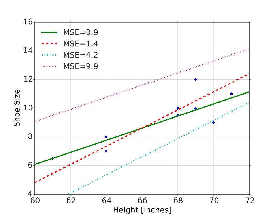
One can intuitively think of getting the best fit as adjusting the slopes and intercepts, calculating the MSE for each, and stopping when you reach a minimum value. An example of this is shown in Figure 10.5.
An Educational Example
The following example is from a data set on school expenditures and SAT scores.2 We plot the total SAT scores as a function of expenditures, perform a linear model fit, and present the best values and their uncertainties in Figure 10.6. The model is
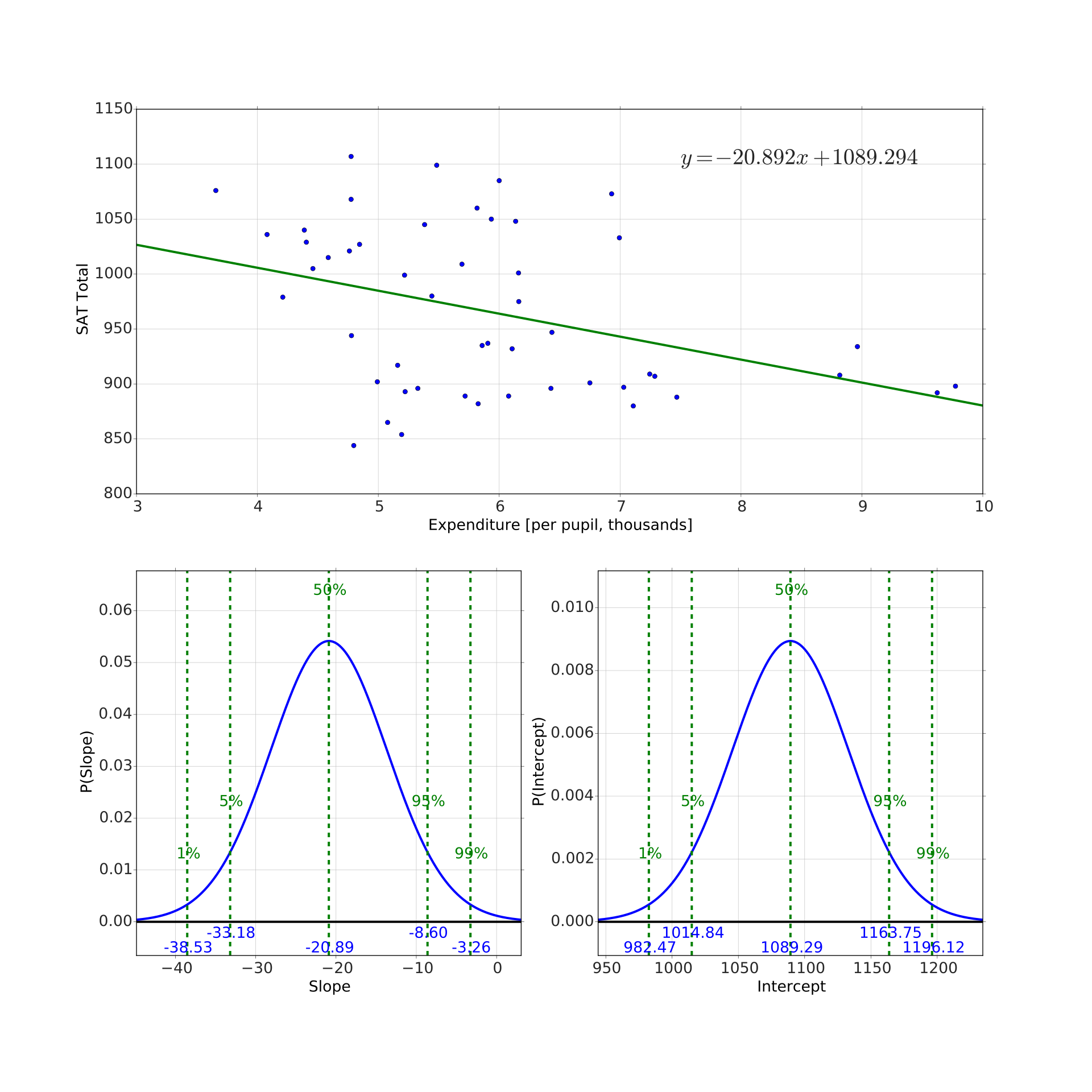
What is immediately odd is that this result seems to suggest the following:
- The larger the expenditure per pupil the lower the SAT scores.
- For each thousand dollars spent per pupil, the total SAT score goes down 20 points.
- If you spent zero dollars per pupil, you'd reach a maximum of SAT score of 1089.
This seems counter intuitive to say the least. What is going on here? What is happening is that there are other variables that are related to the expenditure which then lead to lower SAT scores on average. Such a confounding variable needs to be taken into account in what is called controlling for a variable.
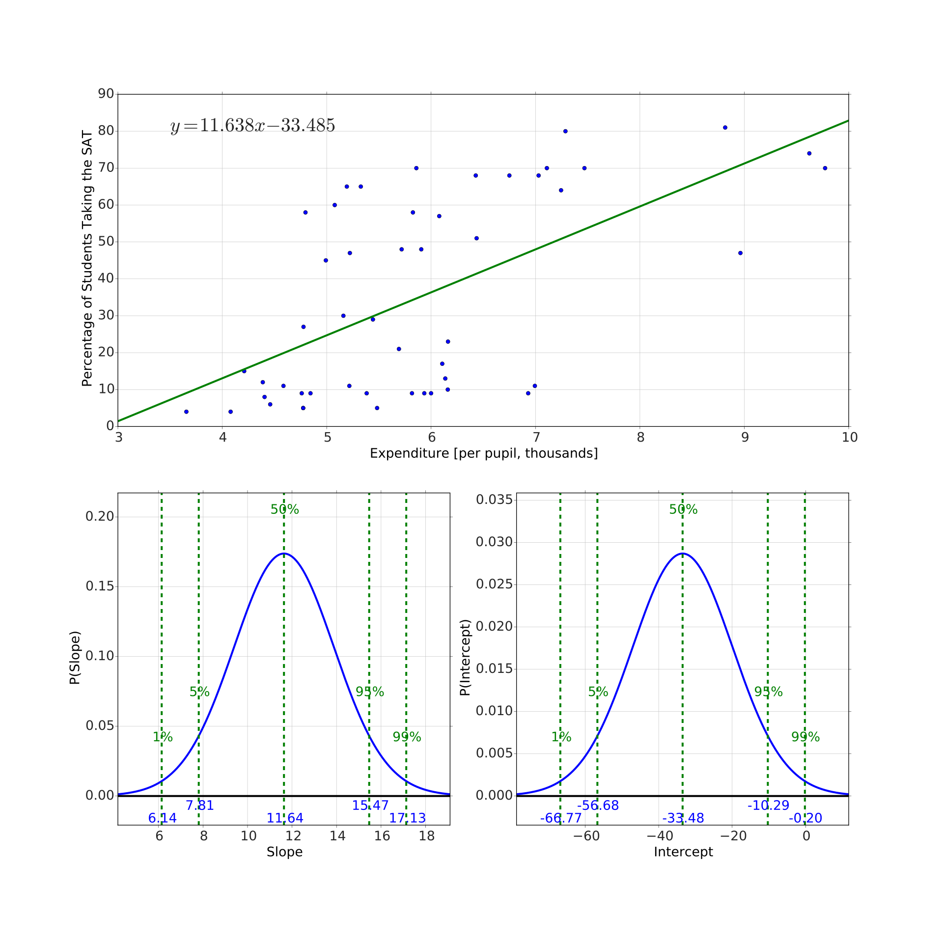
For example, if we look at the relationship between expenditure per pupil and the percent of students taking the SAT we see a pattern, shown in Figure 10.7. The more that is spent per pupil, the more students - both bad and good - take the SAT. Thus, even if expenditure helps students, the fact that the percentage of students taking the exam increases creates the illusion of the opposite. The next section states how you can overcome this problem.
Adapted from Statistical Inference for Everyone, by Brian Blais (Bryant University), licensed under CC BY-SA 4.0 (dual-licensed under the GNU FDL 1.2 or later; this adaptation uses the CC BY-SA grant). Changes were made; this adaptation is distributed under the same license. License: CC-BY-SA-4.0.