
3.5 Visualization of Data
There are two main methods of visualizing data, and several others that are related to these methods. In this section we introduce just two, histograms and scatter plots, and we will use these throughout the text.
Histograms
Histograms are a way of summarizing data, when presenting the entire data set is impractical, or where some understanding of the data is made clearer by summarizing. The histogram plot is done with the following steps:
- Choose a number of bins to divide the data.
- Count up the data that fall into each bin
- Make a bar plot, or a scatter plot to present the data.
The following is an example with a small data set. The process of binning and counting is often done by computer, but it is instructive to perform the process by hand a few times in order to understand what the results are.
Table 3.3 shows a collection of 106 heights (in centimeters) of the male students in a class. As a collection of numbers it is relatively opaque, but as a histogram it is clearer.
| 177.8 | 160.0 | 165.0 | 182.88 | 175.0 | 167.0 |
|---|---|---|---|---|---|
| 182.88 | 190.5 | 177.0 | 190.5 | 180.34 | 180.34 |
| 184.0 | 172.72 | 175.26 | 167.0 | 180.0 | 180.0 |
| 190.0 | 182.5 | 185.0 | 171.0 | 172.0 | 180.34 |
| 180.0 | 170.0 | 200.0 | 190.0 | 170.18 | 179.0 |
| 182.0 | 171.0 | 177.8 | 175.26 | 187.0 | 183.0 |
| 180.0 | 176.0 | 185.42 | 176.5 | 167.64 | 179.0 |
| 183.0 | 179.0 | 190.0 | 165.0 | 187.0 | 170.0 |
| 180.0 | 180.34 | 190.5 | 185.0 | 193.04 | 184.0 |
| 177.0 | 180.0 | 175.26 | 180.34 | 178.5 | 187.96 |
| 178.0 | 175.26 | 189.0 | 182.88 | 170.0 | 180.0 |
| 185.0 | 187.96 | 185.42 | 195.0 | 172.72 | 180.34 |
| 173.0 | 187.96 | 187.0 | 168.0 | 191.8 | 177.0 |
| 189.0 | 180.34 | 182.88 | 172.72 | 172.0 | 170.0 |
| 175.0 | 168.0 | 165.0 | 173.0 | 196.0 | 179.1 |
| 180.0 | 176.0 | 154.94 | 174.0 | 179.1 | 160.0 |
| 165.0 | 165.0 | 170.0 | 185.0 | 188.0 | 171.0 |
| 185.0 | 185.0 | 180.34 | 183.0 |
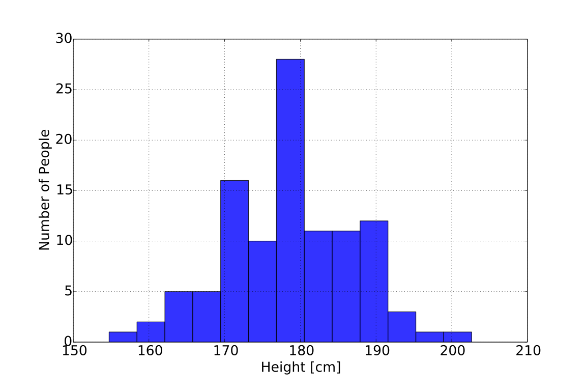
From this histogram, we can immediately observe several quantities which summarize their data:
- The average value (around the middle) should be around 175 cm. The actual value can be calculated from the data, as
- The range of the data is around 155 cm up to about 205 cm. Again we can be more precise, and find the minimum of the data (154.94 cm) and the maximum (200 cm) but the histogram picture yields an approximate value instantly.
- The values are roughly symmetric about the mean (i.e. average) value. This can give us a clue concerning how to model the data.
What is quite clear is that it is far easier to deal with a histogram, as above, than find the same information from the table of numbers.
Too Few Bins
Plotting the same histogram with too few bins might look like:
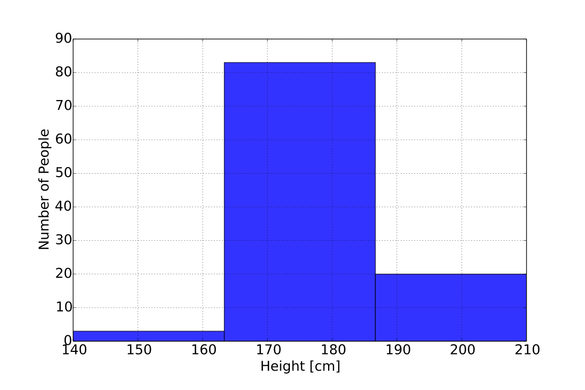
Clearly all the information is washed out.
Too Many Bins
Plotting the same histogram with too many bins might look like:
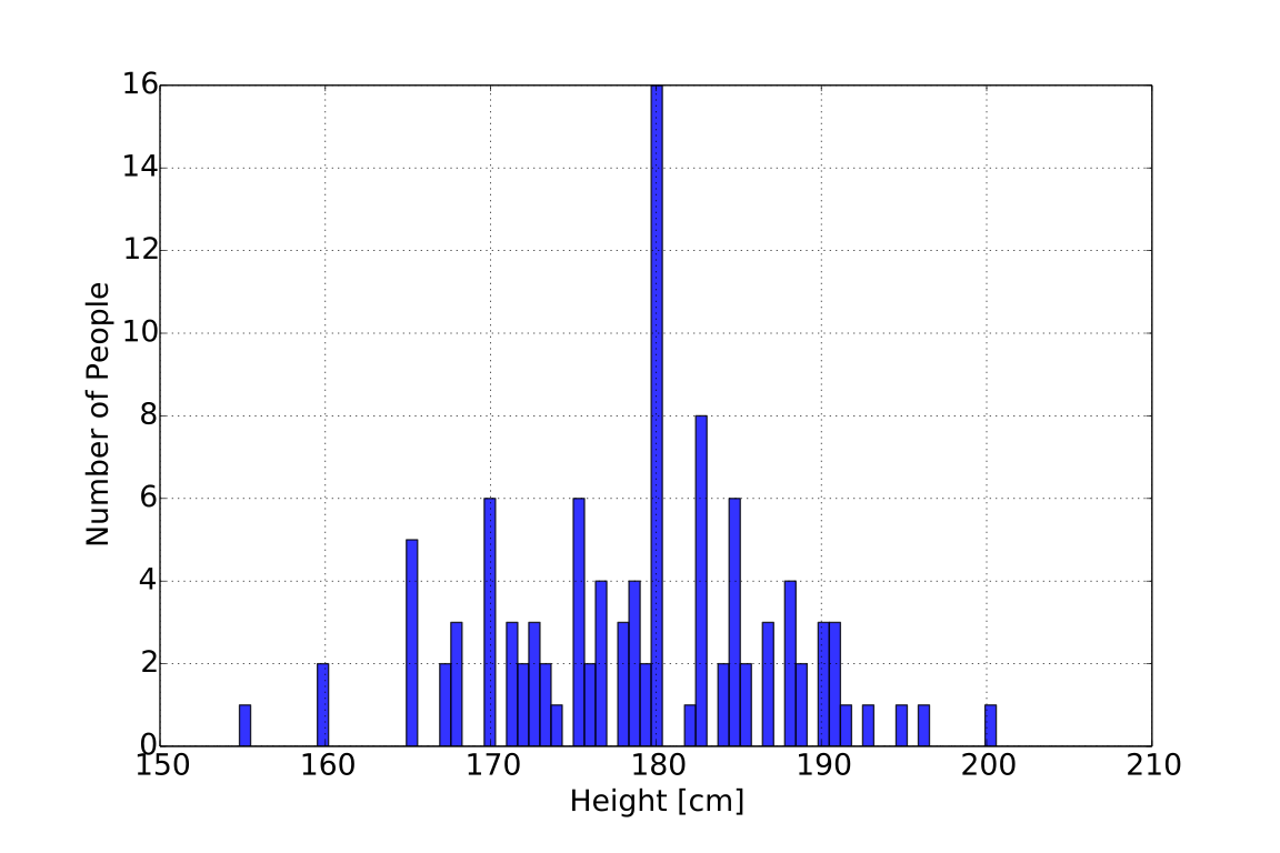
We lose any of the summary information here, where we essentially have one bar for each data-point.
Scatter Plots
A scatter plot is used to explore the relationship between two values. For example, in the survey of male students, in addition to height the students also measured the width of their writing hand viewed as a histogram, here
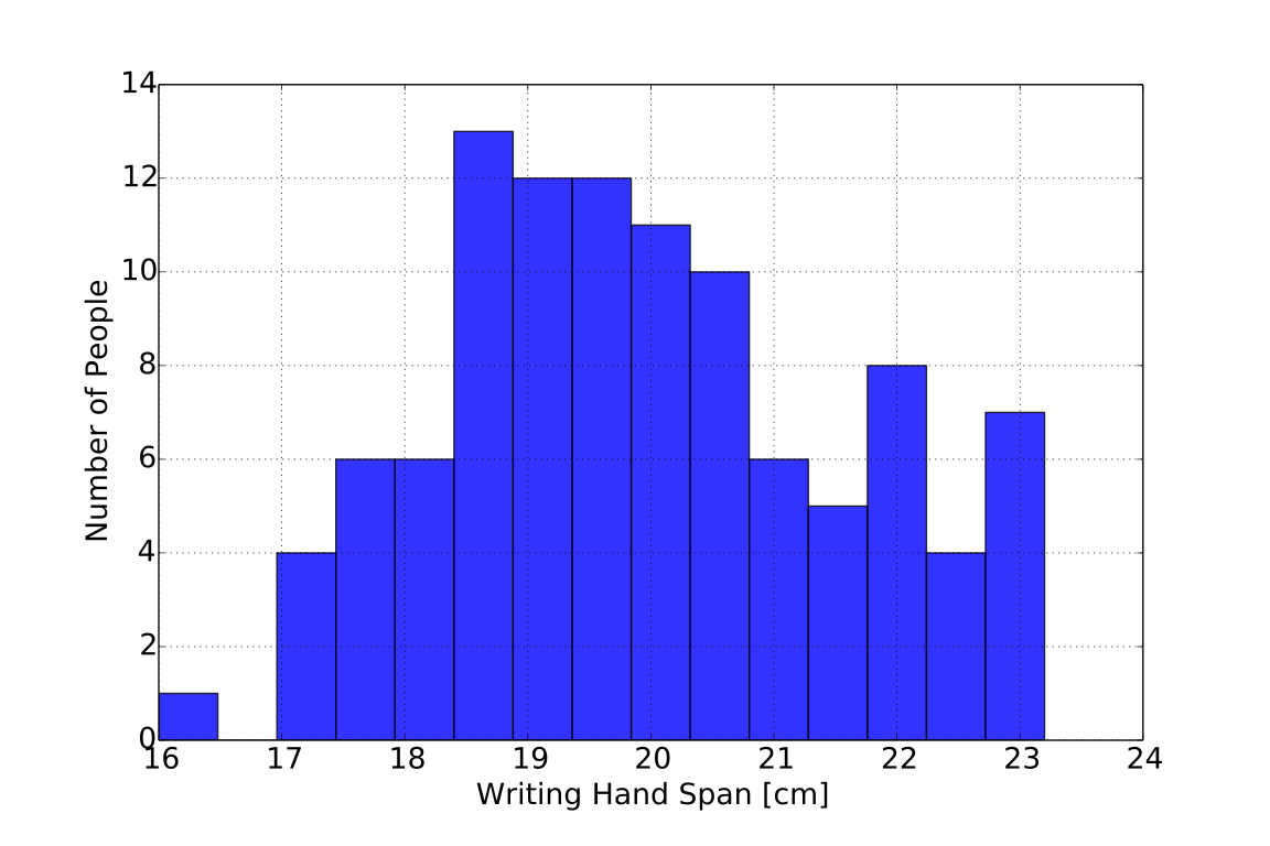
However, due to the possibility that these two variables could be related, it makes more sense to make a scatter plot. In such a plot, one designates one variable as “x” and another as “y,” and places a single dot for each pair of values in the data set. Thus, each dot on the plot corresponds to height and hand-width for a single student.
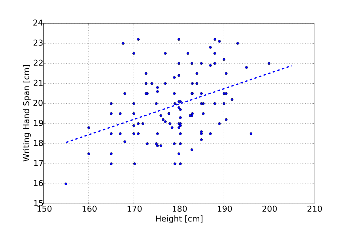
What we can see here, which was obscured with a histogram, is the relationship between these values - for the taller students, their hands are wider. We will explore quantifying this relationship later, but much can be done by eye using a scatter plot.
Adapted from Statistical Inference for Everyone, by Brian Blais (Bryant University), licensed under CC BY-SA 4.0 (dual-licensed under the GNU FDL 1.2 or later; this adaptation uses the CC BY-SA grant). Changes were made; this adaptation is distributed under the same license. License: CC-BY-SA-4.0.