
11.6 Exercises
Skills
- The table below shows scores on a Math test.
- Complete the frequency table for the Math test scores
- Construct a histogram of the data
- Construct a pie chart of the data
| 80 | 50 | 50 | 90 | 70 | 70 | 100 | 60 | 70 | 80 | 70 | 50 |
|---|---|---|---|---|---|---|---|---|---|---|---|
| 90 | 100 | 80 | 70 | 30 | 80 | 80 | 70 | 100 | 60 | 60 | 50 |
- A group of adults where asked how many cars they had in their household
- Complete the frequency table for the car number data
- Construct a histogram of the data
- Construct a pie chart of the data
| 1 | 4 | 2 | 2 | 1 | 2 | 3 | 3 | 1 | 4 | 2 | 2 |
|---|---|---|---|---|---|---|---|---|---|---|---|
| 1 | 2 | 1 | 3 | 2 | 2 | 1 | 2 | 1 | 1 | 1 | 2 |
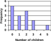 A group of adults were asked how many children they have in their families. The bar graph to the right shows the number of adults who indicated each number of children.
- How many adults where questioned?
- What percentage of the adults questioned had 0 children?
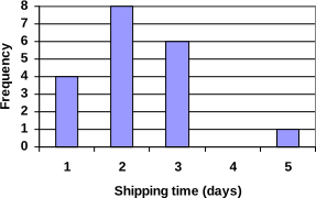
- Jasmine was interested in how many days it would take an order from Netflix to arrive at her door. The graph below shows the data she collected.
- How many movies did she order?
- What percentage of the movies arrived in one day?
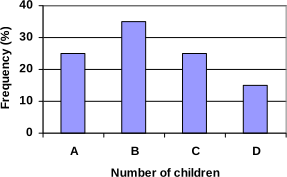
- The bar graph below shows the percentage of students who received each letter grade on their last English paper. The class contains 20 students. What number of students earned an A on their paper?
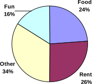
- Kori categorized her spending for this month into four categories: Rent, Food, Fun, and Other. The percents she spent in each category are pictured here. If she spent a total of $2600 this month, how much did she spend on rent?
- A group of diners were asked how much they would pay for a meal. Their responses were: $7.50, $8.25, $9.00, $8.00, $7.25, $7.50, $8.00, $7.00.
- Find the mean
- Find the median
- Write the 5-number summary for this data
- Find the standard deviation of this data
- You recorded the time in seconds it took for 8 participants to solve a puzzle. The times were: 15.2, 18.8, 19.3, 19.7, 20.2, 21.8, 22.1, 29.4.
- Find the mean
- Find the median
- Write the 5-number summary for this data
- Find the standard deviation of this data
- Refer back to the histogram from question #3.
- Compute the mean number of children for the group surveyed
- Compute the median number of children for the group surveyed
- Write the 5-number summary for this data.
- Create box plot.
- Refer back to the histogram from question #4.
- Compute the mean number of shipping days
- Compute the median number of shipping days
- Write the 5-number summary for this data.
- Create box plot.
Concepts
- The box plot below shows salaries for Actuaries and CPAs. Kendra makes the median salary for an Actuary. Kelsey makes the first quartile salary for a CPA. Who makes more money? How much more?
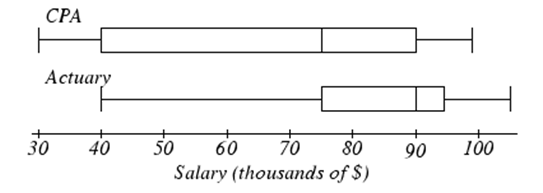
- Referring to the boxplot above, what percentage of actuaries makes more than the median salary of a CPA?
Exploration
- Studies are often done by pharmaceutical companies to determine the effectiveness of a treatment program. Suppose that a new AIDS antibody drug is currently under study. It is given to patients once the AIDS symptoms have revealed themselves. Of interest is the average length of time in months patients live once starting the treatment. Two researchers each follow a different set of 40 AIDS patients from the start of treatment until their deaths. The following data (in months) are collected.
Researcher 1: 3; 4; 11; 15; 16; 17; 22; 44; 37; 16; 14; 24; 25; 15; 26; 27; 33; 29; 35; 44; 13; 21; 22; 10; 12; 8; 40; 32; 26; 27; 31; 34; 29; 17; 8; 24; 18; 47; 33; 34
Researcher 2: 3; 14; 11; 5; 16; 17; 28; 41; 31; 18; 14; 14; 26; 25; 21; 22; 31; 2; 35; 44; 23; 21; 21; 16; 12; 18; 41; 22; 16; 25; 33; 34; 29; 13; 18; 24; 23; 42; 33; 29
- Create comparative histograms of the data
- Create comparative boxplots of the data
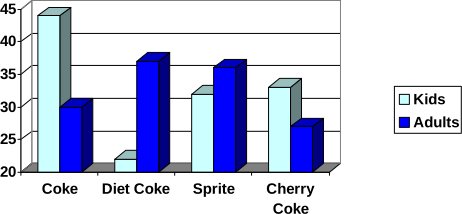
- A graph appears below showing the number of adults and children who prefer each type of soda. There were 130 adults and kids surveyed. Discuss some ways in which the graph below could be improved
- Make up three data sets with 5 numbers each that have:
- the same mean but different standard deviations.
- the same mean but different medians.
- the same median but different means.
- A sample of 30 distance scores measured in yards has a mean of 7, a variance of 16, and a standard deviation of 4.
- You want to convert all your distances from yards to feet, so you multiply each score in the sample by 3. What are the new mean, median, variance, and standard deviation?
- You then decide that you only want to look at the distance past a certain point. Thus, after multiplying the original scores by 3, you decide to subtract 4 feet from each of the scores. Now what are the new mean, median, variance, and standard deviation?
- In your class, design a poll on a topic of interest to you and give it to the class.
- Summarize the data, computing the mean and five-number summary.
- Create a graphical representation of the data.
- Write several sentences about the topic, using your computed statistics as evidence in your writing.
Adapted from Math in Society by David Lippman, hosted on LibreTexts (math.libretexts.org) and licensed under CC BY-SA 3.0. Changes were made. License: CC-BY-SA-3.0.