Quantitative, or numerical, data can also be summarized into frequency tables.
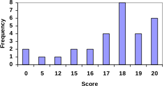
Using this table, it would be possible to create a standard bar chart from this summary, like we did for categorical data:
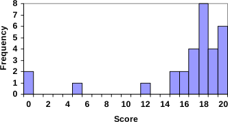
However, since the scores are numerical values, this chart doesn’t really make sense; the first and second bars are five values apart, while the later bars are only one value apart. It would be more correct to treat the horizontal axis as a number line. This type of graph is called a histogram.
Notice that in the histogram, a bar represents values on the horizontal axis from that on the left hand-side of the bar up to, but not including, the value on the right hand side of the bar. Some people choose to have bars start at ½ values to avoid this ambiguity.
Unfortunately, not a lot of common software packages can correctly graph a histogram. About the best you can do in Excel or Word is a bar graph with no gap between the bars and spacing added to simulate a numerical horizontal axis.
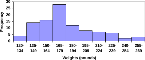
If we have a large number of widely varying data values, creating a frequency table that lists every possible value as a category would lead to an exceptionally long frequency table, and probably would not reveal any patterns. For this reason, it is common with quantitative data to group data into class intervals.
In many software packages, you can create a graph similar to a histogram by putting the class intervals as the labels on a bar chart.
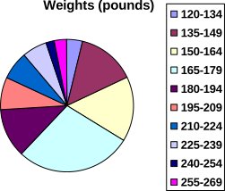
Other graph types such as pie charts are possible for quantitative data. The usefulness of different graph types will vary depending upon the number of intervals and the type of data being represented. For example, a pie chart of our weight data is difficult to read because of the quantity of intervals we used.
When collecting data to compare two groups, it is desirable to create a graph that compares quantities.
Adapted from Math in Society by David Lippman, hosted on LibreTexts (math.libretexts.org) and licensed under CC BY-SA 3.0. Changes were made. License: CC-BY-SA-3.0.
These eBooks are a prerelease and are not yet certified conformant with WCAG 2.1 AA or any other accessibility standard. Every page is built against an automated accessibility gate, and our target for the published editions is WCAG 2.2 Level AA. If something is unusable, please tell us.