Categorical, or qualitative, data are pieces of information that allow us to classify the objects under investigation into various categories. We usually begin working with categorical data by summarizing the data into a frequency table.
Sometimes we need an even more intuitive way of displaying data. This is where charts and graphs come in. There are many, many ways of displaying data graphically, but we will concentrate on one very useful type of graph called a bar graph. In this section we will work with bar graphs that display categorical data; the next section will be devoted to bar graphs that display quantitative data.
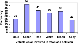
To construct a bar graph, we need to draw a vertical axis and a horizontal axis. The vertical direction will have a scale and measure the frequency of each category; the horizontal axis has no scale in this instance. The construction of a bar chart is most easily described by use of an example.
Notice that the height of each bar is determined by the frequency of the corresponding color. The horizontal gridlines are a nice touch, but not necessary. In practice, you will find it useful to draw bar graphs using graph paper, so the gridlines will already be in place, or using technology. Instead of gridlines, we might also list the frequencies at the top of each bar, like this:
In this case, our chart might benefit from being reordered from largest to smallest frequency values. This arrangement can make it easier to compare similar values in the chart, even without gridlines. When we arrange the categories in decreasing frequency order like this, it is called a Pareto chart.
To show relative sizes, it is common to use a pie chart.
Pie charts look nice, but are harder to draw by hand than bar charts since to draw them accurately we would need to compute the angle each wedge cuts out of the circle, then measure the angle with a protractor. Computers are much better suited to drawing pie charts. Common software programs like Microsoft Word or Excel, OpenOffice.org Write or Calc, or Google Docs are able to create bar graphs, pie charts, and other graph types. There are also numerous online tools that can create graphs[2].
Don’t get fancy with graphs! People sometimes add features to graphs that don’t help to convey their information. For example, 3-dimensional bar charts like the one shown below are usually not as effective as their two-dimensional counterparts.
Here is another way that fanciness can lead to trouble. Instead of plain bars, it is tempting to substitute meaningful images. This type of graph is called a pictogram.
Another distortion in bar charts results from setting the baseline to a value other than zero. The baseline is the bottom of the vertical axis, representing the least number of cases that could have occurred in a category. Normally, this number should be zero.
Adapted from Math in Society by David Lippman, hosted on LibreTexts (math.libretexts.org) and licensed under CC BY-SA 3.0. Changes were made. License: CC-BY-SA-3.0.
These eBooks are a prerelease and are not yet certified conformant with WCAG 2.1 AA or any other accessibility standard. Every page is built against an automated accessibility gate, and our target for the published editions is WCAG 2.2 Level AA. If something is unusable, please tell us.

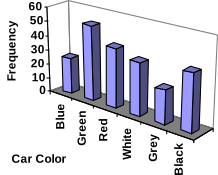 Don’t get fancy with graphs! People sometimes add features to graphs that don’t help to convey their information. For example, 3-dimensional bar charts like the one shown below are usually not as effective as their two-dimensional counterparts.