
15.5 Data visualization
Learning objectives
By the end of this section you should be able to
- Explain why visualization has an important role in data science.
- Choose appropriate visualization for a given task.
- Use Python visualization libraries to create data visualization.
Why visualization?
Data visualization has a crucial role in data science for understanding the data. Data visualization can be used in all steps of the data science life cycle to facilitate data exploration, identify anomalies, understand relationships and trends, and produce reports. Several visualization types are commonly used:
| Visualization type | Description | Benefits/common usage |
|---|---|---|
| Bar plot | Rectangular bars | Compare values across different categories. |
| Line plot | A series of data points connected by line segments | Visualize trends and changes. |
| Scatter plot | Individual data points representing the relationship between two variables | Identify correlations, clusters, and outliers. |
| Histogram plot | Rectangular bars representing the distribution of a continuous variable by dividing the variable's range into bins and representing the frequency or count of data within each bin | Summarizing the distribution of the data. |
| Box plot | Rectangular box with whiskers that summarize the distribution of a continuous variable, including the median, quartiles, and outliers | Summarizing the distribution of the data and comparing different variables. |
Data visualization tools
Many Python data visualization libraries exist that offer a range of capabilities and features to create different plot types. Some of the most commonly used frameworks are Matplotlib, Plotly, and Seaborn. Here, some useful functionalities of Matplotlib are summarized.
| Plot type | Method |
|---|---|
| Bar plot | The plt.bar(x, height) function takes in two inputs, x and height, and plots bars for each x value with the height given in the height variable. |
| Example | Output |
import matplotlib.pyplot as plt

# Data
categories = ["Course A", "Course B", "Course C"]
values = [25, 40, 30]

# Create the bar chart
fig = plt.bar(categories, values)

# Customize the chart
plt.title("Number of students in each course')
plt.xlabel("Courses")
plt.ylabel("Number of students")

# Display the chart
plt.show | 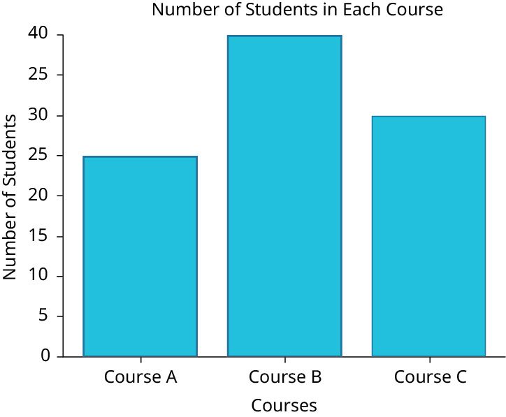 |
| Plot type | Method |
|---|---|
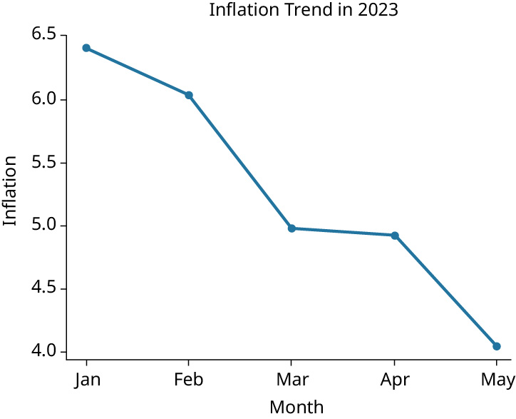
| Line plot | The plt.plot(x, y) function takes in two inputs, x and y, and plots lines connecting pairs of (x, y) values. |
| Example | Output |
import matplotlib.pyplot as plt

# Data
month = ["Jan", "Feb", "Mar", "Apr", "May"]
inflation = [6.41, 6.04, 4.99, 4.93, 4.05]

# Create the line chart
plt.plot(month, inflation, marker="o",
linestyle="-", color="blue")

# Customize the chart
plt.title("Inflation trend in 2023")
plt.xlabel("Month")
plt.ylabel("Inflation")

# Display the chart
plt.show
|  |
| Plot type | Method |
|---|---|
| Scatter plot | The plt.scatter(x, y) function takes in two inputs, x and y, and plots points representing (x, y) pairs. |
| Example | Output |
import matplotlib.pyplot as plt

# Data
x = [1, 2, 3, 4, 5, 6, 7, 8, 9, 10]
y = [10, 8, 6, 4, 2, 5, 7, 9, 3, 1]

# Create the scatter plot
plt.scatter(x, y, marker="o", color="blue")

# Customize the chart
plt.title("Scatter Plot Example")
plt.xlabel("X")
plt.ylabel("Y")

# Display the chart
plt.show | 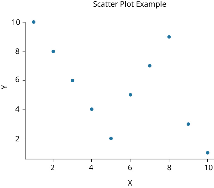 |
| Plot type | Method |
|---|---|
| Histogram plot | The plt.hist(x) function takes in one input, x, and plots a histogram of values in x to show distribution or trend. |
| Example | Output |
import matplotlib.pyplot as plt
import numpy as np

# Data: random 1000 samples
data = np.random.randn(1000)

# Create the histogram
plt.hist(data, bins=30, edgecolor="black")

# Customize the chart
plt.title("Histogram of random values")
plt.xlabel("Values")
plt.ylabel("Frequency")

# Display the chart
plt.show | 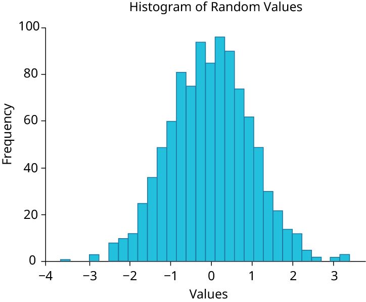 |
| Plot type | Method |
|---|---|
| Box plot | The plt.boxplot(x) function takes in one input, x, and represents minimum, maximum, first, second, and third quartiles, as well as outliers in x. |
| Example | Output |
import matplotlib.pyplot as plt
import numpy as np

# Data: random 100 samples
data = [np.random.normal(0, 5, 100)]

# Create the box plot
plt.boxplot(data)

# Customize the chart
plt.title("Box Plot of random values")
plt.xlabel("Data Distribution")
plt.ylabel("Values")

# Display the chart
plt.show | 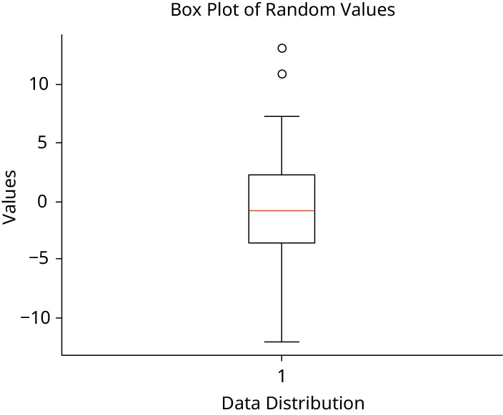 |
Programming practice with Google
Use the Google Colaboratory document below to practice a visualization task on a given dataset.
Adapted from Introduction to Python Programming by OpenStax (openstax.org), licensed under CC BY-NC-SA 4.0. Changes were made. License: CC-BY-NC-SA-4.0.