
1.5 Data Science with Python
Learning Outcomes
By the end of this section, you should be able to
- Load data to Python.
- Perform basic data analysis using Python.
- Use visualization principles to graphically plot data using Python.
Multiple tools are available for writing and executing Python programs. Jupyter Notebook is one convenient and user-friendly tool. The next section explains how to set up the Jupyter Notebook environment using Google Colaboratory (Colab) and then provides the basics of two open-source Python libraries named Pandas and Matplotlib. These libraries are specialized for data analysis and data visualization, respectively.
Jupyter Notebook on Google Colaboratory
Jupyter Notebook is a web-based environment that allows you to run a Python program more interactively, using programming code, math equations, visualizations, and plain texts. There are multiple web applications or software you could use to edit a Jupyter Notebook, but in this textbook we will use Google’s free application named Google Colaboratory (Colab), often abbreviated as Colab. It is a cloud-based platform, which means that you can open, edit, run, and save a Jupyter Notebook on your Google Drive.
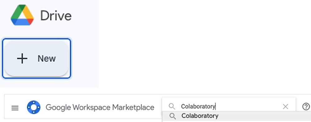
Setting up Colab is simple. On your Google Drive, click New > More. If your Google Drive has already installed Colab before, you will see Colaboratory under More. If not, click “Connect more apps” and install Colab by searching “Colaboratory” on the app store (Figure 1.15). For further information, see the Google Colaboratory Ecosystem animation.
Now click New > More > Google Laboratory. A new, empty Jupyter Notebook will show up as in Figure 1.16.
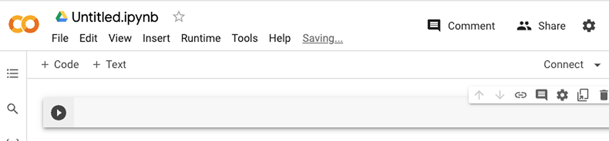
The gray area with the play button is called a cell. A cell is a block where you can type either code or plain text. Notice that there are two buttons on top of the first cell—“+ Code” and “+ Text.” These two buttons add a code or text cell, respectively. A code cell is for the code you want to run; a text cell is to add any text description or note.
Let’s run a Python program on Colab. Type the following code in a code cell.
You can write a Python program across multiple cells and put text cells in between. Colab would treat all the code cells as part of a single program, running from the top to bottom of the current Jupyter Notebook. For example, the two code cells below run as if it is a single program.
When running one cell at a time from the top, we see the following outputs under each cell.
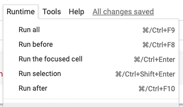
You can also run multiple cells in bulk. Click Runtime on the menu, and you will see there are multiple ways of running multiple cells at once (Figure 1.17). The two commonly used ones are “Run all” and “Run before.” “Run all” runs all the cells in order from the top; “Run before” runs all the cells before the currently selected one.
One thing to keep in mind is that being able to split a long program into multiple blocks and run one block at a time raises chances of user error. Let’s look at a modified code from the previous example.
The modified code has an additional cell at the end, updating a from 1 to 2. Notice that now a+b returns 5 as a has been changed to 2. Now suppose you need to run the second cell for some reason, so you run the second cell again.
The value of a has changed to 2. This implies that the execution order of each cell matters! If you have run the third cell before the second cell, the value of a will have the value from the third one even though the third cell is located below the second cell. Therefore, it is recommended to use “Run all” or “Run before” after you make changes across multiple cells of code. This way your code is guaranteed to run sequentially from the top.
Python Pandas
One of the strengths of Python is that it includes a variety of free, open-source libraries. Libraries are a set of already-implemented methods that a programmer can refer to, allowing a programmer to avoid building common functions from scratch.
Pandas is a Python library specialized for data manipulation and analysis, and it is very commonly used among data scientists. It offers a variety of methods, which allows data scientists to quickly use them for data analysis. You will learn how to analyze data using Pandas throughout this textbook.
Colab already has Pandas installed, so you just need to import Pandas and you are set to use all the methods in Pandas. Note that it is convention to abbreviate pandas to pd so that when you call a method from Pandas, you can do so by using pd instead of having to type out Pandas every time. It offers a bit of convenience for a programmer!
Load Data Using Python Pandas
The first step for data analysis is to load the data of your interest to your Notebook. Let’s create a folder on Google Drive where you can keep a CSV file for the dataset and a Notebook for data analysis. Download a public dataset, ch1-movieprofit.csv, and store it in a Google Drive folder. Then open a new Notebook in that folder by entering that folder and clicking New > More > Google Colaboratory.
Open the Notebook and allow it to access files in your Google Drive by following these steps:
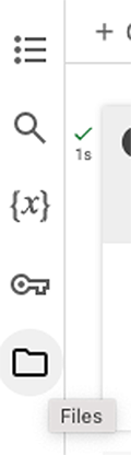
First, click the Files icon on the side tab (Figure 1.18).
Then click the Mount Drive icon (Figure 1.19) and select “Connect to Google Drive” on the pop-up window.
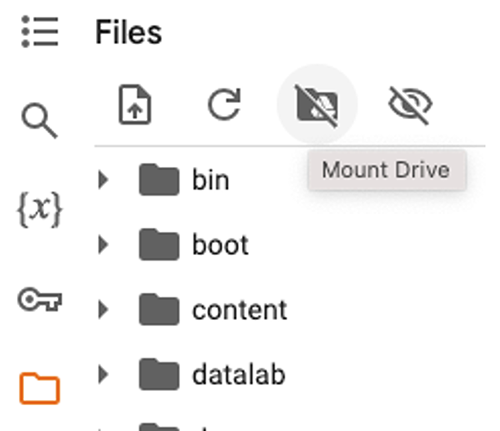
Notice that a new cell has been inserted on the Notebook as a result (Figure 1.20).
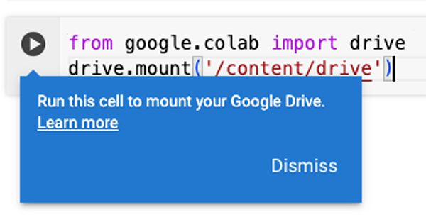
Connect your Google Drive by running the cell, and now your Notebook file can access all the files under content/drive. Navigate folders under drive to find your Notebook and ch1-movieprofit.csv files. Then click “…” > Copy Path (Figure 1.21).
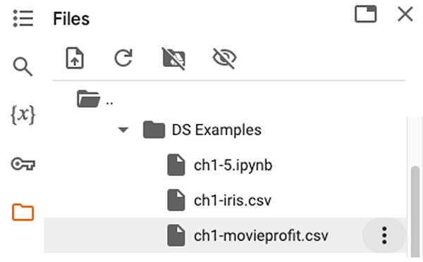
Now replace [Path] with the copied path in the below code. Run the code and you will see the dataset has been loaded as a table and stored as a Python variable data.
The read_csv method in Pandas loads a CSV file and stores it as a DataFrame. A DataFrame is a data type that Pandas uses to store multi-column tabular data. Therefore, the variable data holds the table in ch1-movieprofit.csv in the form of a Pandas DataFrame.
Summarize Data Using Python Pandas
You can compute basic statistics for data quite quickly by using the DataFrame.describe method. Add and run the following code in a new cell. It calls the describe method upon data, the DataFrame we defined earlier with ch1-movieprofit.csv.
describe returns a table whose columns are a subset of the columns in the entire dataset and whose rows are different statistics. The statistics include the number of unique values in a column (count), mean (mean), standard deviation (std), minimum and maximum values (min/max), and different quartiles (25%/50%/75%), which you will learn about in Measures of Variation. Using this representation, you can compute such statistics of different columns easily.
Select Data Using Python Pandas
The Pandas DataFrame allows a programmer to use the column name itself when selecting a column. For example, the following code prints all the values in the “US_Gross_Million” column in the form of a Series (remember the data from a single column is stored in the Series type in Pandas).
DataFrame.iloc enables a more powerful selection—it lets a programmer select by both column and row, using column and row indices. Let’s look at some code examples below.
To pinpoint a specific value within the “US_Gross_Million” column, you can use an index number.
You can also use DataFrame.iloc to select a specific group of cells on the table. The example code below shows different ways of using iloc. There are multiple ways of using iloc, but this chapter introduces a couple of common ones. You will learn more techniques for working with data throughout this textbook.
Search Data Using Python Pandas
To search for some data entries that fulfill specific criteria (i.e., filter), you can use DataFrame.loc of Pandas. When you indicate the filtering criteria inside the brackets,, the output returns the filtered rows within the DataFrame. For example, the code below filters out the rows whose genre is comedy. Notice that the output only has 307 out of the full 3,400 rows. You can check the output on your own, and you will see their Genre values are all “Comedy.”
Visualize Data Using Python Matplotlib
There are multiple ways to draw plots of data in Python. The most common and straightforward way is to import another library, Matplotlib, which is specialized for data visualization. Matplotlib is a huge library, and to draw the plots you only need to import a submodule named pyplot.
Type the following import statement in a new cell. Note it is convention to denote matplotlib.pyplot with plt, similarly to denoting Pandas with pd.
Matplotlib offers a method for each type of plot, and you will learn the Matplotlib methods for all of the commonly used types throughout this textbook. In this chapter, however, let’s briefly look at how to draw a plot using Matplotlib in general.
Suppose you want to draw a scatterplot between “US_Gross_Million” and “Worldwide_Gross_Million” of the movie profit dataset (ch1-movieprofit.csv). You will investigate scatterplots in more detail in Correlation and Linear Regression Analysis. The example code below draws such a scatterplot using the method scatter. scatter takes the two columns of your interest—data["US_Gross_Million"] and data["Worldwide_Gross_Million"]—as the inputs and assigns them for the x- and y-axes, respectively.
Notice that it simply has a set of dots on a white plane. The plot itself does not show what each axis represents, what this plot is about, etc. Without them, it is difficult to capture what the plot shows. You can set these with the following code. The resulting plot below indicates that there is a positive correlation between domestic gross and worldwide gross.
You can also change the range of numbers along the x- and y-axes with plt.xlim and plt.ylim. Add the following two lines of code to the cell in the previous Python code example, which plots the scatterplot.
The resulting plot with the additional lines of code has a narrower range of values along the x- and y-axes.
Project A: Data Source Quality
As a student of, or a new professional working in, data science, you will not always be collecting new primary data. It’s just as important to be able to locate, critically evaluate, and properly clean existing sources of secondary data. (Collecting and Preparing Data will cover the topic of data collection and cleaning in more detail.)
Some reputable government data sources are:
Data.gov
Bureau of Labor Statistics (BLS)
National Oceanic and Atmospheric Administration (NOAA)
Some reputable nongovernment data sources are:
Kaggle
Statista
Pew Research Center
Using the suggested sources or similar-quality sources that you research on the Internet, find two to three datasets about the field or industry in which you intend to work. (You might also try to determine whether similar data sets are available at the national, state/province, and local/city levels.) In a group, formulate a specific, typical policy issue or business decision that managers in these organizations might make. For the datasets you found, compare and contrast their size, collection methods, types of data, update frequency and recency, and relevance to the decision question you have identified.
Project B: Data Visualization
Using one of the data sources mentioned in the previous project, find a dataset that interests you. Download it as a CSV file. Use Python to read in the CSV file as a Pandas DataFrame. As a group, think of a specific question that might be addressed using this dataset, discuss which features of the data seem most important to answer your question, and then use the Python libraries Pandas and Matplotlib to select the features and make graphs that might help to answer your question about the data. Note, you will learn many sophisticated techniques for doing data analysis in later chapters, but for this project, you should stick to simply isolating some data and visualizing it using the tools present in this chapter. Write a brief report on your findings.
Project C: Privacy, Ethics, and Bias
Identify at least one example from recent current events or news articles that is related to each of the following themes (starting references given in parentheses):
- Privacy concerns related to data collection (See the Protecting Personal Privacy website of the U.S. Government Accountability Office.)
- Ethics concerns related to data collection, including fair use of copyrighted materials (See the U.S. Copyright Office guidelines.)
- Bias concerns related to data collection (See the National Cancer Institute (NCI) article on data bias.)
Suppose that you are part of a data science team working for an organization on data collection for a major project or product. Discuss as a team how the issues of privacy, ethics, and equity (avoiding bias) could be addressed, depending on your position in the organization and the type of project or product.
Anaconda. (2020). 2020 state of data science. https://www.anaconda.com/resources/whitepapers/state-of-data-science-2020
Clewlow, A. (2024, January 26). Three smart cities that failed within five years of launch. Intelligent Build.tech. https://www.intelligentbuild.tech/2024/01/26/three-smart-cities-that-failed-within-five-years-of-launch/
Hays, C. L. (2004, November 14). What Wal-Mart knows about customers’ habits. New York Times. https://www.nytimes.com/2004/11/14/business/yourmoney/what-walmart-knows-about-customers-habits.html
Herrington, D. (2023, July 31). Amazon is delivering its largest selection of products to U.S. Prime members at the fastest speeds ever. Amazon News. https://www.aboutamazon.com/news/operations/doug-herrington-amazon-prime-delivery-speed
Hitachi. (2023, February 22). Ag Automation and Hitachi drive farming efficiency with sustainable digital solutions. Hitachi Social Innovation. https://social-innovation.hitachi/en-us/case_studies/digital-solutions-in-agriculture-drive-sustainability-in-farming/
IABAC. (2023, September 20). Fraud detection through data analytics: Identifying anomalies and patterns. International Association of Business Analytics Certification. https://iabac.org/blog/fraud-detection-through-data-analytics-identifying-anomalies-and-patterns
Statista. (2024, May 10). Walmart: weekly customer visits to stores worldwide FY2017-FY2024. https://www.statista.com/statistics/818929/number-of-weekly-customer-visits-to-walmart-stores-worldwide/
Van Bocxlaer, A. (2020, 20 August). Sensors for a smart city. RFID & Wireless IoT. https://www.rfid-wiot-search.com/rfid-wiot-global-sensors-for-a-smart-city
Adapted from Principles of Data Science by OpenStax (openstax.org), licensed under CC BY-NC-SA 4.0. Changes were made. License: CC-BY-NC-SA-4.0.