
8.2 Contour Plots
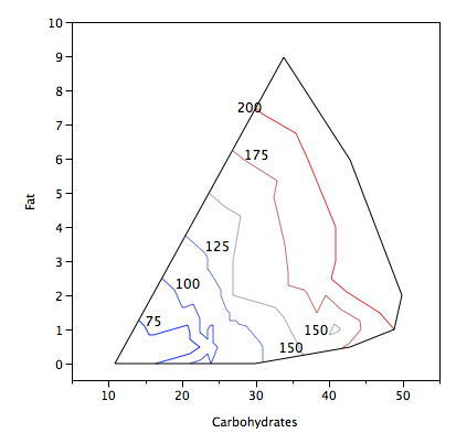
Contour plots portray data for three variables in two dimensions. The plot contains a number of contour lines. Each contour line is shown in an X-Y plot and has a constant value on a third variable. Consider the Figure 1 that contains data on the fat, non-sugar carbohydrates, and calories present in a variety of breakfast cereals. Each line shows the carbohydrate and fat levels for cereals with the same number of calories. Note that the number of calories is not determined exactly by the fat and non-sugar carbohydrates since cereals also differ in sugar and protein.
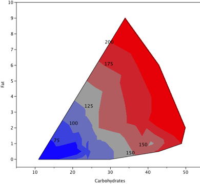
An alternative way to draw the plot is shown in Figure 2. The areas with the same number of calories are shaded.
Contour plots are used in many disciplines. For example, in cartography, contour lines can indicate areas of equal elevation, whereas in meteorological maps, contour lines can show equal temperature or equal barometric pressure.
Application in Geology
Application in Meteorology
Adapted from Online Statistics Education: A Multimedia Course of Study (onlinestatbook.com), Project Leader: David M. Lane, Rice University. Developed with NSF support. The original work is in the public domain; it is cited here at the authors' request. Changes were made: reformatted as an accessible XYZ web edition with native MathML. License: Public-Domain.