
9.3 Graphing the means
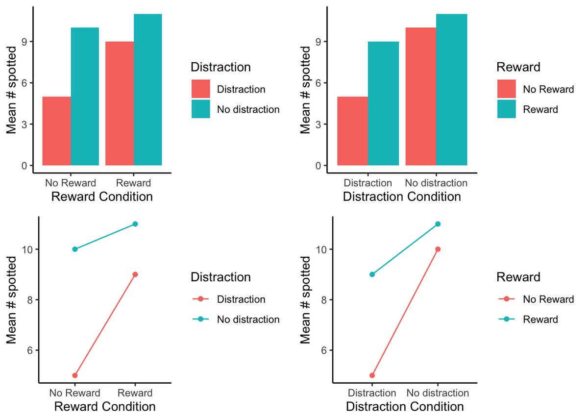
In our example above we showed you two bar graphs of the very same means for our 2x2 design. Even though the graphs plot identical means, they look different, so they are more or less easy to interpret by looking at them. Results from 2x2 designs are also often plotted with line graphs. Those look different too. There are four different graphs in Figure 9.7, using bars and lines to plot the very same means from before. We are showing you this so that you realize how you graph your data matters because it makes it more or less easy for people to understand the results. Also, how the data is plotted matters for what you need to look at to interpret the results.
Adapted from Answering Questions with Data: Introductory Statistics for Psychology Students, by Matthew J. C. Crump (Brooklyn College of CUNY), crumplab.com/statistics, licensed under CC BY-SA 4.0. Portions adapt Danielle Navarro's Learning Statistics with R (CC BY-SA). Changes were made; this adaptation is distributed under the same license. License: CC-BY-SA-4.0.