
14.4 Visualization
Example: The dataset below (URL) contains students test1_score, test2_score,test3_score, gender, level, section etc.
Write a program to display a frequency bar graph for gender.
my_csv_file.csv
Bar graphs
Data: Download my_csv_file.csv (CSV, 7 KB)
import pandas as pd

url='my_csv_file.csv'

x_df = pd.read_csv(url)
x_df.groupby(['gender']).size().plot(kind='bar')
import matplotlib.pyplot as plt
plt.suptitle("Bar Graph")
plt.ylabel("Frequency")Show source-edition output (different dataset)
Text(0, 0.5, 'Frequency')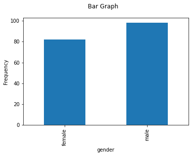
Example: The dataset below (URL) contains students test1_score, test2_score,test3_score, gender, level, section etc.
Write a program to display a frequency pie chart for section.
my_csv_file.csv
Pie Chart
import pandas as pd

url='my_csv_file.csv'

x_df = pd.read_csv(url)
x_df.groupby(['section']).size().plot(kind='pie')
import matplotlib.pyplot as plt
plt.suptitle("Pie Chart")
plt.ylabel("sections")Show source-edition output (different dataset)
Text(0, 0.5, 'sections')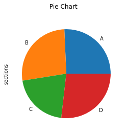
Example: The dataset below (URL) contains students test1_score, test2_score,test3_score, gender, level, section etc.
Write a program to display a box plot for test1_socre.
my_csv_file.csv
Box Plots
import pandas as pd

url='my_csv_file.csv'

x_df = pd.read_csv(url)
x_df.boxplot(column=['test1_score'], showmeans = True)Show source-edition output (different dataset)
<matplotlib.axes._subplots.AxesSubplot at 0x7f9c424fd650>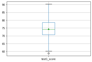
Example: The dataset below (URL) contains students test1_score, test2_score,test3_score, gender, level, section etc.
Write a program to display box plot for test1_score grouped by level.
my_csv_file.csv
import pandas as pd

url='my_csv_file.csv'

x_df = pd.read_csv(url)
x_df.boxplot(column=['test1_score'], by = ['level'], showmeans = True, vert = False)Show source-edition output (different dataset)
<matplotlib.axes._subplots.AxesSubplot at 0x7f9c329f73d0>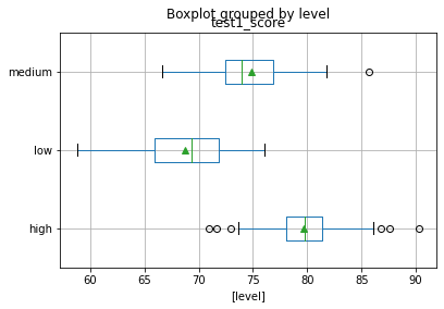
Example: The dataset below (URL) contains students test1_score, test2_score,test3_score, gender, level, section etc.
Write a program to display box plot for test1_score grouped by gender.
my_csv_file.csv
import pandas as pd

url='my_csv_file.csv'

x_df = pd.read_csv(url)
x_df.boxplot(column=['test1_score'], by = ['gender'], showmeans = True, vert = False,)Show source-edition output (different dataset)
/usr/local/lib/python3.7/dist-packages/numpy/core/_asarray.py:83: VisibleDeprecationWarning:

Creating an ndarray from ragged nested sequences (which is a list-or-tuple of lists-or-tuples-or ndarrays with different lengths or shapes) is deprecated. If you meant to do this, you must specify 'dtype=object' when creating the ndarray

<matplotlib.axes._subplots.AxesSubplot at 0x7f9c32a1de10>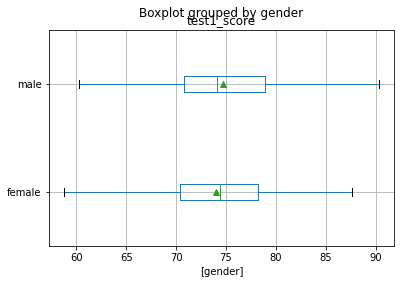
Alternative solution to the above example using the seaborn visualization library
import pandas as pd
import seaborn as sns
sns.set_theme(style="ticks", palette="pastel")

# Load the example tips dataset
url='my_csv_file.csv'

x_df = pd.read_csv(url)

sns.boxplot(x="test1_score", y="gender", hue_order="smoker", palette=["m", "g"], data=x_df)
sns.despine(offset=10, trim=True)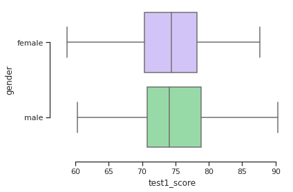
Example: The dataset below (URL) contains students test1_score, test2_score,test3_score, gender, level, section etc.
Write a program to display a histogram for test1_score with 6 bins(classes).
my_csv_file.csv
Histograms
import pandas as pd

url='my_csv_file.csv'

x_df = pd.read_csv(url)
x_df.test1_score.hist(bins=10, ec='k')Show source-edition output (different dataset)
<matplotlib.axes._subplots.AxesSubplot at 0x7f8fcd56bf50>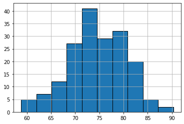
Scatter plots
Example: The dataset in the website (URL below) includes 20 columns about home sale, including price, number of bedrooms and bathrooms, areas etc. The data includes 21,613 entries.
- Write a program to read the dataset and display the basic information.
- Write a program to display a scatter plot of
sqft_livingandprice. - Write a program to display a scatter plot of
bathroomsandbedrooms
kc_house_data.csv
Data: Download kc_house_data.csv (CSV, 2.4 MB)
import pandas as pd

url = 'kc_house_data.csv'

x_df = pd.read_csv(url)

x_df.info()
Show source-edition output (different dataset)
<class 'pandas.core.frame.DataFrame'>
RangeIndex: 21613 entries, 0 to 21612
Data columns (total 21 columns):
 #   Column         Non-Null Count  Dtype
---  ------         --------------  -----
 0   id             21613 non-null  int64
 1   date           21613 non-null  object
 2   price          21613 non-null  float64
 3   bedrooms       21613 non-null  int64
 4   bathrooms      21613 non-null  float64
 5   sqft_living    21613 non-null  int64
 6   sqft_lot       21613 non-null  int64
 7   floors         21613 non-null  float64
 8   waterfront     21613 non-null  int64
 9   view           21613 non-null  int64
 10  condition      21613 non-null  int64
 11  grade          21613 non-null  int64
 12  sqft_above     21613 non-null  int64
 13  sqft_basement  21613 non-null  int64
 14  yr_built       21613 non-null  int64
 15  yr_renovated   21613 non-null  int64
 16  zipcode        21613 non-null  int64
 17  lat            21613 non-null  float64
 18  long           21613 non-null  float64
 19  sqft_living15  21613 non-null  int64
 20  sqft_lot15     21613 non-null  int64
dtypes: float64(5), int64(15), object(1)
memory usage: 3.5+ MB
Example: The dataset in the website (URL below) includes 20 columns about home sale, including price, number of bedrooms and bathrooms, areas etc. The data includes 21,613 entries.
Write a program to display a scatter plot of sqft_living and price.
kc_house_data.csv
import pandas as pd

url = 'kc_house_data.csv'

x_df = pd.read_csv(url)
x_df.plot('sqft_living','price',style='o', xlabel='Living Room Square Foot', ylabel='Price in Millions')Show source-edition output (different dataset)
<matplotlib.axes._subplots.AxesSubplot at 0x7f8fcd489c90>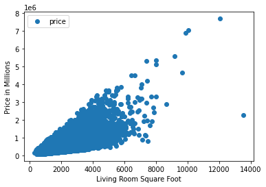
Example: The dataset in the website (URL below) includes 20 columns about home sale, including price, number of bedrooms and bathrooms, areas etc. The data includes 21,613 entries.
Write a program to display a scatter plot of bathrooms and bedrooms
kc_house_data.csv
import pandas as pd

url = 'kc_house_data.csv'

x_df = pd.read_csv(url)x_df.plot('bathrooms','bedrooms',style='o')Show source-edition output (different dataset)
<matplotlib.axes._subplots.AxesSubplot at 0x7f9c323b21d0>
Adapted from Python for Introductory Statistics, by Simon Aman (Truman College, City Colleges of Chicago), licensed under CC BY 4.0. Changes were made: reformatted as an accessible XYZ web edition with live in-browser code cells. License: CC-BY-4.0.