
3.4 Examples with Data
In the lab for correlation you will be shown how to compute correlations in real data-sets using software. To give you a brief preview, let’s look at some data from the world happiness report (2018).
This report measured various attitudes across people from different countries. For example, one question asked about how much freedom people thought they had to make life choices. Another question asked how confident people were in their national government. Figure 3.5 is a scatterplot showing the relationship between these two measures. Each dot represents one country in one year, from 2005 to 2017.
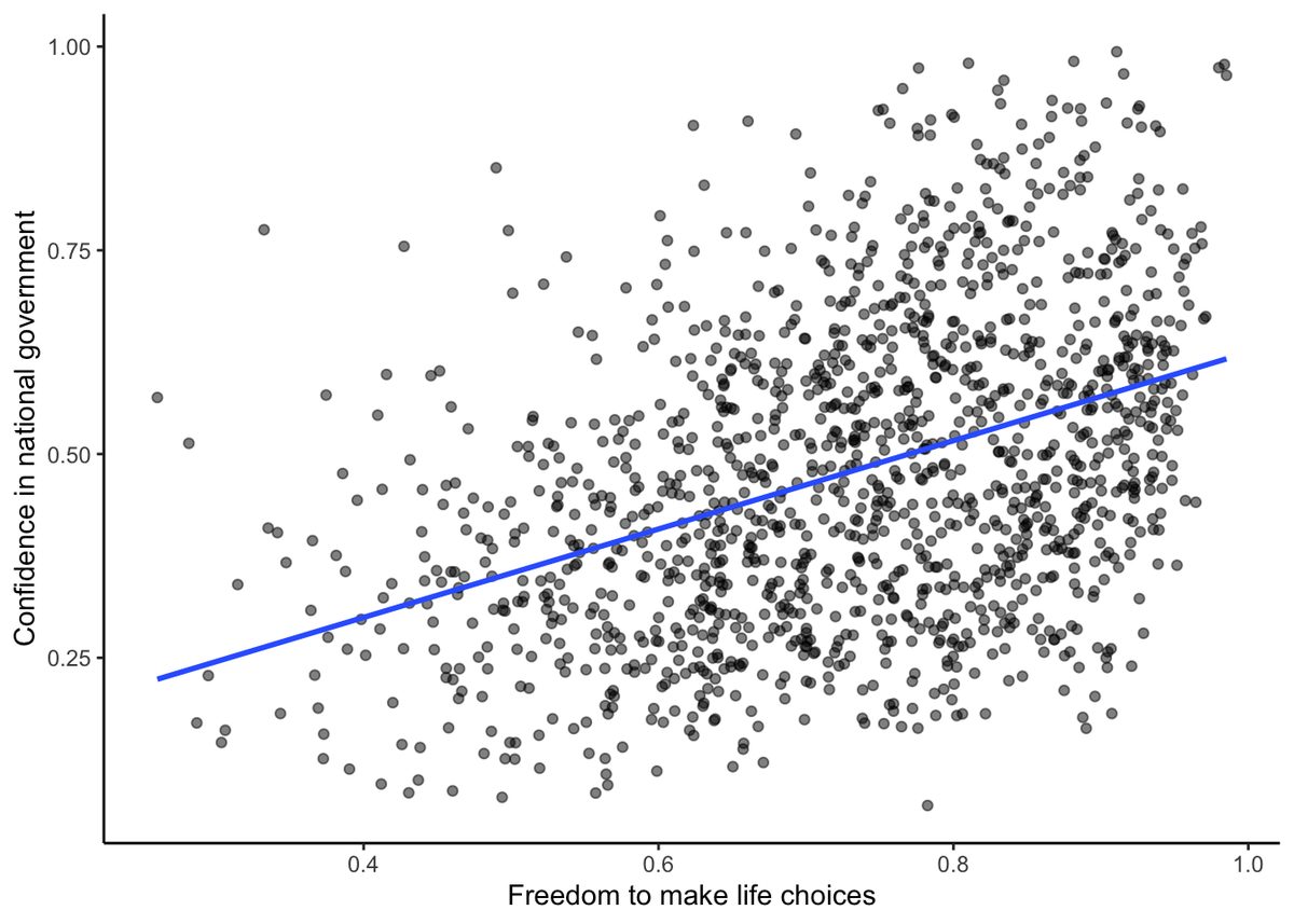
We put a blue line on the scatterplot to summarize the positive relationship. It appears that as “freedom to make life choices goes up”, so to does confidence in national government. It’s a positive correlation.
The actual correlation, as measured by Pearson’s is:
Show expected output
[1] 0.4080963You will do a lot more of this kind of thing in the lab. Looking at the graph you might start to wonder: Does freedom to make life choices cause changes how confident people are in their national government? Our does it work the other way? Does being confident in your national government give you a greater sense of freedom to make life choices? Or, is this just a random relationship that doesn’t mean anything? All good questions. These data do not provide the answers, they just suggest a possible relationship.
Adapted from Answering Questions with Data: Introductory Statistics for Psychology Students, by Matthew J. C. Crump (Brooklyn College of CUNY), crumplab.com/statistics, licensed under CC BY-SA 4.0. Portions adapt Danielle Navarro's Learning Statistics with R (CC BY-SA). Changes were made; this adaptation is distributed under the same license. License: CC-BY-SA-4.0.