
2.8 Remember to look at your data
Descriptive statistics are great and we will use them a lot in the course to describe data. You may suspect that descriptive statistics also have some short-comings. This is very true. They are compressed summaries of large piles of numbers. They will almost always be unable to represent all of the numbers fairly. There are also different kinds of descriptive statistics that you could use, and it sometimes not clear which one’s you should use.
Perhaps the most important thing you can do when using descriptives is to use them in combination with looking at the data in a graph form. This can help you see whether or not your descriptives are doing a good job of representing the data.
2.8.1 Anscombe’s Quartet
To hit this point home, and to get you thinking about the issues we discuss in the next chapter, check this out. It’s called Anscombe’s Quartet, because these interesting graphs and numbers and numbers were produced by Anscombe (1973). In Figure 2.5 you are looking at pairs of measurements. Each graph has an X and Y axis, and each point represents two measurements. Each of the graphs looks very different, right?
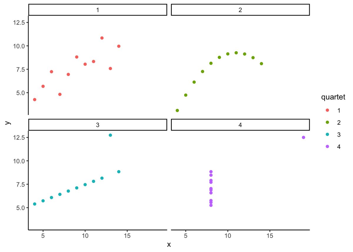
Well, would you be surprised if I told that the descriptive statistics for the numbers in these graphs are exactly the same? It turns out they do have the same descriptive statistics. In the table below I present the mean and variance for the x-values in each graph, and the mean and the variance for the y-values in each graph.
| quartet | mean_x | var_x | mean_y | var_y |
|---|---|---|---|---|
| 1 | 9 | 11 | 7.500909 | 4.127269 |
| 2 | 9 | 11 | 7.500909 | 4.127629 |
| 3 | 9 | 11 | 7.500000 | 4.122620 |
| 4 | 9 | 11 | 7.500909 | 4.123249 |
The descriptives are all the same! Anscombe put these special numbers together to illustrate the point of graphing your numbers. If you only look at your descriptives, you don’t know what patterns in the data they are hiding. If you look at the graph, then you can get a better understanding.
2.8.2 Datasaurus Dozen
If you thought that Anscombe’s quartet was neat, you should take a look at the Datasaurus Dozen (Matejka and Fitzmaurice 2017). Scroll down to see the examples. You will be looking at dot plots. The dot plots show many different patterns, including dinosaurs! What’s amazing is that all of the dots have very nearly the same descriptive statistics. Just another reminder to look at your data, it might look like a dinosaur!
Adapted from Answering Questions with Data: Introductory Statistics for Psychology Students, by Matthew J. C. Crump (Brooklyn College of CUNY), crumplab.com/statistics, licensed under CC BY-SA 4.0. Portions adapt Danielle Navarro's Learning Statistics with R (CC BY-SA). Changes were made; this adaptation is distributed under the same license. License: CC-BY-SA-4.0.